Caratteri
14 minutes sharp Caratteri
Descrizione
- 14minute.ttf
- Caratteri: 14 minutes sharp
- Peso: sharp
- Versione: Version Macromedia Fontographer 4.1 1998-02-01
- Numero di caratteri:: 95
- Schema di codifica:
- È fissato Pitch: 0
Benvenuto nella pagina delle Tendenze Font — scopri i caratteri che stanno definendo il design attuale. Seguire le tendenze mantiene il tuo lavoro fresco e rilevante per branding, social e UI web.
Questa raccolta riunisce le font di tendenza della stagione, scelte da creativi di tutto il mondo. Troverai serif eleganti, sans serif minimaliste, display espressivi e script artigianali che delineano lo stile del 2025.
Combina font in tendenza con categorie classiche come Moderne, Serif o Manoscritte per una tipografia equilibrata e accattivante.
-
 Scaricare 1007 Downloads@WebFont
 -
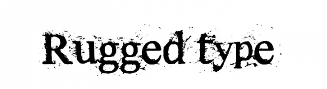
![Rugged type font caratteri gratis]() Scaricare 849 Downloads@WebFont
Scaricare 849 Downloads@WebFont -
![Alien font caratteri gratis]() Scaricare 1063 Downloads@WebFont
Scaricare 1063 Downloads@WebFont -
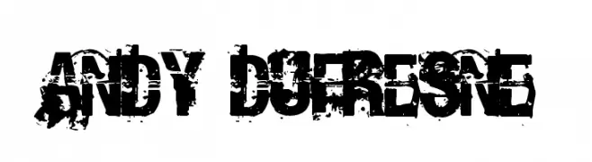
![Andy Dufresne font caratteri gratis]() Scaricare 756 Downloads@WebFont
Scaricare 756 Downloads@WebFont -
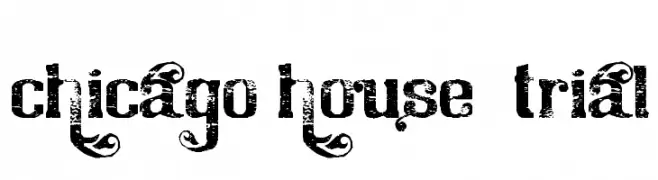
![Chicago House_trial font caratteri gratis]() Scaricare 713 Downloads@WebFont
Scaricare 713 Downloads@WebFont -
( Fonts by SDFonts - Ritzy )
A rugged, distressed font with a bold, weathered appearance.
![Seabreed 2 font caratteri gratis]() Scaricare 185 Downloads@WebFont
Scaricare 185 Downloads@WebFont -
( Fonts by SDFonts - Ritzy )
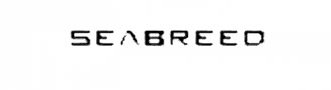
A textured, modern font with a bold, slightly condensed style.
![Seabreed font caratteri gratis]() Scaricare 194 Downloads@WebFont
Scaricare 194 Downloads@WebFont -
![Vestite y Andate! font caratteri gratis]() Scaricare 576 Downloads@WebFont
Scaricare 576 Downloads@WebFont


FAQ — Tendenze Font
Quali sono le tendenze attuali?
Semplicità, leggibilità e calore umano: sans serif arrotondate, serif ad alto contrasto e tocchi retrò sono protagonisti.
Quali font sono di moda ora?
Popolari come Poppins, Roboto e Montserrat uniscono modernità e senza tempo, perfetti per web, social e packaging.
Come usare al meglio i font di tendenza?
Usa un display riconoscibile per i titoli e abbinalo a una sans serif semplice per il testo. Otterrai contrasto senza perdere leggibilità. Prova su device e dimensioni diverse prima della pubblicazione.
💡 Consiglio: aggiorna gli asset principali ogni pochi mesi con un font di tendenza per mantenere freschezza e spinta SEO.