Caratteri
Aardvark Fixed Light Caratteri
Descrizione
- aardvark-fixed-light.ttf
- Caratteri: Aardvark Fixed Light
- Peso: Regular
- Versione: Version Version 0.00;May 6, 2020;FontCreator 12.0.0.2522 64-bit; ttfautohint [v1.8.3]
- Numero di caratteri:: 3608
- Schema di codifica:
- È fissato Pitch: 1
Benvenuto nella pagina delle Tendenze Font — scopri i caratteri che stanno definendo il design attuale. Seguire le tendenze mantiene il tuo lavoro fresco e rilevante per branding, social e UI web.
Questa raccolta riunisce le font di tendenza della stagione, scelte da creativi di tutto il mondo. Troverai serif eleganti, sans serif minimaliste, display espressivi e script artigianali che delineano lo stile del 2025.
Combina font in tendenza con categorie classiche come Moderne, Serif o Manoscritte per una tipografia equilibrata e accattivante.
-
( Fonts by www.fontdiner.com )
A whimsical, retro-inspired font with elongated, narrow characters and playful star embellishments.
 Scaricare 4263 Downloads@WebFont
 -
![bigattino font caratteri gratis]() Scaricare 609 Downloads@WebFont
Scaricare 609 Downloads@WebFont -
( Fonts by Miss Tiina at www.misstiina.com (please check the website before use) )
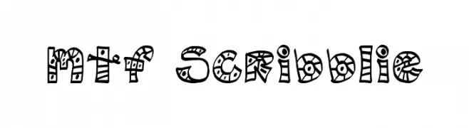
A playful, hand-drawn font with intricate patterns and doodles.
![MTF Scribblie font caratteri gratis]() Scaricare 435 Downloads@WebFont
Scaricare 435 Downloads@WebFont -
( Fonts by Gyom Seguin - last-soundtrack.daportfolio.com )
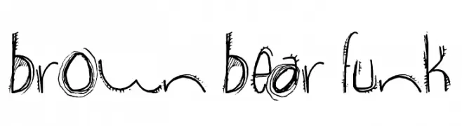
A playful, hand-drawn font with a quirky and energetic style.
![brown bear funk font caratteri gratis]() Scaricare 1437 Downloads@WebFont
Scaricare 1437 Downloads@WebFont -
( Fonts by ShyFonts )
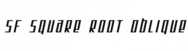
A modern, oblique font with a geometric and dynamic style.
![SF Square Root Oblique font caratteri gratis]() Scaricare 204 Downloads@WebFont
Scaricare 204 Downloads@WebFont -
![SharKbait Regular font caratteri gratis]() Scaricare 384 Downloads@WebFont
Scaricare 384 Downloads@WebFont -
( Fonts by Rob Dobi - Toxic Type - www.dobi.nu )
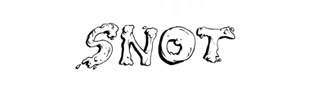
A playful, blob-like font with a whimsical and cartoonish style.
![Snot font caratteri gratis]() Scaricare 1342 Downloads@WebFont
Scaricare 1342 Downloads@WebFont -
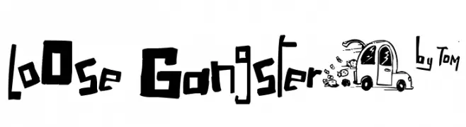
( Fonts by Tn2 - TOM )
A bold, graffiti-inspired font with a playful, rebellious edge.
![LoOse Gangsterµ* font caratteri gratis]() Scaricare 514 Downloads@WebFont
Scaricare 514 Downloads@WebFont


FAQ — Tendenze Font
Quali sono le tendenze attuali?
Semplicità, leggibilità e calore umano: sans serif arrotondate, serif ad alto contrasto e tocchi retrò sono protagonisti.
Quali font sono di moda ora?
Popolari come Poppins, Roboto e Montserrat uniscono modernità e senza tempo, perfetti per web, social e packaging.
Come usare al meglio i font di tendenza?
Usa un display riconoscibile per i titoli e abbinalo a una sans serif semplice per il testo. Otterrai contrasto senza perdere leggibilità. Prova su device e dimensioni diverse prima della pubblicazione.
💡 Consiglio: aggiorna gli asset principali ogni pochi mesi con un font di tendenza per mantenere freschezza e spinta SEO.