Caratteri
BritishScript Caratteri
Descrizione
- Caratteri: BritishScript
- Peso:
- Versione:
- Numero di caratteri::
- Schema di codifica:
- È fissato Pitch: 0
Benvenuto nella pagina delle Tendenze Font — scopri i caratteri che stanno definendo il design attuale. Seguire le tendenze mantiene il tuo lavoro fresco e rilevante per branding, social e UI web.
Questa raccolta riunisce le font di tendenza della stagione, scelte da creativi di tutto il mondo. Troverai serif eleganti, sans serif minimaliste, display espressivi e script artigianali che delineano lo stile del 2025.
Combina font in tendenza con categorie classiche come Moderne, Serif o Manoscritte per una tipografia equilibrata e accattivante.
-
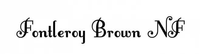
( Fonts by Nick Curtis - www.nicksfonts.com )
An elegant, decorative font with ornate uppercase letters and subtle lowercase curves.
 Scaricare 8013 Downloads@WebFont
 -
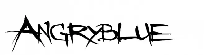
( Fonts by www.angryblue.com )
A raw, edgy font with a hand-drawn, rebellious style.
![Angryblue font caratteri gratis]() Scaricare 24987 Downloads@WebFont
Scaricare 24987 Downloads@WebFont -
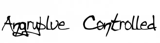
( Fonts by www.angryblue.com )
A bold, hand-drawn font with dynamic strokes and an expressive, rebellious style.
![Angryblue Controlled font caratteri gratis]() Scaricare 3354 Downloads@WebFont
Scaricare 3354 Downloads@WebFont -
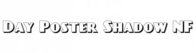
( Fonts by Nick Curtis - www.nicksfonts.com )
A bold, three-dimensional font with a vintage shadow effect.
![Day Poster Shadow NF font caratteri gratis]() Scaricare 782 Downloads@WebFont
Scaricare 782 Downloads@WebFont -
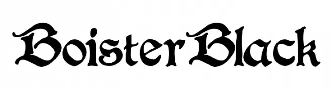
( Paul Lloyd Fonts )
A bold, ornate blackletter font with intricate details and a gothic style.
![BoisterBlack font caratteri gratis]() Scaricare 19244 Downloads
Scaricare 19244 Downloads -
( Fonts by Graham Meade - GemFonts )
An elegant oblique font with smooth, flowing letterforms and a refined appearance.
![Czaristite Oblique font caratteri gratis]() Scaricare 402 Downloads@WebFont
Scaricare 402 Downloads@WebFont -
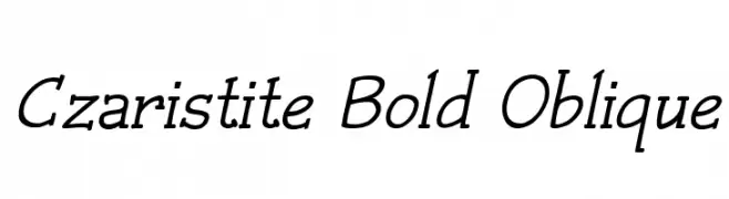
( Fonts by Graham Meade - GemFonts )
A bold, oblique font with a dynamic and elegant style.
![Czaristite Bold Oblique font caratteri gratis]() Scaricare 365 Downloads@WebFont
Scaricare 365 Downloads@WebFont -
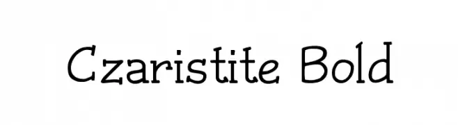
( Fonts by Graham Meade - GemFonts )
A bold, playful font with a hand-drawn aesthetic and varying line thickness.
![Czaristite Bold font caratteri gratis]() Scaricare 567 Downloads@WebFont
Scaricare 567 Downloads@WebFont

FAQ — Tendenze Font
Quali sono le tendenze attuali?
Semplicità, leggibilità e calore umano: sans serif arrotondate, serif ad alto contrasto e tocchi retrò sono protagonisti.
Quali font sono di moda ora?
Popolari come Poppins, Roboto e Montserrat uniscono modernità e senza tempo, perfetti per web, social e packaging.
Come usare al meglio i font di tendenza?
Usa un display riconoscibile per i titoli e abbinalo a una sans serif semplice per il testo. Otterrai contrasto senza perdere leggibilità. Prova su device e dimensioni diverse prima della pubblicazione.
💡 Consiglio: aggiorna gli asset principali ogni pochi mesi con un font di tendenza per mantenere freschezza e spinta SEO.