Caratteri
Chronosphere Caratteri
Descrizione
- Caratteri: Chronosphere
- Peso: Regular
- Versione: Version Version 1.00;April 30, 2019;FontCreator 11.5.0.2422 64-bit
- Numero di caratteri:: 65
- Schema di codifica:
- È fissato Pitch: 0
Benvenuto nella pagina delle Tendenze Font — scopri i caratteri che stanno definendo il design attuale. Seguire le tendenze mantiene il tuo lavoro fresco e rilevante per branding, social e UI web.
Questa raccolta riunisce le font di tendenza della stagione, scelte da creativi di tutto il mondo. Troverai serif eleganti, sans serif minimaliste, display espressivi e script artigianali che delineano lo stile del 2025.
Combina font in tendenza con categorie classiche come Moderne, Serif o Manoscritte per una tipografia equilibrata e accattivante.
-
( Fonts by ShyFonts )
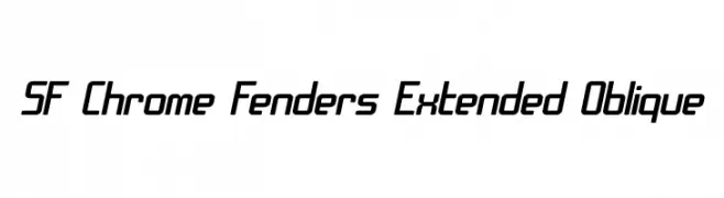
A modern, extended oblique font with a sleek, dynamic style.
 Scaricare 376 Downloads@WebFont
 -
( Fonts by ShyFonts )
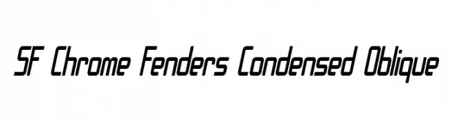
A modern, condensed, and oblique font with a sleek and dynamic appearance.
![SF Chrome Fenders Condensed Oblique font caratteri gratis]() Scaricare 245 Downloads@WebFont
Scaricare 245 Downloads@WebFont -
( Fonts by ShyFonts )
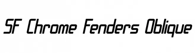
A sleek, futuristic oblique font with geometric precision and modern appeal.
![SF Chrome Fenders Oblique font caratteri gratis]() Scaricare 271 Downloads@WebFont
Scaricare 271 Downloads@WebFont -
( Fonts by ShyFonts )
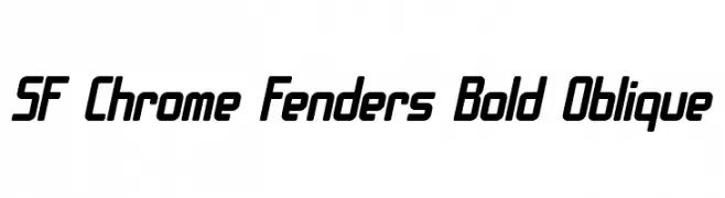
A bold, oblique font with a futuristic and modern design.
![SF Chrome Fenders Bold Oblique font caratteri gratis]() Scaricare 849 Downloads@WebFont
Scaricare 849 Downloads@WebFont -
( Fonts by ShyFonts )
A modern, geometric typeface with rounded edges and uniform character width.
![SF Chrome Fenders Extended font caratteri gratis]() Scaricare 685 Downloads@WebFont
Scaricare 685 Downloads@WebFont -
( Fonts by ShyFonts )
A bold, geometric font with rounded edges and a modern, futuristic style.
![SF Chrome Fenders Bold font caratteri gratis]() Scaricare 911 Downloads@WebFont
Scaricare 911 Downloads@WebFont -
( Fonts by ShyFonts )
A modern, geometric font with rounded edges and consistent stroke width.
![SF Chrome Fenders font caratteri gratis]() Scaricare 904 Downloads@WebFont
Scaricare 904 Downloads@WebFont -
![Slap Happy font caratteri gratis]() Scaricare 1489 Downloads@WebFont
Scaricare 1489 Downloads@WebFont
FAQ — Tendenze Font
Quali sono le tendenze attuali?
Semplicità, leggibilità e calore umano: sans serif arrotondate, serif ad alto contrasto e tocchi retrò sono protagonisti.
Quali font sono di moda ora?
Popolari come Poppins, Roboto e Montserrat uniscono modernità e senza tempo, perfetti per web, social e packaging.
Come usare al meglio i font di tendenza?
Usa un display riconoscibile per i titoli e abbinalo a una sans serif semplice per il testo. Otterrai contrasto senza perdere leggibilità. Prova su device e dimensioni diverse prima della pubblicazione.
💡 Consiglio: aggiorna gli asset principali ogni pochi mesi con un font di tendenza per mantenere freschezza e spinta SEO.