Caratteri
Cursed Gothic Witch Caratteri
Descrizione
- Caratteri: Cursed Gothic Witch
- Peso: Regular
- Versione: Version Version 1.002;Fontself Maker 3.5.8
- Numero di caratteri:: 130
- Schema di codifica:
- È fissato Pitch: 0
Benvenuto nella pagina delle Tendenze Font — scopri i caratteri che stanno definendo il design attuale. Seguire le tendenze mantiene il tuo lavoro fresco e rilevante per branding, social e UI web.
Questa raccolta riunisce le font di tendenza della stagione, scelte da creativi di tutto il mondo. Troverai serif eleganti, sans serif minimaliste, display espressivi e script artigianali che delineano lo stile del 2025.
Combina font in tendenza con categorie classiche come Moderne, Serif o Manoscritte per una tipografia equilibrata e accattivante.
-
( Fonts by Nick Curtis - www.nicksfonts.com )
A decorative serif font with a blend of geometric and handwritten styles.
 Scaricare 409 Downloads@WebFont
 -
( Fonts by Daniel Zadorozny - www.iconian.com )
A dynamic, italicized font with a futuristic and angular design.
![Thundergod II Italic font caratteri gratis]() Scaricare 440 Downloads@WebFont
Scaricare 440 Downloads@WebFont -
![Thundergod II Shadow font caratteri gratis]() Scaricare 259 Downloads@WebFont
Scaricare 259 Downloads@WebFont -
( Fonts by Daniel Zadorozny - www.iconian.com )
A futuristic, angular font with geometric shapes and consistent stroke thickness.
![Thundergod II font caratteri gratis]() Scaricare 719 Downloads@WebFont
Scaricare 719 Downloads@WebFont -
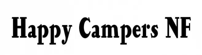
( Fonts by Nick Curtis - www.nicksfonts.com )
A bold, serif font with strong strokes and classic elegance.
![Happy Campers NF font caratteri gratis]() Scaricare 873 Downloads@WebFont
Scaricare 873 Downloads@WebFont -
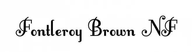
( Fonts by Nick Curtis - www.nicksfonts.com )
An elegant, decorative font with ornate uppercase letters and subtle lowercase curves.
![Fontleroy Brown NF font caratteri gratis]() Scaricare 7982 Downloads@WebFont
Scaricare 7982 Downloads@WebFont -
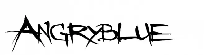
( Fonts by www.angryblue.com )
A raw, edgy font with a hand-drawn, rebellious style.
![Angryblue font caratteri gratis]() Scaricare 24945 Downloads@WebFont
Scaricare 24945 Downloads@WebFont -
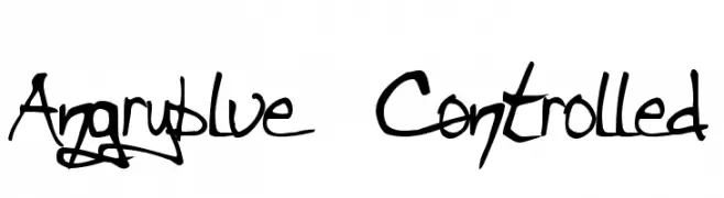
( Fonts by www.angryblue.com )
A bold, hand-drawn font with dynamic strokes and an expressive, rebellious style.
![Angryblue Controlled font caratteri gratis]() Scaricare 3330 Downloads@WebFont
Scaricare 3330 Downloads@WebFont
FAQ — Tendenze Font
Quali sono le tendenze attuali?
Semplicità, leggibilità e calore umano: sans serif arrotondate, serif ad alto contrasto e tocchi retrò sono protagonisti.
Quali font sono di moda ora?
Popolari come Poppins, Roboto e Montserrat uniscono modernità e senza tempo, perfetti per web, social e packaging.
Come usare al meglio i font di tendenza?
Usa un display riconoscibile per i titoli e abbinalo a una sans serif semplice per il testo. Otterrai contrasto senza perdere leggibilità. Prova su device e dimensioni diverse prima della pubblicazione.
💡 Consiglio: aggiorna gli asset principali ogni pochi mesi con un font di tendenza per mantenere freschezza e spinta SEO.