Caratteri
Dreamotions Free Regular Caratteri
Descrizione
- Caratteri: Dreamotions Free Regular
- Peso: Regular
- Versione: Version Version 1.000
- Numero di caratteri:: 115
- Schema di codifica:
- È fissato Pitch: 0
Benvenuto nella pagina delle Tendenze Font — scopri i caratteri che stanno definendo il design attuale. Seguire le tendenze mantiene il tuo lavoro fresco e rilevante per branding, social e UI web.
Questa raccolta riunisce le font di tendenza della stagione, scelte da creativi di tutto il mondo. Troverai serif eleganti, sans serif minimaliste, display espressivi e script artigianali che delineano lo stile del 2025.
Combina font in tendenza con categorie classiche come Moderne, Serif o Manoscritte per una tipografia equilibrata e accattivante.
-
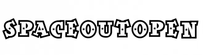
( Fonts by Daniel Gauthier )
A bold decorative font with star-shaped cutouts and thick outlines, perfect for playful designs.
 Scaricare 337 Downloads@WebFont
 -
( Fonts by Nick Curtis - www.nicksfonts.com )
A bold, geometric font with a three-dimensional, faceted design.
![Facets NF font caratteri gratis]() Scaricare 1950 Downloads@WebFont
Scaricare 1950 Downloads@WebFont -
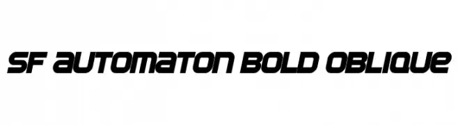
( Fonts by ShyFonts )
A bold, oblique font with a futuristic and mechanical design.
![SF Automaton Bold Oblique font caratteri gratis]() Scaricare 1917 Downloads@WebFont
Scaricare 1917 Downloads@WebFont -
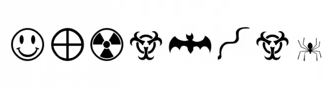
( Fonts by Altsys Metamorphosis )
A diverse collection of bold, high-contrast symbols and icons.
![Mortbats font caratteri gratis]() Scaricare 399 Downloads@WebFont
Scaricare 399 Downloads@WebFont -
( Fonts by ShyFonts )
A futuristic, geometric font with bold, angular letterforms.
![SF Automaton Extended font caratteri gratis]() Scaricare 3986 Downloads@WebFont
Scaricare 3986 Downloads@WebFont -
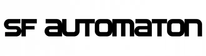
( Fonts by ShyFonts )
A futuristic, geometric font with bold, blocky letterforms and consistent stroke width.
![SF Automaton font caratteri gratis]() Scaricare 2806 Downloads@WebFont
Scaricare 2806 Downloads@WebFont -
( Fonts by ShyFonts )
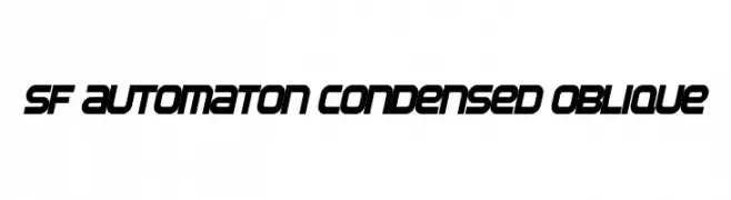
A futuristic, bold, and oblique font with a condensed style.
![SF Automaton Condensed Oblique font caratteri gratis]() Scaricare 1018 Downloads@WebFont
Scaricare 1018 Downloads@WebFont -
( Fonts by ShyFonts )
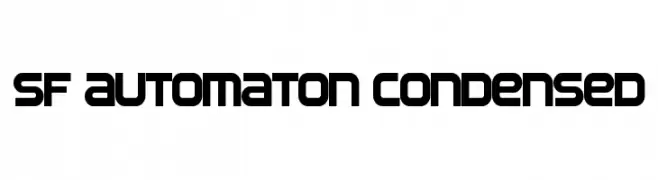
A bold, condensed font with a futuristic, geometric design.
![SF Automaton Condensed font caratteri gratis]() Scaricare 1226 Downloads@WebFont
Scaricare 1226 Downloads@WebFont


FAQ — Tendenze Font
Quali sono le tendenze attuali?
Semplicità, leggibilità e calore umano: sans serif arrotondate, serif ad alto contrasto e tocchi retrò sono protagonisti.
Quali font sono di moda ora?
Popolari come Poppins, Roboto e Montserrat uniscono modernità e senza tempo, perfetti per web, social e packaging.
Come usare al meglio i font di tendenza?
Usa un display riconoscibile per i titoli e abbinalo a una sans serif semplice per il testo. Otterrai contrasto senza perdere leggibilità. Prova su device e dimensioni diverse prima della pubblicazione.
💡 Consiglio: aggiorna gli asset principali ogni pochi mesi con un font di tendenza per mantenere freschezza e spinta SEO.