Caratteri
KR Valentines 2006 Caratteri
Descrizione
- KR Valentines 2006 .ttf
- Caratteri: KR Valentines 2006
- Peso: Regular
- Versione: Version Macromedia Fontographer 4.1 1/20/2006
- Numero di caratteri:: 15
- Schema di codifica:
- È fissato Pitch: 0
Benvenuto nella pagina delle Tendenze Font — scopri i caratteri che stanno definendo il design attuale. Seguire le tendenze mantiene il tuo lavoro fresco e rilevante per branding, social e UI web.
Questa raccolta riunisce le font di tendenza della stagione, scelte da creativi di tutto il mondo. Troverai serif eleganti, sans serif minimaliste, display espressivi e script artigianali che delineano lo stile del 2025.
Combina font in tendenza con categorie classiche come Moderne, Serif o Manoscritte per una tipografia equilibrata e accattivante.
-
 Scaricare 1512 Downloads@WebFont
 -
( Fonts by Daniel Gauthier )
A bold, playful font with diamond-shaped backgrounds and slight serifs.
![FrootStand font caratteri gratis]() Scaricare 272 Downloads@WebFont
Scaricare 272 Downloads@WebFont -
( Fonts by Graham Meade - GemFonts )
A bold, layered font with a three-dimensional, futuristic design.
![Bonk Outercut font caratteri gratis]() Scaricare 455 Downloads@WebFont
Scaricare 455 Downloads@WebFont -
( Fonts by Graham Meade - GemFonts )
A bold, futuristic font with horizontal stripes and geometric shapes.
![Bonk Undercut font caratteri gratis]() Scaricare 844 Downloads@WebFont
Scaricare 844 Downloads@WebFont -
( Fonts by Graham Meade - GemFonts )
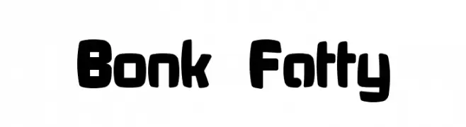
A bold, rounded font with a playful and chunky style.
![Bonk Fatty font caratteri gratis]() Scaricare 1600 Downloads@WebFont
Scaricare 1600 Downloads@WebFont -
( Fonts by Graham Meade - GemFonts )
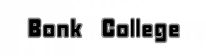
A bold, outlined font with a modern and playful style, featuring geometric shapes and rounded edges.
![Bonk College font caratteri gratis]() Scaricare 1588 Downloads@WebFont
Scaricare 1588 Downloads@WebFont -
( Fonts by Graham Meade - GemFonts )
A bold, geometric font with rounded edges and minimal contrast.
![Bonk font caratteri gratis]() Scaricare 3066 Downloads@WebFont
Scaricare 3066 Downloads@WebFont -
( Fonts by Astigmatic One Eye Typographic Institute - Brian J. Bonislawsky - astigmatic.com )
A bold, geometric font with a futuristic, grid-like design.
![Transponder Grid AOE font caratteri gratis]() Scaricare 390 Downloads@WebFont
Scaricare 390 Downloads@WebFont

FAQ — Tendenze Font
Quali sono le tendenze attuali?
Semplicità, leggibilità e calore umano: sans serif arrotondate, serif ad alto contrasto e tocchi retrò sono protagonisti.
Quali font sono di moda ora?
Popolari come Poppins, Roboto e Montserrat uniscono modernità e senza tempo, perfetti per web, social e packaging.
Come usare al meglio i font di tendenza?
Usa un display riconoscibile per i titoli e abbinalo a una sans serif semplice per il testo. Otterrai contrasto senza perdere leggibilità. Prova su device e dimensioni diverse prima della pubblicazione.
💡 Consiglio: aggiorna gli asset principali ogni pochi mesi con un font di tendenza per mantenere freschezza e spinta SEO.