Caratteri
PHATKIDfreeRegular Caratteri
Descrizione
- Phatkidfree-K70R7.otf
- Caratteri: PHATKIDfreeRegular
- Peso: Regular
- Versione: Version 1.008;Fontself Maker 3.5.1
- Numero di caratteri:: 33
- Schema di codifica:
- È fissato Pitch: 0
Benvenuto nella pagina delle Tendenze Font — scopri i caratteri che stanno definendo il design attuale. Seguire le tendenze mantiene il tuo lavoro fresco e rilevante per branding, social e UI web.
Questa raccolta riunisce le font di tendenza della stagione, scelte da creativi di tutto il mondo. Troverai serif eleganti, sans serif minimaliste, display espressivi e script artigianali che delineano lo stile del 2025.
Combina font in tendenza con categorie classiche come Moderne, Serif o Manoscritte per una tipografia equilibrata e accattivante.
-
 Scaricare 3366 Downloads@WebFont
 -
( Fonts by Graham Meade - GemFonts )
A tall, slender, and modern typeface with a geometric and minimalist design.
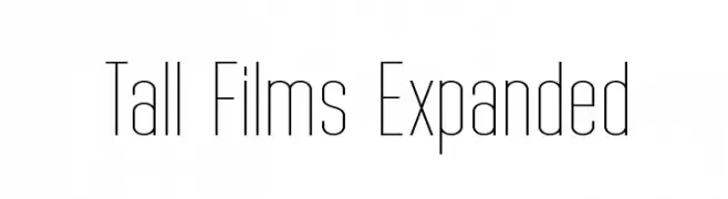
![Tall Films Expanded font caratteri gratis]() Scaricare 3517 Downloads@WebFont
Scaricare 3517 Downloads@WebFont -
( Fonts by Graham Meade - GemFonts )
A tall, narrow, and modern font with thin, consistent strokes.
![Tall Films font caratteri gratis]() Scaricare 5995 Downloads@WebFont
Scaricare 5995 Downloads@WebFont -
( Fonts by Graham Meade - GemFonts )
A tall, ultra-thin, and modern font with a sleek and elegant design.
![Tall Films Fine font caratteri gratis]() Scaricare 2256 Downloads@WebFont
Scaricare 2256 Downloads@WebFont -
( Fonts by Graham Meade - GemFonts )
A sleek, elongated oblique font with a modern and dynamic style.
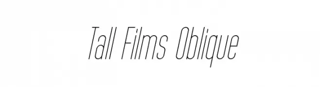
![Tall Films Oblique font caratteri gratis]() Scaricare 563 Downloads@WebFont
Scaricare 563 Downloads@WebFont -
( Fonts by Graham Meade - GemFonts )
A sleek, oblique font with tall, narrow characters and a modern aesthetic.
![Tall Films Expanded Oblique font caratteri gratis]() Scaricare 349 Downloads@WebFont
Scaricare 349 Downloads@WebFont -
( Fonts by Graham Meade - GemFonts )
A sleek, elongated, and oblique font with fine lines and a modern aesthetic.
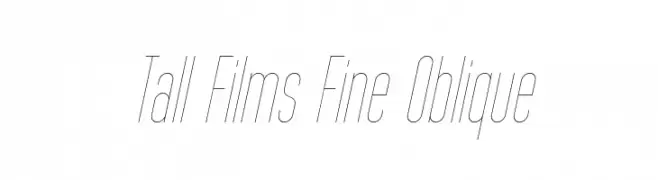
![Tall Films Fine Oblique font caratteri gratis]() Scaricare 306 Downloads@WebFont
Scaricare 306 Downloads@WebFont -
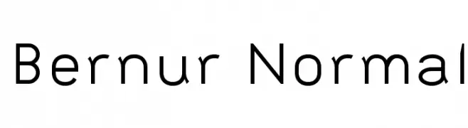
![Bernur Normal font caratteri gratis]() Scaricare 1167 Downloads@WebFont
Scaricare 1167 Downloads@WebFont


FAQ — Tendenze Font
Quali sono le tendenze attuali?
Semplicità, leggibilità e calore umano: sans serif arrotondate, serif ad alto contrasto e tocchi retrò sono protagonisti.
Quali font sono di moda ora?
Popolari come Poppins, Roboto e Montserrat uniscono modernità e senza tempo, perfetti per web, social e packaging.
Come usare al meglio i font di tendenza?
Usa un display riconoscibile per i titoli e abbinalo a una sans serif semplice per il testo. Otterrai contrasto senza perdere leggibilità. Prova su device e dimensioni diverse prima della pubblicazione.
💡 Consiglio: aggiorna gli asset principali ogni pochi mesi con un font di tendenza per mantenere freschezza e spinta SEO.