Caratteri
Payopony Caratteri
Descrizione
- payopony.ttf
- Caratteri: Payopony
- Peso: Regular
- Versione: Version Version 1.000
- Numero di caratteri:: 73
- Schema di codifica:
- È fissato Pitch: 0
Benvenuto nella pagina delle Tendenze Font — scopri i caratteri che stanno definendo il design attuale. Seguire le tendenze mantiene il tuo lavoro fresco e rilevante per branding, social e UI web.
Questa raccolta riunisce le font di tendenza della stagione, scelte da creativi di tutto il mondo. Troverai serif eleganti, sans serif minimaliste, display espressivi e script artigianali che delineano lo stile del 2025.
Combina font in tendenza con categorie classiche come Moderne, Serif o Manoscritte per una tipografia equilibrata e accattivante.
-
 Scaricare 2025 Downloads@WebFont
 -
![Monika font caratteri gratis]() Scaricare 2311 Downloads@WebFont
Scaricare 2311 Downloads@WebFont -
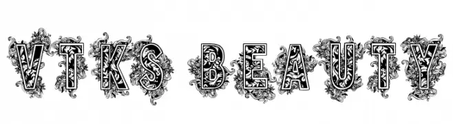
( Fonts by Douglas Vitkauskas - www.vtksdesign.com. Personal-use only. For commercial use please contact owner. )
An ornate, decorative font with intricate floral embellishments.
![VTKS BEAUTY font caratteri gratis]() Scaricare 534 Downloads@WebFont
Scaricare 534 Downloads@WebFont -
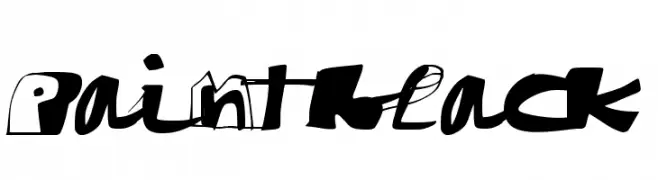
( Fonts by www.paintblackeditions.org - Free for personal use only )
A bold, graffiti-inspired font with dynamic, irregular shapes.
![paintblack font caratteri gratis]() Scaricare 196 Downloads@WebFont
Scaricare 196 Downloads@WebFont -
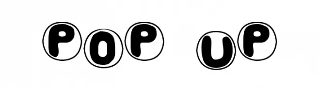
( Fonts by Blue Vinyl - Jess Latham - www.bvfonts.com )
A playful, bold font with characters encased in circles, perfect for fun and engaging designs.
![Pop Up font caratteri gratis]() Scaricare 276 Downloads@WebFont
Scaricare 276 Downloads@WebFont -
![Medalhão font caratteri gratis]() Scaricare 230 Downloads@WebFont
Scaricare 230 Downloads@WebFont -
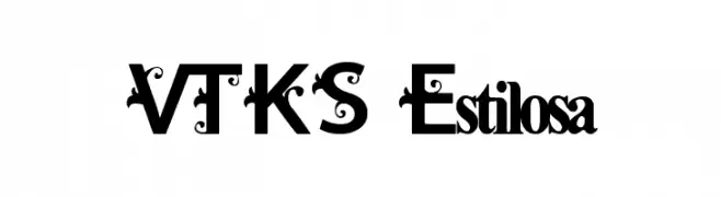
( Fonts by Douglas Vitkauskas - www.vtksdesign.com. Personal-use only. For commercial use please contact owner. )
A decorative font with ornate swirls and embellishments, offering a bold and elegant appearance.
![VTKS Estilosa font caratteri gratis]() Scaricare 665 Downloads@WebFont
Scaricare 665 Downloads@WebFont -
![TTEdit Font font caratteri gratis]() Scaricare 2261 Downloads@WebFont
Scaricare 2261 Downloads@WebFont


FAQ — Tendenze Font
Quali sono le tendenze attuali?
Semplicità, leggibilità e calore umano: sans serif arrotondate, serif ad alto contrasto e tocchi retrò sono protagonisti.
Quali font sono di moda ora?
Popolari come Poppins, Roboto e Montserrat uniscono modernità e senza tempo, perfetti per web, social e packaging.
Come usare al meglio i font di tendenza?
Usa un display riconoscibile per i titoli e abbinalo a una sans serif semplice per il testo. Otterrai contrasto senza perdere leggibilità. Prova su device e dimensioni diverse prima della pubblicazione.
💡 Consiglio: aggiorna gli asset principali ogni pochi mesi con un font di tendenza per mantenere freschezza e spinta SEO.