Caratteri
Potters Free Regular Caratteri
Descrizione
- Caratteri: Potters Free Regular
- Peso: Regular
- Versione: Version Version 1.000
- Numero di caratteri:: 56
- Schema di codifica:
- È fissato Pitch: 0
Benvenuto nella pagina delle Tendenze Font — scopri i caratteri che stanno definendo il design attuale. Seguire le tendenze mantiene il tuo lavoro fresco e rilevante per branding, social e UI web.
Questa raccolta riunisce le font di tendenza della stagione, scelte da creativi di tutto il mondo. Troverai serif eleganti, sans serif minimaliste, display espressivi e script artigianali che delineano lo stile del 2025.
Combina font in tendenza con categorie classiche come Moderne, Serif o Manoscritte per una tipografia equilibrata e accattivante.
-
( Fonts by Graham Meade - GemFonts )
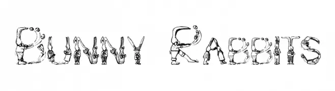
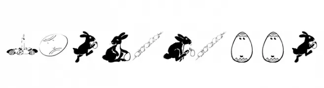
A whimsical font featuring letters and numbers crafted from detailed rabbit illustrations.
 Scaricare 4148 Downloads@WebFont
 -
( Fonts by Dieter Steffmann )
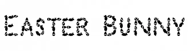
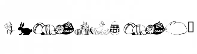
A whimsical, Easter-themed decorative font featuring eggs and bunnies.
![Easter Bunny font caratteri gratis]() Scaricare 2665 Downloads@WebFont
Scaricare 2665 Downloads@WebFont -
( Fonts by Kat`s Fun Fonts - Personal-use only. For commercial use please contact owner. )
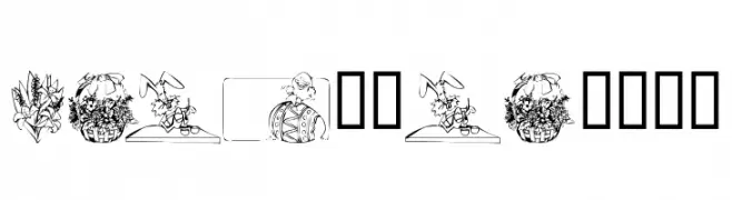
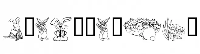
A decorative font with Easter-themed illustrations for each character.
![KR Easter 2002 font caratteri gratis]() Scaricare 225 Downloads@WebFont
Scaricare 225 Downloads@WebFont -
( Fonts by www.houseoflime.com )
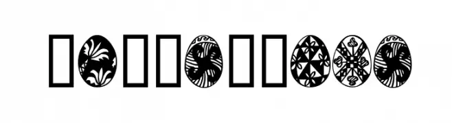
Ornamental display font with Easter egg illustrations as glyphs.
![EasterTime font caratteri gratis]() Scaricare 378 Downloads@WebFont
Scaricare 378 Downloads@WebFont -
( Fonts by Manfred Klein - manfred-klein.ina-mar.com )
Decorative dingbat font with Easter-themed illustrations.
![Eastereggs font caratteri gratis]() Scaricare 719 Downloads@WebFont
Scaricare 719 Downloads@WebFont -
![wmeaster1 font caratteri gratis]() Scaricare 358 Downloads@WebFont
Scaricare 358 Downloads@WebFont -
( Fonts by Kat`s Fun Fonts - Personal-use only. For commercial use please contact owner. )
A decorative Easter-themed font with playful illustrations in each character.
![KR Easter No 2 font caratteri gratis]() Scaricare 246 Downloads@WebFont
Scaricare 246 Downloads@WebFont -
( Fonts by Apostrophic Lab )
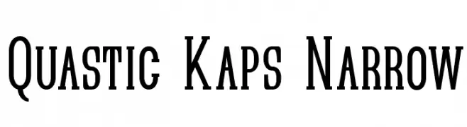
A narrow, elongated serif font with strong vertical emphasis and sharp serifs.
![Quastic Kaps Narrow font caratteri gratis]() Scaricare 358 Downloads@WebFont
Scaricare 358 Downloads@WebFont
FAQ — Tendenze Font
Quali sono le tendenze attuali?
Semplicità, leggibilità e calore umano: sans serif arrotondate, serif ad alto contrasto e tocchi retrò sono protagonisti.
Quali font sono di moda ora?
Popolari come Poppins, Roboto e Montserrat uniscono modernità e senza tempo, perfetti per web, social e packaging.
Come usare al meglio i font di tendenza?
Usa un display riconoscibile per i titoli e abbinalo a una sans serif semplice per il testo. Otterrai contrasto senza perdere leggibilità. Prova su device e dimensioni diverse prima della pubblicazione.
💡 Consiglio: aggiorna gli asset principali ogni pochi mesi con un font di tendenza per mantenere freschezza e spinta SEO.