Benvenuto nella sezione Nuovi Font — una selezione curata dei caratteri appena aggiunti su FFonts.net. Che tu sia designer, sviluppatore o appassionato di tipografia, qui resti aggiornato sulle ultime tendenze.
Ogni nuovo font ha una sua personalità: dalle sans serif moderne e pulite alle script espressive, fino ai display audaci. Aggiorniamo spesso la lista così puoi provare in anteprima e scaricare gratuitamente.
-
( Fonts by Ben Suarez. OFF SITE )
A bold, geometric font with strong, angular lines and a modern aesthetic.
 Scaricare 0 Downloads
 -
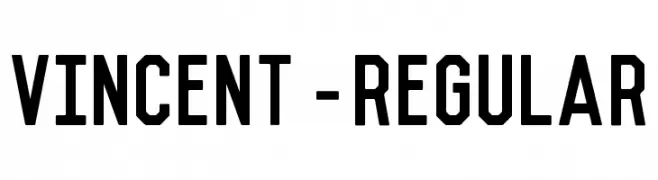
( Fonts by Axel Lymphos )
A pixelated, retro-style font inspired by vintage digital displays.
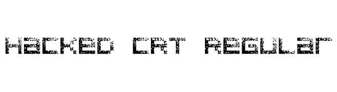
![Hacked CRT Regular font caratteri gratis]() Scaricare 234 Downloads@WebFont
Scaricare 234 Downloads@WebFont -
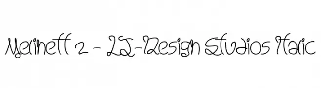
![Melinett 2 - LJ-Design Studios Italic font caratteri gratis]() Scaricare 95 Downloads@WebFont
Scaricare 95 Downloads@WebFont -
( Fonts by Southype )
A pixelated, grid-based font with a modern, digital look.
![UltraLED St font caratteri gratis]() Scaricare 101 Downloads@WebFont
Scaricare 101 Downloads@WebFont -
![CRU-teerapong-Hand-Written font caratteri gratis]() Scaricare 94 Downloads@WebFont
Scaricare 94 Downloads@WebFont -
-
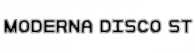
( Fonts by Southype )
A bold, modern font with a retro outline effect, ideal for standout headlines.
![Moderna Disco St font caratteri gratis]() Scaricare 140 Downloads@WebFont
Scaricare 140 Downloads@WebFont -
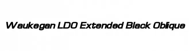
( Fonts by Luke Owens - Personal-use only. For commercial use please contact owner. )
A bold, extended, and oblique typeface with a modern, dynamic style.
![Waukegan LDO Extended Black Oblique font caratteri gratis]() Scaricare 894 Downloads@WebFont
Scaricare 894 Downloads@WebFont -
( Fonts by Luke Owens - Personal-use only. For commercial use please contact owner. )
A bold, geometric font with a modern and clean appearance.
![Waukegan LDO Black font caratteri gratis]() Scaricare 1895 Downloads@WebFont
Scaricare 1895 Downloads@WebFont -
( Fonts by Luke Owens - Personal-use only. For commercial use please contact owner. )
A bold, extended sans-serif font with a modern and clean design.
![Waukegan LDO Extended Bold font caratteri gratis]() Scaricare 3282 Downloads@WebFont
Scaricare 3282 Downloads@WebFont -
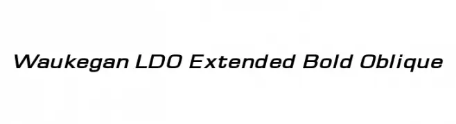
( Fonts by Luke Owens - Personal-use only. For commercial use please contact owner. )
A modern, bold, and oblique font with extended width and high contrast.
![Waukegan LDO Extended Bold Oblique font caratteri gratis]() Scaricare 773 Downloads@WebFont
Scaricare 773 Downloads@WebFont


FAQ — Nuovi Font
Qual è il nuovo font che usano tutti?
Le tendenze cambiano rapidamente, ma oggi dominano le sans serif minimaliste e i display espressivi — perfetti per contenuti mobile e branding moderno.
Quali sono cinque nuovi font consigliati?
Tra i preferiti recenti: Poppins, Roboto, Montserrat, Open Sans e Lato. Bilanciano chiarezza e personalità; ideali per brand tech, editoriali e social.
Come provare prima di scaricare?
Usa l'anteprima live: scrivi il tuo testo nella pagina del font per verificare peso, spaziatura e leggibilità a varie dimensioni. Se ti convince, scarica i file TTF/OTF.