Benvenuto nella sezione Nuovi Font — una selezione curata dei caratteri appena aggiunti su FFonts.net. Che tu sia designer, sviluppatore o appassionato di tipografia, qui resti aggiornato sulle ultime tendenze.
Ogni nuovo font ha una sua personalità: dalle sans serif moderne e pulite alle script espressive, fino ai display audaci. Aggiorniamo spesso la lista così puoi provare in anteprima e scaricare gratuitamente.
-
( Fonts by Gus Fajar - Personal-use only. For commercial use please contact owner. )
A lively handwritten font with fluid, playful strokes.
 Scaricare 33 Downloads@WebFont
 -
( Fonts by Gunawan Soderi - Personal-use only. For commercial use please contact owner. )
An elegant, flowing script font with bold, ornate uppercase and graceful lowercase letters.
![Whitney font caratteri gratis]() Scaricare 466 Downloads@WebFont
Scaricare 466 Downloads@WebFont -
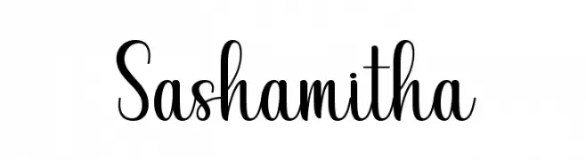
( Fonts by Gunawan Soderi - Personal-use only. For commercial use please contact owner. )
A playful and elegant script font with a handwritten touch.
![Sashamitha font caratteri gratis]() Scaricare 148 Downloads@WebFont
Scaricare 148 Downloads@WebFont -
( Fonts by Gunawan - Personal-use only. For commercial use please contact owner. )
A playful, handwritten font with tall, narrow letters and a casual style.
![LemonJuiceRegular font caratteri gratis]() Scaricare 162 Downloads@WebFont
Scaricare 162 Downloads@WebFont -
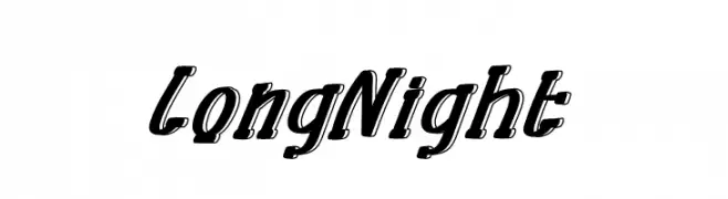
( Fonts by Gunawan - Personal-use only. For commercial use please contact owner. )
A bold, shadowed font with a dynamic, three-dimensional look.
![Long Night font caratteri gratis]() Scaricare 34 Downloads@WebFont
Scaricare 34 Downloads@WebFont -
-
( Fonts by Gunawan - Personal-use only. For commercial use please contact owner. )
A playful, bold font with bubble-like, three-dimensional characters.
![Boba Ball font caratteri gratis]() Scaricare 76 Downloads@WebFont
Scaricare 76 Downloads@WebFont -
( Fonts by Gunawan - Personal-use only. For commercial use please contact owner. )
A bold, dynamic script font with strong, slanted characters.
![HelloFriendRegular font caratteri gratis]() Scaricare 40 Downloads@WebFont
Scaricare 40 Downloads@WebFont -
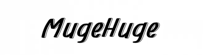
( Fonts by Gunawan - Personal-use only. For commercial use please contact owner. )
A bold, dynamic script font with a playful and energetic style.
![Muge Huge font caratteri gratis]() Scaricare 38 Downloads@WebFont
Scaricare 38 Downloads@WebFont -
( Fonts by Gunawan - Personal-use only. For commercial use please contact owner. )
A dynamic script font with smooth, flowing lines and a slight slant.
![Mexico House font caratteri gratis]() Scaricare 47 Downloads@WebFont
Scaricare 47 Downloads@WebFont -
( Fonts by Gunawan - Personal-use only. For commercial use please contact owner. )
A playful and whimsical font with decorative curls and loops.
![Green Island font caratteri gratis]() Scaricare 46 Downloads@WebFont
Scaricare 46 Downloads@WebFont -
( Fonts by Gunawan - Personal-use only. For commercial use please contact owner. )
A bold, dynamic script font with high contrast and flowing letterforms.
![Good Job font caratteri gratis]() Scaricare 81 Downloads@WebFont
Scaricare 81 Downloads@WebFont -
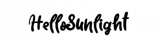
( Fonts by Gunawan - Personal-use only. For commercial use please contact owner. )
A bold, playful script font with interconnected characters and a dynamic style.
![Hello Sunlight font caratteri gratis]() Scaricare 43 Downloads@WebFont
Scaricare 43 Downloads@WebFont -
( Fonts by Gunawan - Personal-use only. For commercial use please contact owner. )
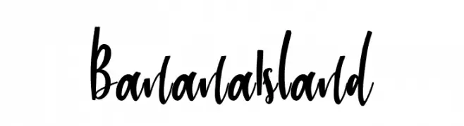
A bold, playful handwritten font with dynamic strokes and lively curves.
![Banana Island font caratteri gratis]() Scaricare 36 Downloads@WebFont
Scaricare 36 Downloads@WebFont -
( Fonts by Gunawan - Personal-use only. For commercial use please contact owner. )
A playful, hand-drawn font with a whimsical, organic style.
![Seaweed font caratteri gratis]() Scaricare 68 Downloads@WebFont
Scaricare 68 Downloads@WebFont -
( Fonts by Gunawan - Personal-use only. For commercial use please contact owner. )
A playful, hand-drawn style font with tall, narrow letters and rounded edges.
![Month Flower font caratteri gratis]() Scaricare 267 Downloads@WebFont
Scaricare 267 Downloads@WebFont -
( Fonts by Gunawan - Personal-use only. For commercial use please contact owner. )
A bold, rounded, and playful font with a hand-drawn look.
![Big Mango font caratteri gratis]() Scaricare 79 Downloads@WebFont
Scaricare 79 Downloads@WebFont -
( Fonts by Gunawan - Personal-use only. For commercial use please contact owner. )
A playful, outlined font with a dynamic and energetic style.
![Halloha font caratteri gratis]() Scaricare 37 Downloads@WebFont
Scaricare 37 Downloads@WebFont -
( Fonts by GulioSt - Wahy Sapt - Personal-use only. For commercial use please contact owner. )
A dynamic and elegant script font with flowing, cursive letterforms.
![Atrusttacho font caratteri gratis]() Scaricare 81 Downloads@WebFont
Scaricare 81 Downloads@WebFont -
( Fonts by GulioSt - Wahy Sapt - Personal-use only. For commercial use please contact owner. )
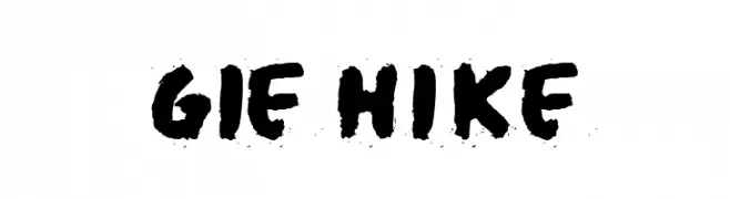
A bold, hand-painted style font with a distressed texture.
![Gie Hike font caratteri gratis]() Scaricare 35 Downloads@WebFont
Scaricare 35 Downloads@WebFont -
( Fonts by GulioSt - Wahy Sapt - Personal-use only. For commercial use please contact owner. )
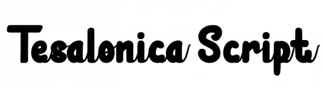
A bold, playful script font with rounded strokes and smooth curves.
![Tesalonica Script font caratteri gratis]() Scaricare 55 Downloads@WebFont
Scaricare 55 Downloads@WebFont -
( Fonts by GulioSt - Wahy Sapt - Personal-use only. For commercial use please contact owner. )
An elegant script font with decorative swirls and flowing cursive style.
![Javinka Alternate font caratteri gratis]() Scaricare 63 Downloads@WebFont
Scaricare 63 Downloads@WebFont -
( Fonts by GulioSt - Wahy Sapt - Personal-use only. For commercial use please contact owner. )
An elegant and flowing script font with graceful curves and cursive lines.
![Javinka Script font caratteri gratis]() Scaricare 53 Downloads@WebFont
Scaricare 53 Downloads@WebFont -
( Fonts by GulioSt - Wahy Sapt - Personal-use only. For commercial use please contact owner. )
A playful, bold, and handwritten-style font with rounded edges.
![Sughar font caratteri gratis]() Scaricare 45 Downloads@WebFont
Scaricare 45 Downloads@WebFont -
( Fonts by GulioSt - Wahy Sapt - Personal-use only. For commercial use please contact owner. )
A playful, handwritten font with bold, flowing characters and medium contrast.
![Kamathara font caratteri gratis]() Scaricare 37 Downloads@WebFont
Scaricare 37 Downloads@WebFont -
( Fonts by GulioSt - Wahy Sapt - Personal-use only. For commercial use please contact owner. )
A flowing, cursive script font with elegant loops and varying stroke widths.
![JavinkaScript font caratteri gratis]() Scaricare 44 Downloads@WebFont
Scaricare 44 Downloads@WebFont -
( Fonts by GulioSt - Wahy Sapt - Personal-use only. For commercial use please contact owner. )
A bold, hand-drawn font with a rugged and organic appearance.
![Twikle font caratteri gratis]() Scaricare 41 Downloads@WebFont
Scaricare 41 Downloads@WebFont -
( Fonts by GulioSt - Wahy Sapt - Personal-use only. For commercial use please contact owner. )
A playful, bold handwritten font with rounded, slightly irregular characters.
![Steffie Austin font caratteri gratis]() Scaricare 38 Downloads@WebFont
Scaricare 38 Downloads@WebFont -
( Fonts by GulioSt - Wahy Sapt - Personal-use only. For commercial use please contact owner. )
A bold, modern script font with dynamic slanted characters and elegant curves.
![Lunik Sangat font caratteri gratis]() Scaricare 125 Downloads@WebFont
Scaricare 125 Downloads@WebFont -
( Fonts by Guiltype Studio - MIZAN - Personal-use only. For commercial use please contact owner. )
A bold, dynamic font with a modern, angular design.
![ELDERWEISS Regular font caratteri gratis]() Scaricare 66 Downloads@WebFont
Scaricare 66 Downloads@WebFont -
( Fonts by Guilherme Padovani Bensone - Personal-use only. For commercial use please contact owner. )
A pixelated, retro-style font with a blocky, digital appearance.
![Pixiel font caratteri gratis]() Scaricare 42 Downloads@WebFont
Scaricare 42 Downloads@WebFont -
( Fonts by Gryn Studio - Quentin Biojout - Personal-use only. For commercial use please contact owner. )
A playful and whimsical font with rounded, smooth letterforms and consistent stroke width.
![Spark font caratteri gratis]() Scaricare 190 Downloads@WebFont
Scaricare 190 Downloads@WebFont -
( Fonts by Grontype - Jarnawi Saja - Personal-use only. For commercial use please contact owner. )
A bold, playful font with rounded edges and a chunky appearance.
![Richest font caratteri gratis]() Scaricare 56 Downloads@WebFont
Scaricare 56 Downloads@WebFont -
( Fonts by Grontype - Jarnawi Saja - Personal-use only. For commercial use please contact owner. )
A playful and flowing script font with elegant curves and continuous strokes.
![Gasing font caratteri gratis]() Scaricare 45 Downloads@WebFont
Scaricare 45 Downloads@WebFont -
( Fonts by Grontype - Jarnawi Saja - Personal-use only. For commercial use please contact owner. )
A modern, geometric font with clean lines and a sleek, contemporary style.
![Klenik. font caratteri gratis]() Scaricare 63 Downloads@WebFont
Scaricare 63 Downloads@WebFont -
( Fonts by Grontype - Jarnawi Saja - Personal-use only. For commercial use please contact owner. )
A bold, energetic, hand-drawn font with brush-like strokes and a lively appearance.
![Brullos font caratteri gratis]() Scaricare 34 Downloads@WebFont
Scaricare 34 Downloads@WebFont


FAQ — Nuovi Font
Qual è il nuovo font che usano tutti?
Le tendenze cambiano rapidamente, ma oggi dominano le sans serif minimaliste e i display espressivi — perfetti per contenuti mobile e branding moderno.
Quali sono cinque nuovi font consigliati?
Tra i preferiti recenti: Poppins, Roboto, Montserrat, Open Sans e Lato. Bilanciano chiarezza e personalità; ideali per brand tech, editoriali e social.
Come provare prima di scaricare?
Usa l'anteprima live: scrivi il tuo testo nella pagina del font per verificare peso, spaziatura e leggibilità a varie dimensioni. Se ti convince, scarica i file TTF/OTF.