Benvenuto nella sezione Nuovi Font — una selezione curata dei caratteri appena aggiunti su FFonts.net. Che tu sia designer, sviluppatore o appassionato di tipografia, qui resti aggiornato sulle ultime tendenze.
Ogni nuovo font ha una sua personalità: dalle sans serif moderne e pulite alle script espressive, fino ai display audaci. Aggiorniamo spesso la lista così puoi provare in anteprima e scaricare gratuitamente.
-
 Scaricare 142 Downloads@WebFont
 -
( Fonts by Espen Morten Kvalheim - www.unbornchikken.com )
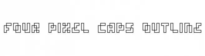
A bold, geometric font with blocky, rounded characters.
![Bob Filled font caratteri gratis]() Scaricare 259 Downloads@WebFont
Scaricare 259 Downloads@WebFont -
( Fonts by www.onezero.tv )
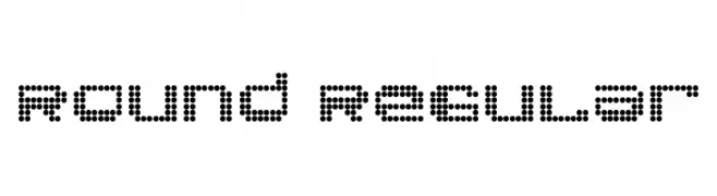
A modern, dot-based font with a geometric and playful style.
![Round Regular font caratteri gratis]() Scaricare 188 Downloads@WebFont
Scaricare 188 Downloads@WebFont -
( Font by Eric Wirjanata. All of my font are donation based. You can support by buying something from here. http://society6.com/EricWirjanata )
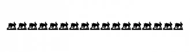
Bold, animal-themed decorative font with silhouette glyphs.
![Violent Alligator font caratteri gratis]() Scaricare 150 Downloads@WebFont
Scaricare 150 Downloads@WebFont -
![divlit font caratteri gratis]() Scaricare 1 Downloads
Scaricare 1 Downloads -
-
( Fonts by www.ajpaglia.com - FREE for personal or commercial usage )
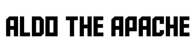
A bold, geometric font with sharp angles and a blocky design.
![Aldo the Apache font caratteri gratis]() Scaricare 8295 Downloads@WebFont
Scaricare 8295 Downloads@WebFont -
( Fonts by Iconian Fonts - Daniel Zadorozny )
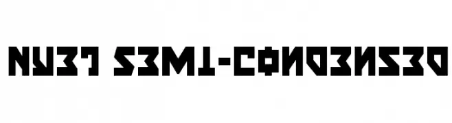
A bold, geometric font with angular lines and a semi-condensed width.
![Nyet Semi-Condensed font caratteri gratis]() Scaricare 127 Downloads@WebFont
Scaricare 127 Downloads@WebFont -
( Fonts by Iconian Fonts - Daniel Zadorozny )
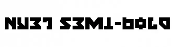
A bold, geometric font with sharp angles and a blocky appearance.
![Nyet Semi-Bold font caratteri gratis]() Scaricare 134 Downloads@WebFont
Scaricare 134 Downloads@WebFont -
( Fonts by Iconian Fonts - Daniel Zadorozny )
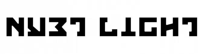
A bold, geometric font with sharp angles and a futuristic look.
![Nyet Light font caratteri gratis]() Scaricare 151 Downloads@WebFont
Scaricare 151 Downloads@WebFont -
( Fonts by Iconian Fonts - Daniel Zadorozny )
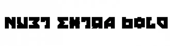
A bold, geometric font with angular lines and a blocky appearance.
![Nyet Extra Bold font caratteri gratis]() Scaricare 317 Downloads@WebFont
Scaricare 317 Downloads@WebFont


FAQ — Nuovi Font
Qual è il nuovo font che usano tutti?
Le tendenze cambiano rapidamente, ma oggi dominano le sans serif minimaliste e i display espressivi — perfetti per contenuti mobile e branding moderno.
Quali sono cinque nuovi font consigliati?
Tra i preferiti recenti: Poppins, Roboto, Montserrat, Open Sans e Lato. Bilanciano chiarezza e personalità; ideali per brand tech, editoriali e social.
Come provare prima di scaricare?
Usa l'anteprima live: scrivi il tuo testo nella pagina del font per verificare peso, spaziatura e leggibilità a varie dimensioni. Se ti convince, scarica i file TTF/OTF.