Benvenuto nella sezione Nuovi Font — una selezione curata dei caratteri appena aggiunti su FFonts.net. Che tu sia designer, sviluppatore o appassionato di tipografia, qui resti aggiornato sulle ultime tendenze.
Ogni nuovo font ha una sua personalità: dalle sans serif moderne e pulite alle script espressive, fino ai display audaci. Aggiorniamo spesso la lista così puoi provare in anteprima e scaricare gratuitamente.
-
( Fonts by www.aenigmafonts.com )
A modern, geometric font with slender and wide strokes, perfect for bold designs.
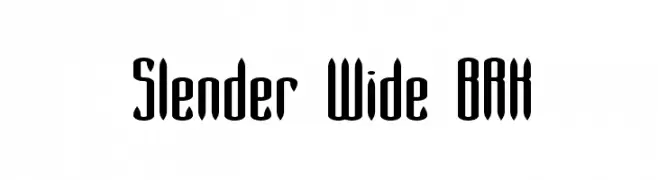 Scaricare 242 Downloads@WebFont
 -
( Fonts by www.aenigmafonts.com )
A tall, narrow font with elongated vertical lines and a sleek, modern style.
![Slender BRK font caratteri gratis]() Scaricare 372 Downloads@WebFont
Scaricare 372 Downloads@WebFont -
( Fonts by www.aenigmafonts.com )
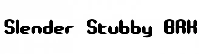
A bold, playful font with a unique combination of slender and stubby elements.
![Slender Stubby BRK font caratteri gratis]() Scaricare 870 Downloads@WebFont
Scaricare 870 Downloads@WebFont -
( Fonts by www.aenigmafonts.com )
A modern, playful font with elongated, curved characters.
![Slender Mini BRK font caratteri gratis]() Scaricare 318 Downloads@WebFont
Scaricare 318 Downloads@WebFont -
( Fonts by ShyFonts )
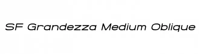
A modern, oblique font with clean lines and a dynamic style.
![SF Grandezza Medium Oblique font caratteri gratis]() Scaricare 346 Downloads@WebFont
Scaricare 346 Downloads@WebFont -
-
( Fonts by ShyFonts )
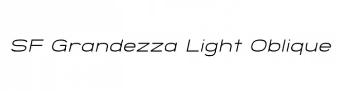
A sleek, modern oblique font with a light weight and minimalist design.
![SF Grandezza Light Oblique font caratteri gratis]() Scaricare 295 Downloads@WebFont
Scaricare 295 Downloads@WebFont -
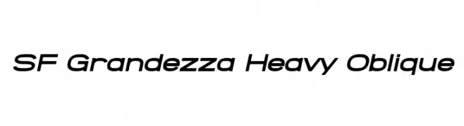
( Fonts by ShyFonts )
A bold, oblique font with a modern and dynamic style.
![SF Grandezza Heavy Oblique font caratteri gratis]() Scaricare 544 Downloads@WebFont
Scaricare 544 Downloads@WebFont -
( Fonts by ShyFonts )
A modern, geometric sans-serif font with uniform strokes and a sleek design.
![SF Grandezza Medium font caratteri gratis]() Scaricare 1915 Downloads@WebFont
Scaricare 1915 Downloads@WebFont -
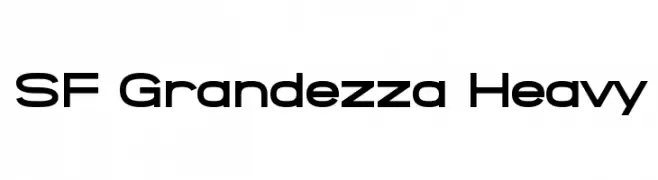
( Fonts by ShyFonts )
A bold, geometric sans-serif font with a modern and clean design.
![SF Grandezza Heavy font caratteri gratis]() Scaricare 5801 Downloads@WebFont
Scaricare 5801 Downloads@WebFont -
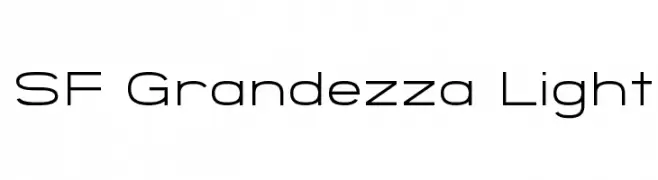
( Fonts by ShyFonts )
A sleek, modern font with clean lines and balanced spacing.
![SF Grandezza Light font caratteri gratis]() Scaricare 1630 Downloads@WebFont
Scaricare 1630 Downloads@WebFont


FAQ — Nuovi Font
Qual è il nuovo font che usano tutti?
Le tendenze cambiano rapidamente, ma oggi dominano le sans serif minimaliste e i display espressivi — perfetti per contenuti mobile e branding moderno.
Quali sono cinque nuovi font consigliati?
Tra i preferiti recenti: Poppins, Roboto, Montserrat, Open Sans e Lato. Bilanciano chiarezza e personalità; ideali per brand tech, editoriali e social.
Come provare prima di scaricare?
Usa l'anteprima live: scrivi il tuo testo nella pagina del font per verificare peso, spaziatura e leggibilità a varie dimensioni. Se ti convince, scarica i file TTF/OTF.