Benvenuto nella sezione Nuovi Font — una selezione curata dei caratteri appena aggiunti su FFonts.net. Che tu sia designer, sviluppatore o appassionato di tipografia, qui resti aggiornato sulle ultime tendenze.
Ogni nuovo font ha una sua personalità: dalle sans serif moderne e pulite alle script espressive, fino ai display audaci. Aggiorniamo spesso la lista così puoi provare in anteprima e scaricare gratuitamente.
-
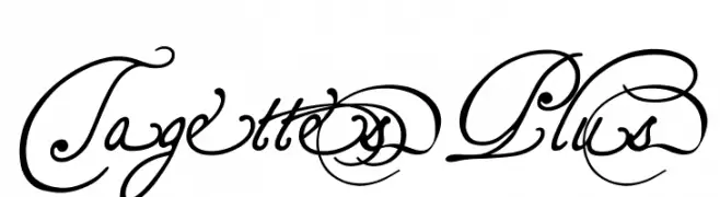
( Fonts by Pia Frauss - Personal-use only. For commercial use please contact owner. )
An ornate and decorative script font with intricate swirls and flourishes.
 Scaricare 58 Downloads@WebFont
 -
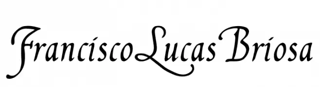
( Fonts by Pia Frauss - Personal-use only. For commercial use please contact owner. )
A classic and elegant script font with ornate uppercase and smooth lowercase letters.
![FranciscoLucas Briosa font caratteri gratis]() Scaricare 77 Downloads@WebFont
Scaricare 77 Downloads@WebFont -
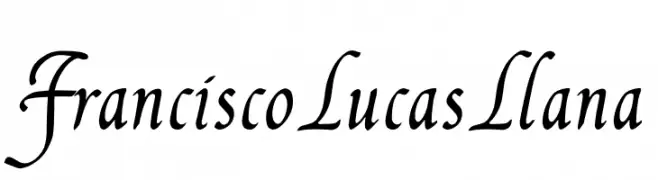
( Fonts by Pia Frauss - Personal-use only. For commercial use please contact owner. )
A classic and elegant script font with flowing, connected letterforms and medium contrast.
![FranciscoLucas Llana font caratteri gratis]() Scaricare 72 Downloads@WebFont
Scaricare 72 Downloads@WebFont -
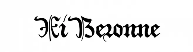
( Fonts by Pia Frauss - Personal-use only. For commercial use please contact owner. )
An ornate blackletter font with gothic, medieval-inspired letterforms.
![XiBeronne font caratteri gratis]() Scaricare 51 Downloads@WebFont
Scaricare 51 Downloads@WebFont -
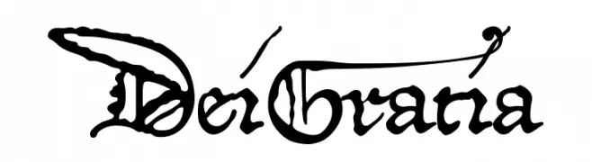
( Fonts by Pia Frauss - Personal-use only. For commercial use please contact owner. )
An ornate, medieval-inspired font with intricate flourishes and bold characters.
![DeiGratia font caratteri gratis]() Scaricare 48 Downloads@WebFont
Scaricare 48 Downloads@WebFont -
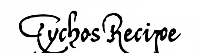
( Fonts by Pia Frauss - Personal-use only. For commercial use please contact owner. )
An ornate and artistic script font with flowing, interconnected letterforms.
![TychosRecipe font caratteri gratis]() Scaricare 47 Downloads@WebFont
Scaricare 47 Downloads@WebFont -
( Fonts by Philippe Moesch - Personal-use only. For commercial use please contact owner. )
A sleek, modern font with geometric lines and uniform character width.
![Franks font caratteri gratis]() Scaricare 189 Downloads@WebFont
Scaricare 189 Downloads@WebFont -
( Fonts by Philippe Cochy - Personal-use only. For commercial use please contact owner. )
A casual, handwritten font with a playful and informal style.
![Pecita font caratteri gratis]() Scaricare 199 Downloads@WebFont
Scaricare 199 Downloads@WebFont -
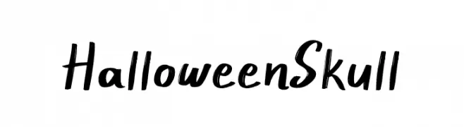
( Fonts by Phantom Studio - Phantom Creative Studio - Personal-use only. For commercial use please contact owner. )
A bold, handwritten font with playful, brush-like strokes and a slightly spooky aesthetic.
![Halloween Skull font caratteri gratis]() Scaricare 59 Downloads@WebFont
Scaricare 59 Downloads@WebFont -
( Fonts by Phantom Studio - Phantom Creative Studio - Personal-use only. For commercial use please contact owner. )
A playful handwritten font with smooth, flowing strokes and a casual vibe.
![Winter Sonata font caratteri gratis]() Scaricare 42 Downloads@WebFont
Scaricare 42 Downloads@WebFont -
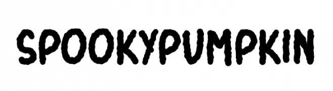
( Fonts by Phantom Studio - Phantom Creative Studio - Personal-use only. For commercial use please contact owner. )
A playful, spooky font with a hand-drawn, Halloween-inspired design.
![Spooky Pumpkin font caratteri gratis]() Scaricare 45 Downloads@WebFont
Scaricare 45 Downloads@WebFont -
( Fonts by Phantom Studio - Phantom Creative Studio - Personal-use only. For commercial use please contact owner. )
A bold, handwritten font with dynamic and expressive strokes.
![Big Bang font caratteri gratis]() Scaricare 54 Downloads@WebFont
Scaricare 54 Downloads@WebFont -
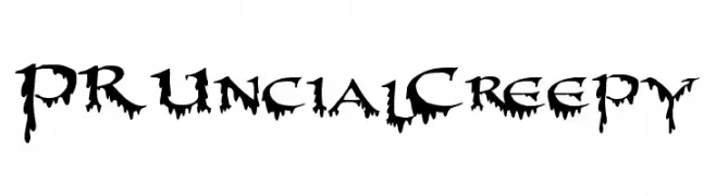
( Fonts by Peter Rempel - Personal-use only. For commercial use please contact owner. )
A spooky, dripping font perfect for horror-themed designs.
![PR-Uncial Creepy font caratteri gratis]() Scaricare 44 Downloads@WebFont
Scaricare 44 Downloads@WebFont -
( Fonts by MJType )
A playful, bold font with rounded, thick strokes and a hand-drawn feel.
![SNEAKER font caratteri gratis]() Scaricare 46 Downloads@WebFont
Scaricare 46 Downloads@WebFont -
( Fonts by MJType )
A bold, playful font with rounded edges and uniform strokes.
![SNEAKER font caratteri gratis]() Scaricare 76 Downloads@WebFont
Scaricare 76 Downloads@WebFont -
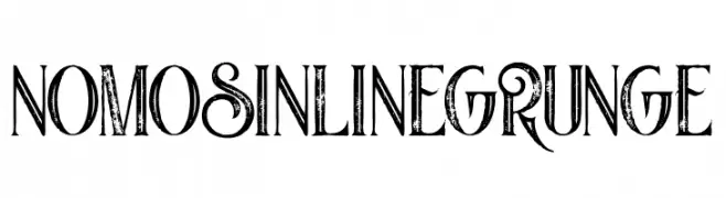
( Fonts by Peter Olexa - Personal-use only. For commercial use please contact owner. )
A grunge-style font with an inline design and decorative serifs.
![Nomos Inline Grunge font caratteri gratis]() Scaricare 54 Downloads@WebFont
Scaricare 54 Downloads@WebFont -
( Fonts by Peter Olexa - Personal-use only. For commercial use please contact owner. )
A bold, decorative font with a grunge aesthetic and intricate details.
![Jewel Bold Grunge font caratteri gratis]() Scaricare 32 Downloads@WebFont
Scaricare 32 Downloads@WebFont -
( Fonts by Peter Olexa - Personal-use only. For commercial use please contact owner. )
A bold, elegant font with classic and modern elements, featuring distinct curves and decorative flair.
![Starla Bold font caratteri gratis]() Scaricare 72 Downloads@WebFont
Scaricare 72 Downloads@WebFont -
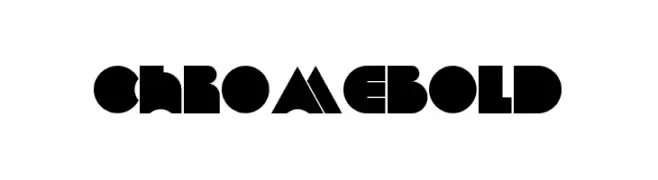
( Fonts by Peter Olexa - Personal-use only. For commercial use please contact owner. )
A bold, geometric typeface with angular shapes and sharp edges.
![Chrome Bold font caratteri gratis]() Scaricare 45 Downloads@WebFont
Scaricare 45 Downloads@WebFont -
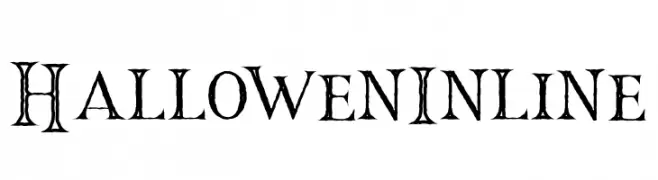
( Fonts by Peter Olexa - Personal-use only. For commercial use please contact owner. )
A decorative, whimsical font with a playful, spooky style and inline design.
![Hallowen Inline font caratteri gratis]() Scaricare 37 Downloads@WebFont
Scaricare 37 Downloads@WebFont -
( Fonts by Peter Olexa - Personal-use only. For commercial use please contact owner. )
Futuristic, bold inline font with geometric uppercase characters.
![Tron Bold Inline font caratteri gratis]() Scaricare 39 Downloads@WebFont
Scaricare 39 Downloads@WebFont -
( Fonts by Peter Olexa - Personal-use only. For commercial use please contact owner. )
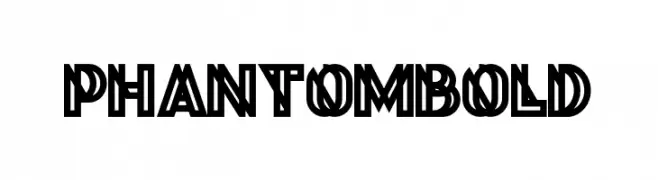
A bold, geometric font with thick strokes and a distinct outline.
![Phantom Bold font caratteri gratis]() Scaricare 44 Downloads@WebFont
Scaricare 44 Downloads@WebFont -
( Fonts by Peter Olexa - Personal-use only. For commercial use please contact owner. )
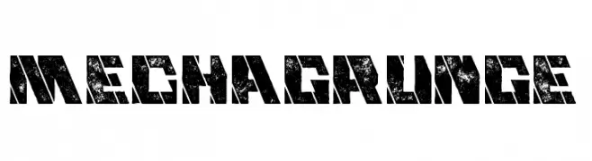
A bold, industrial font with a distressed, grunge texture.
![Mecha Grunge font caratteri gratis]() Scaricare 30 Downloads@WebFont
Scaricare 30 Downloads@WebFont -
( Fonts by Peter Olexa - Personal-use only. For commercial use please contact owner. )
A bold, decorative font with intricate inline detailing and a dynamic, vintage-modern aesthetic.
![Evolve Inline font caratteri gratis]() Scaricare 78 Downloads@WebFont
Scaricare 78 Downloads@WebFont -
( Fonts by Peter Olexa - Personal-use only. For commercial use please contact owner. )
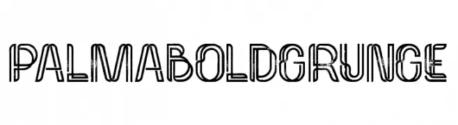
A bold, grunge-style font with a distressed, rugged appearance.
![Palma Bold Grunge font caratteri gratis]() Scaricare 32 Downloads@WebFont
Scaricare 32 Downloads@WebFont -
( Fonts by Peter Olexa - Personal-use only. For commercial use please contact owner. )
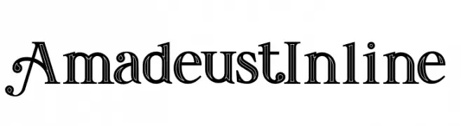
An elegant and decorative font with intricate inline details and unique flourishes.
![Amadeust Inline font caratteri gratis]() Scaricare 66 Downloads@WebFont
Scaricare 66 Downloads@WebFont -
( Fonts by Peter Olexa - Personal-use only. For commercial use please contact owner. )
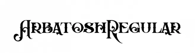
An ornate and decorative font with intricate swirls and flourishes.
![Arbatosh Regular font caratteri gratis]() Scaricare 52 Downloads@WebFont
Scaricare 52 Downloads@WebFont -
( Fonts by Peter Olexa - Personal-use only. For commercial use please contact owner. )
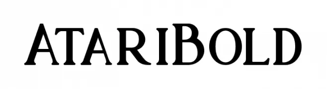
A bold, high-contrast serif font with a classic yet modern appeal.
![Atari Bold font caratteri gratis]() Scaricare 47 Downloads@WebFont
Scaricare 47 Downloads@WebFont -
( Fonts by Peter Olexa - Personal-use only. For commercial use please contact owner. )
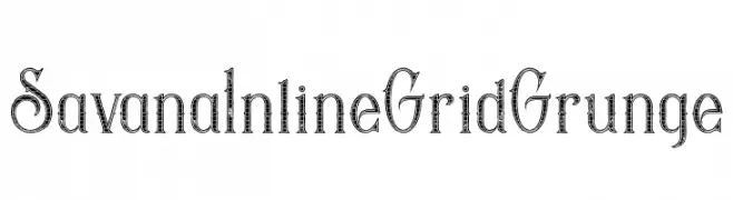
A grunge-style font with inline detailing and elegant serifs.
![Savana Inline Grid Grunge font caratteri gratis]() Scaricare 47 Downloads@WebFont
Scaricare 47 Downloads@WebFont -
( Fonts by Peter Olexa - Personal-use only. For commercial use please contact owner. )
A bold, decorative font with geometric and sharp serif elements.
![Maroon Bold font caratteri gratis]() Scaricare 58 Downloads@WebFont
Scaricare 58 Downloads@WebFont -
( Fonts by Peter Olexa - Personal-use only. For commercial use please contact owner. )
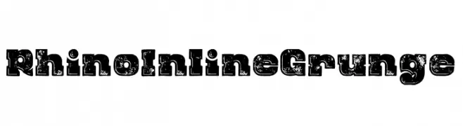
A bold, distressed font with a grunge effect and inline design.
![Rhino Inline Grunge font caratteri gratis]() Scaricare 47 Downloads@WebFont
Scaricare 47 Downloads@WebFont -
( Fonts by Peter Olexa - Personal-use only. For commercial use please contact owner. )
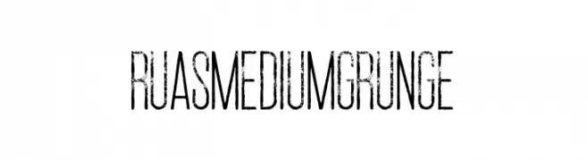
A distressed, grunge-style font with a tall, narrow structure and textured appearance.
![Ruas Medium Grunge font caratteri gratis]() Scaricare 48 Downloads@WebFont
Scaricare 48 Downloads@WebFont -
( Fonts by Peter Olexa - Personal-use only. For commercial use please contact owner. )
A bold, decorative font with grunge and inline detailing.
![Green Light Bold Inline Grunge font caratteri gratis]() Scaricare 45 Downloads@WebFont
Scaricare 45 Downloads@WebFont -
( Fonts by Peter Olexa - Personal-use only. For commercial use please contact owner. )
A bold, geometric font with strong, angular characters.
![Cube Bold font caratteri gratis]() Scaricare 33 Downloads@WebFont
Scaricare 33 Downloads@WebFont -
( Fonts by Peter Olexa - Personal-use only. For commercial use please contact owner. )
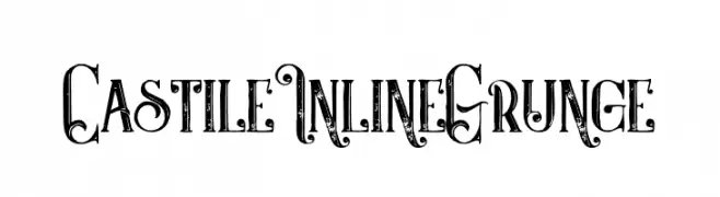
A grunge-style serif font with an inline design and vintage texture.
![Castile Inline Grunge font caratteri gratis]() Scaricare 41 Downloads@WebFont
Scaricare 41 Downloads@WebFont


FAQ — Nuovi Font
Qual è il nuovo font che usano tutti?
Le tendenze cambiano rapidamente, ma oggi dominano le sans serif minimaliste e i display espressivi — perfetti per contenuti mobile e branding moderno.
Quali sono cinque nuovi font consigliati?
Tra i preferiti recenti: Poppins, Roboto, Montserrat, Open Sans e Lato. Bilanciano chiarezza e personalità; ideali per brand tech, editoriali e social.
Come provare prima di scaricare?
Usa l'anteprima live: scrivi il tuo testo nella pagina del font per verificare peso, spaziatura e leggibilità a varie dimensioni. Se ti convince, scarica i file TTF/OTF.