Benvenuto nella sezione Nuovi Font — una selezione curata dei caratteri appena aggiunti su FFonts.net. Che tu sia designer, sviluppatore o appassionato di tipografia, qui resti aggiornato sulle ultime tendenze.
Ogni nuovo font ha una sua personalità: dalle sans serif moderne e pulite alle script espressive, fino ai display audaci. Aggiorniamo spesso la lista così puoi provare in anteprima e scaricare gratuitamente.
-
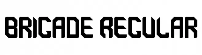
( Bill Walker )
A bold, geometric font with a modern, industrial style.
 Scaricare 154 Downloads@WebFont
 -
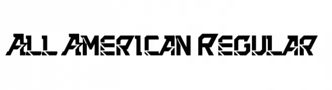
( Bill Walker )
A bold, geometric font with a futuristic and edgy design.
![All American Regular font caratteri gratis]() Scaricare 114 Downloads@WebFont
Scaricare 114 Downloads@WebFont -
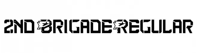
( Bill Walker )
A bold, military-inspired font with angular, geometric shapes.
![2nd Brigade Regular font caratteri gratis]() Scaricare 127 Downloads@WebFont
Scaricare 127 Downloads@WebFont -
( Bill Johnston - bill.org.org )
A playful, hand-drawn font with rounded, bold characters and a whimsical style.
![Lednar font caratteri gratis]() Scaricare 92 Downloads@WebFont
Scaricare 92 Downloads@WebFont -
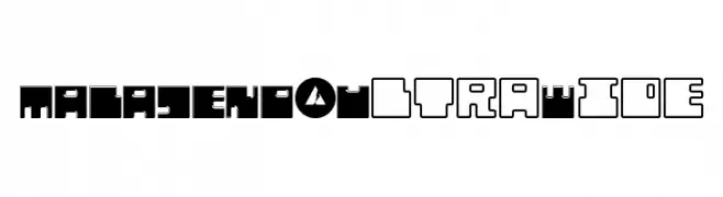
( Bicho - Federico Abrahams )
A bold, ultra-wide font with geometric shapes and a futuristic feel.
![MALAJENO-UltraWide font caratteri gratis]() Scaricare 48 Downloads@WebFont
Scaricare 48 Downloads@WebFont -
-
( Bhavika Malhotra - www.creativemarket.com/theinkaffair/?u=theinkaffair )
A bold, handwritten font with a playful and energetic style.
![Wild Wanderlust Personal font caratteri gratis]() Scaricare 382 Downloads@WebFont
Scaricare 382 Downloads@WebFont -
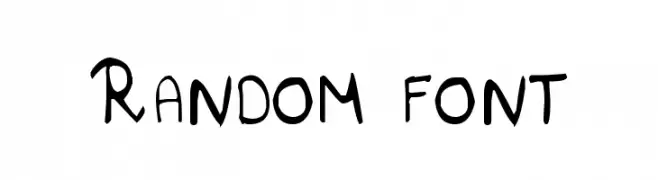
( Bhavesh Shaha )
A playful, handwritten-style font with a casual and dynamic appearance.
![Random font font caratteri gratis]() Scaricare 1133 Downloads@WebFont
Scaricare 1133 Downloads@WebFont -
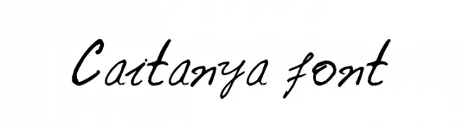
( Bhavesh Shaha )
A dynamic, cursive handwritten font with fluid strokes and a slanted style.
![Caitanya font font caratteri gratis]() Scaricare 75 Downloads@WebFont
Scaricare 75 Downloads@WebFont -
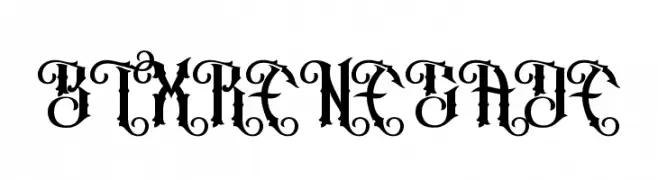
( Betwixt Designs - betwixtdesigns.com )
A bold, Gothic-inspired font with intricate flourishes and sharp edges.
![BTX RENEGADE font caratteri gratis]() Scaricare 85 Downloads@WebFont
Scaricare 85 Downloads@WebFont -
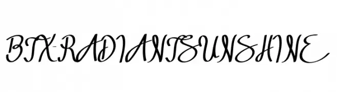
( Betwixt Designs - betwixtdesigns.com )
A flowing, cursive font with elegant curves and a handwritten aesthetic.
![BTX-RADIANT SUNSHINE font caratteri gratis]() Scaricare 80 Downloads@WebFont
Scaricare 80 Downloads@WebFont


FAQ — Nuovi Font
Qual è il nuovo font che usano tutti?
Le tendenze cambiano rapidamente, ma oggi dominano le sans serif minimaliste e i display espressivi — perfetti per contenuti mobile e branding moderno.
Quali sono cinque nuovi font consigliati?
Tra i preferiti recenti: Poppins, Roboto, Montserrat, Open Sans e Lato. Bilanciano chiarezza e personalità; ideali per brand tech, editoriali e social.
Come provare prima di scaricare?
Usa l'anteprima live: scrivi il tuo testo nella pagina del font per verificare peso, spaziatura e leggibilità a varie dimensioni. Se ti convince, scarica i file TTF/OTF.