Benvenuto nelle Font Più Popolari — dove popolarità e qualità si incontrano. Qui trovi i font più scaricati e usati dell'anno. Se cerchi scelte sicure per logo, web o social, inizia da qui.
Ogni font top si distingue per equilibrio, leggibilità e versatilità. Troverai sans serif moderne, script eleganti, serif vintage e display minimalisti.
-
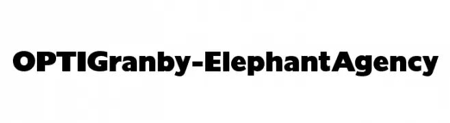
( Fonts by Castcraft Software - opti.netii.net - check the website before use )
A bold, modern font with thick, uniform strokes for strong visual impact.
 Scaricare 5518 Downloads@WebFont
 -
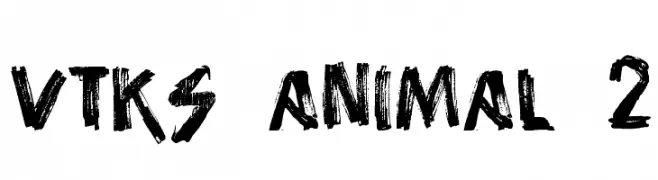
( Fonts by Douglas Vitkauskas - www.vtksdesign.com. Personal-use only. For commercial use please contact owner. )
A bold, rugged font with a wild, brush-stroke appearance.
![vtks animal 2 font caratteri gratis]() Scaricare 5513 Downloads@WebFont
Scaricare 5513 Downloads@WebFont -
( Fonts by Daniel Zadorozny - www.iconian.com )
A bold, geometric font with a modern and slightly futuristic style.
![Usuzi font caratteri gratis]() Scaricare 5513 Downloads@WebFont
Scaricare 5513 Downloads@WebFont -
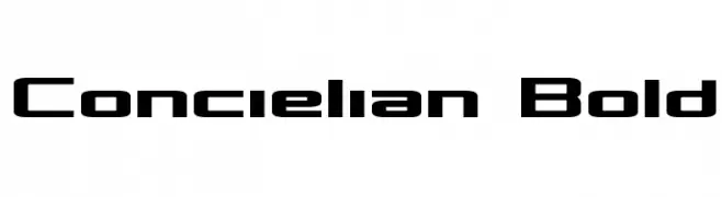
( Fonts by Daniel Zadorozny - www.iconian.com - Free for personal use )
A bold, geometric font with a modern and futuristic style.
![Concielian Bold font caratteri gratis]() Scaricare 5512 Downloads@WebFont
Scaricare 5512 Downloads@WebFont -
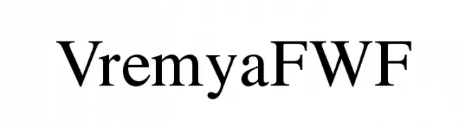
( Fonts by Casady & Greene )
A classic serif font with elegant strokes and medium contrast, ideal for sophisticated designs.
![VremyaFWF font caratteri gratis]() Scaricare 5511 Downloads@WebFont
Scaricare 5511 Downloads@WebFont -
![CaslonTwoBlackSSK font caratteri gratis]() Scaricare 5511 Downloads@WebFont
Scaricare 5511 Downloads@WebFont -
![VI Thuoc Duoc Hoa font caratteri gratis]() Scaricare 5510 Downloads@WebFont
Scaricare 5510 Downloads@WebFont -
( Free for a personal use. For a commercial use please visit www.kevinandamanda.com )
A playful, handwritten font with bold, rounded strokes and a whimsical style.
![Annoying Kettle font caratteri gratis]() Scaricare 5510 Downloads@WebFont
Scaricare 5510 Downloads@WebFont -
![Gantz font font caratteri gratis]() Scaricare 5510 Downloads@WebFont
Scaricare 5510 Downloads@WebFont -
( Fonts by a Clement Nicolle - www.stereo-type.fr . Personal-use only. For commercial use please contact owner. )
A bold, distressed font with vintage swashes and a rugged aesthetic.
![Docktrin font caratteri gratis]() Scaricare 5508 Downloads@WebFont
Scaricare 5508 Downloads@WebFont -
( Fonts by a Neale Davidson - www.pixelsagas.com. Personal-use only. For commercial use please contact owner. )
A modern, geometric, and condensed font with clean lines.
![Gotham Nights font caratteri gratis]() Scaricare 5508 Downloads@WebFont
Scaricare 5508 Downloads@WebFont -
( Google Web Fonts )
A playful, bold font with irregular, cartoon-like letterforms.
![Slackey font caratteri gratis]() Scaricare 5508 Downloads@WebFont
Scaricare 5508 Downloads@WebFont -
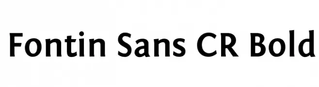
( A font by Jos Buivenga (exljbris) -> www.exljbris.com )
A bold, modern sans-serif font with excellent legibility and balance.
![Fontin Sans CR Bold font caratteri gratis]() Scaricare 5508 Downloads@WebFont
Scaricare 5508 Downloads@WebFont -
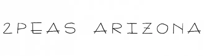
( Fonts by www.twopeasinabucket.com )
A playful, handwritten font with thin, irregular strokes and a casual vibe.
![2Peas Arizona font caratteri gratis]() Scaricare 5507 Downloads@WebFont
Scaricare 5507 Downloads@WebFont -
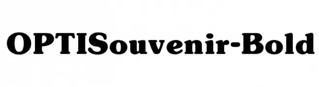
( Fonts by Castcraft Software - OPTI Fonts Archive - opti.netii.net - Personal-use only. For commercial use please contact owner. )
A bold, serif font with thick strokes and rounded serifs, offering a classic yet modern appeal.
![OPTISouvenir-Bold font caratteri gratis]() Scaricare 5506 Downloads@WebFont
Scaricare 5506 Downloads@WebFont -
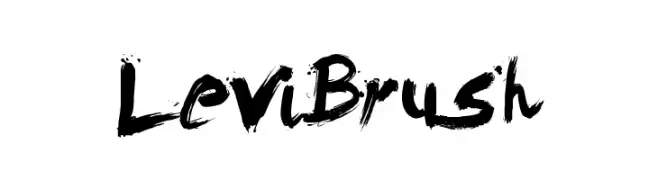
( Fonts by Levi Szekeres - www.loremipsum.ro. Personal-use only. For commercial use please contact owner. )
A bold, expressive brush-style font with dynamic, hand-painted strokes.
![LeviBrush font caratteri gratis]() Scaricare 5505 Downloads@WebFont
Scaricare 5505 Downloads@WebFont -
![VI Cam Thach Hoa font caratteri gratis]() Scaricare 5503 Downloads@WebFont
Scaricare 5503 Downloads@WebFont -
![Bulka font caratteri gratis]() Scaricare 5502 Downloads
Scaricare 5502 Downloads -
( Fonts by a www.fontfabric.com. Personal-use only. For commercial use please contact owner. )
A modern, geometric font with tall, narrow letters and clean lines.
![Donau Uppercase Neue font caratteri gratis]() Scaricare 5501 Downloads@WebFont
Scaricare 5501 Downloads@WebFont -
( Fonts by www.chequered.ink - Chequered Ink - Personal-use only. For commercial use please contact owner. )
A bold, geometric font with a futuristic and modern design.
![Enter the Grid 2 font caratteri gratis]() Scaricare 5500 Downloads@WebFont
Scaricare 5500 Downloads@WebFont -
Caratteri di NicholasJudy456. For commercial use please contact the owner.
![Playhouse font caratteri gratis]() Scaricare 5499 Downloads@WebFont
Scaricare 5499 Downloads@WebFont -
( Fonts by Zetafonts - Personal-use only. For commercial use please contact owner. )
A bold, high-contrast font with tight spacing, perfect for impactful headlines.
![Extenda 40 Hecto font caratteri gratis]() Scaricare 5498 Downloads@WebFont
Scaricare 5498 Downloads@WebFont -
( Fonts by Flanker - Personal-use only. For commercial use please contact owner. )
A classic serif font with high contrast and elegant strokes.
![EUR42 font caratteri gratis]() Scaricare 5496 Downloads@WebFont
Scaricare 5496 Downloads@WebFont -
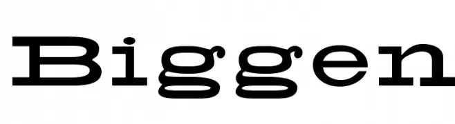
![Biggen font caratteri gratis]() Scaricare 5493 Downloads@WebFont
Scaricare 5493 Downloads@WebFont -
( Fonts by or from www.graffitifonts.net )
A bold, playful font with dynamic slanted characters.
![Yikes! font caratteri gratis]() Scaricare 5493 Downloads@WebFont
Scaricare 5493 Downloads@WebFont -
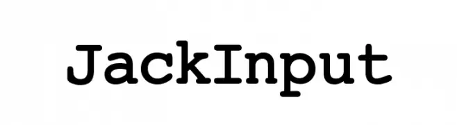
![JackInput font caratteri gratis]() Scaricare 5492 Downloads@WebFont
Scaricare 5492 Downloads@WebFont -
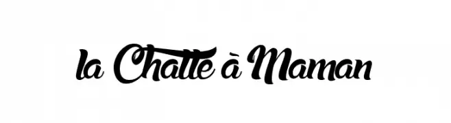
( Fonts by Maelle.K - Thomas Boucherie )
A bold, flowing script font with elegant, interconnected characters.
![la Chatte à Maman font caratteri gratis]() Scaricare 5491 Downloads@WebFont
Scaricare 5491 Downloads@WebFont -
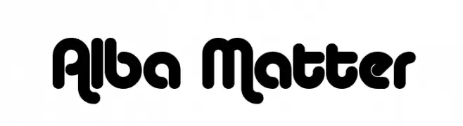
( Fonts by www.fontalicious.com )
A bold, rounded font with a playful and modern aesthetic.
![Alba Matter font caratteri gratis]() Scaricare 5491 Downloads@WebFont
Scaricare 5491 Downloads@WebFont -
Caratteri di freefontspro. For commercial use please contact the owner.
![akaDora font caratteri gratis]() Scaricare 5490 Downloads@WebFont
Scaricare 5490 Downloads@WebFont -
( Fonts by www.germanventriglia.com )
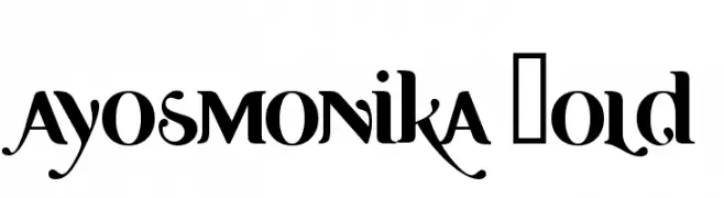
A bold, high-contrast font with a blend of modern and vintage styles.
![Ayosmonika Bold font caratteri gratis]() Scaricare 5489 Downloads@WebFont
Scaricare 5489 Downloads@WebFont -
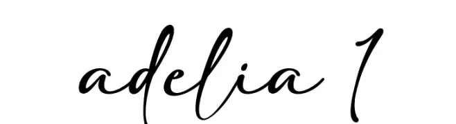
( Fonts by Carroline Herrera - Personal-use only. For commercial use please contact owner. )
A flowing, cursive script font with elegant, interconnected characters.
![adelia 1 font caratteri gratis]() Scaricare 5488 Downloads@WebFont
Scaricare 5488 Downloads@WebFont -
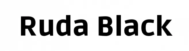
( Copyright (c) 2011, Mariela Monsalve (marmonsalve@gmail.com) )
A bold, modern sans-serif font with excellent readability and strong presence.
![Ruda Black font caratteri gratis]() Scaricare 5488 Downloads@WebFont
Scaricare 5488 Downloads@WebFont -
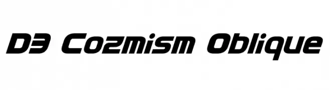
( Fonts by www.DigitalDreamDesign.net )
A bold, futuristic font with an oblique slant and geometric design.
![D3 Cozmism Oblique font caratteri gratis]() Scaricare 5484 Downloads@WebFont
Scaricare 5484 Downloads@WebFont -
( Fonts by Alfredo Marco Pradil - Personal-use only. For commercial use please contact owner. )
A modern, light sans-serif font with clean lines and excellent readability.
![Open Sauce One Light font caratteri gratis]() Scaricare 5483 Downloads@WebFont
Scaricare 5483 Downloads@WebFont -
![NewAthenaUnicode font caratteri gratis]() Scaricare 5480 Downloads@WebFont
Scaricare 5480 Downloads@WebFont


Quali sono i font più popolari adesso?
Poppins, Roboto, Montserrat, Open Sans e Lato sono molto usati per le forme pulite e l'ampia applicabilità — dall'identità di marca alle landing page e ai poster.
Quali font si usano spesso nei loghi?
Le sans serif geometriche (es. Poppins, famiglie in stile Gotham) sono scelte comuni per un branding pulito e scalabile. Per un tocco personale restano valide script e stili manoscritti. Abbina un display deciso per i titoli a un corpo testo neutro per riconoscibilità ed equilibrio.
Ogni quanto si aggiorna la lista?
Con regolarità, in base ai download e all'attività reale. Torna spesso per scoprire in anticipo le nuove preferite.
💡 Consiglio: aggiungi ai preferiti — le tendenze cambiano in fretta e i font top di oggi possono ispirare il rebranding di domani.