Benvenuto nelle Font Più Popolari — dove popolarità e qualità si incontrano. Qui trovi i font più scaricati e usati dell'anno. Se cerchi scelte sicure per logo, web o social, inizia da qui.
Ogni font top si distingue per equilibrio, leggibilità e versatilità. Troverai sans serif moderne, script eleganti, serif vintage e display minimalisti.
-
( weknow - Wino S Kadir - www.creativefabrica.com/designer/weknow/ )
A bold, playful font with rounded edges, perfect for casual and inviting designs.
 Scaricare 100 Downloads@WebFont
 -
( Paul Lloyd Fonts )
A modern striped font with geometric shapes and consistent design.
![JacobiStriped font caratteri gratis]() Scaricare 100 Downloads
Scaricare 100 Downloads -
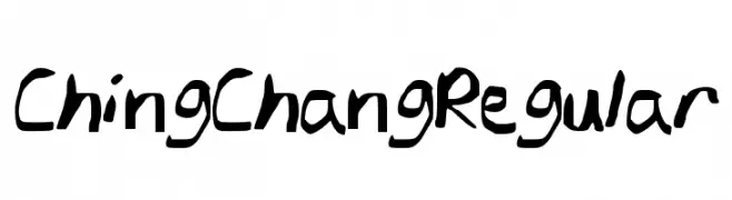
![ChingChangRegular font caratteri gratis]() Scaricare 100 Downloads@WebFont
Scaricare 100 Downloads@WebFont -
( Fonts by Ditatype - Personal-use only. For commercial use please contact owner. )
A dynamic handwritten font with fluid, expressive strokes.
![Megiday Personal Use font caratteri gratis]() Scaricare 100 Downloads@WebFont
Scaricare 100 Downloads@WebFont -
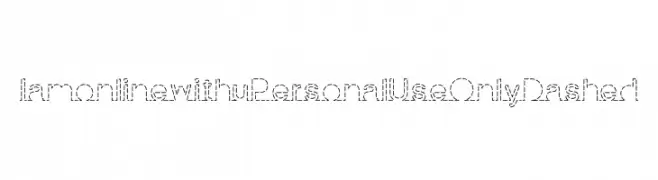
( Pisto Casero - Gilberto Moya Perona - www.pistocasero.com )
A playful dashed line font with a casual and creative style.
![I am online with u Personal Use Only Dashed font caratteri gratis]() Scaricare 100 Downloads@WebFont
Scaricare 100 Downloads@WebFont -
-
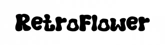
( Fonts by Muhammad Afif )
A bold, rounded, and playful retro font with a nostalgic 60s and 70s vibe.
![Retro Flower font caratteri gratis]() Scaricare 100 Downloads@WebFont
Scaricare 100 Downloads@WebFont -
( Fonts by Des Gomez )
A playful, handwritten font with a whimsical and casual style.
![Psalm71 font caratteri gratis]() Scaricare 100 Downloads@WebFont
Scaricare 100 Downloads@WebFont -
( Fonts by Jovanny Lemonad )
A steampunk-inspired decorative font with mechanical elements and vintage flair.
![Steamy font caratteri gratis]() Scaricare 100 Downloads@WebFont
Scaricare 100 Downloads@WebFont -
( Fonts by Peter Wiegel - www.peter-wiegel.de - Personal-use only. For commercial use please contact owner. )
A dynamic and fluid script font with elegant, flowing cursive letters.
![Wolgast Two font caratteri gratis]() Scaricare 100 Downloads@WebFont
Scaricare 100 Downloads@WebFont -
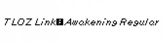
( Fonts by a David Fens. Personal-use only. For commercial use please contact owner. )
A pixelated, retro-style font inspired by classic video game graphics.
![TLOZ Link's Awakening Regular font caratteri gratis]() Scaricare 100 Downloads@WebFont
Scaricare 100 Downloads@WebFont


Quali sono i font più popolari adesso?
Poppins, Roboto, Montserrat, Open Sans e Lato sono molto usati per le forme pulite e l'ampia applicabilità — dall'identità di marca alle landing page e ai poster.
Quali font si usano spesso nei loghi?
Le sans serif geometriche (es. Poppins, famiglie in stile Gotham) sono scelte comuni per un branding pulito e scalabile. Per un tocco personale restano valide script e stili manoscritti. Abbina un display deciso per i titoli a un corpo testo neutro per riconoscibilità ed equilibrio.
Ogni quanto si aggiorna la lista?
Con regolarità, in base ai download e all'attività reale. Torna spesso per scoprire in anticipo le nuove preferite.
💡 Consiglio: aggiungi ai preferiti — le tendenze cambiano in fretta e i font top di oggi possono ispirare il rebranding di domani.