Benvenuto nelle Font Più Popolari — dove popolarità e qualità si incontrano. Qui trovi i font più scaricati e usati dell'anno. Se cerchi scelte sicure per logo, web o social, inizia da qui.
Ogni font top si distingue per equilibrio, leggibilità e versatilità. Troverai sans serif moderne, script eleganti, serif vintage e display minimalisti.
-
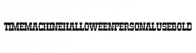
( Fonts by Billy Argel Fonts - www.billyargel.com - Personal-use only. For commercial use please contact owner. )
A bold, distressed font with a vintage horror aesthetic.
 Scaricare 100 Downloads@WebFont
 -
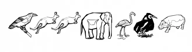
( Fonts by Manfred Klein. Free for private and charity use. Free for commercial with donation to organizations )
Animal illustration font with each character depicted as a unique animal or bird.
![Zoobats font caratteri gratis]() Scaricare 100 Downloads@WebFont
Scaricare 100 Downloads@WebFont -
( Fonts by Vladimir Nikolic )
A bold, decorative font with a vintage gangster theme and 3D effect.
![Gangster Regular font caratteri gratis]() Scaricare 100 Downloads@WebFont
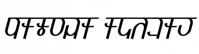
Scaricare 100 Downloads@WebFont -
![Qijomi Italic font caratteri gratis]() Scaricare 100 Downloads@WebFont
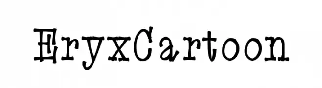
Scaricare 100 Downloads@WebFont -
![EryxCartoon font caratteri gratis]() Scaricare 100 Downloads@WebFont
Scaricare 100 Downloads@WebFont -
-
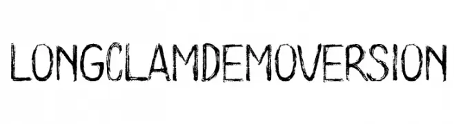
( Poemhaiku - Huong Le Thi Thu - www.behance.net/poemhaiku )
A bold, hand-drawn font with a distressed, textured appearance.
![Long Clam Demo Version font caratteri gratis]() Scaricare 100 Downloads@WebFont
Scaricare 100 Downloads@WebFont -
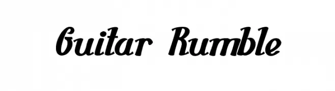
( Fonts by Wino S Kadir - weknow - www.revolge.com/shop/weknow/ - Personal-use only. For commercial use please contact owner. )
A bold, dynamic script font with a strong, flowing style.
![Guitar Rumble font caratteri gratis]() Scaricare 100 Downloads@WebFont
Scaricare 100 Downloads@WebFont -
( Tahir Jamil )
A playful, bold, hand-drawn font with decorative dots and wide spacing.
![chocolate type bold spaced font caratteri gratis]() Scaricare 100 Downloads@WebFont
Scaricare 100 Downloads@WebFont -
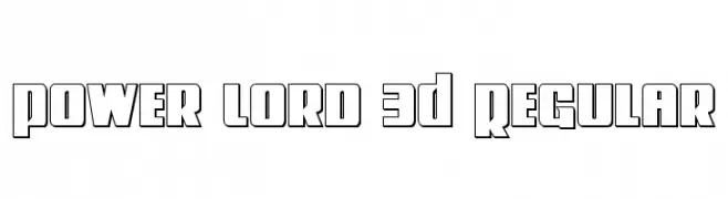
( Fonts by Iconian Fonts - Daniel Zadorozny )
A bold, 3D geometric font with a futuristic and dynamic style.
![Power Lord 3D Regular font caratteri gratis]() Scaricare 100 Downloads@WebFont
Scaricare 100 Downloads@WebFont -
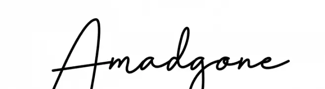
( Fonts by Multype Studio )
Elegant cursive script with a handwritten feel.
![Amadgone font caratteri gratis]() Scaricare 100 Downloads@WebFont
Scaricare 100 Downloads@WebFont


Quali sono i font più popolari adesso?
Poppins, Roboto, Montserrat, Open Sans e Lato sono molto usati per le forme pulite e l'ampia applicabilità — dall'identità di marca alle landing page e ai poster.
Quali font si usano spesso nei loghi?
Le sans serif geometriche (es. Poppins, famiglie in stile Gotham) sono scelte comuni per un branding pulito e scalabile. Per un tocco personale restano valide script e stili manoscritti. Abbina un display deciso per i titoli a un corpo testo neutro per riconoscibilità ed equilibrio.
Ogni quanto si aggiorna la lista?
Con regolarità, in base ai download e all'attività reale. Torna spesso per scoprire in anticipo le nuove preferite.
💡 Consiglio: aggiungi ai preferiti — le tendenze cambiano in fretta e i font top di oggi possono ispirare il rebranding di domani.