Benvenuto nelle Font Più Popolari — dove popolarità e qualità si incontrano. Qui trovi i font più scaricati e usati dell'anno. Se cerchi scelte sicure per logo, web o social, inizia da qui.
Ogni font top si distingue per equilibrio, leggibilità e versatilità. Troverai sans serif moderne, script eleganti, serif vintage e display minimalisti.
-
( Fonts by Tshepo Mosoeu - https://www.behance.net/thecyantist Personal-use only. For commercial use please contact owner. )
A sleek, modern, light italic font with medium contrast and elegant slant.
 Scaricare 99 Downloads@WebFont
 -
![SuperFont font caratteri gratis]() Scaricare 99 Downloads@WebFont
Scaricare 99 Downloads@WebFont -
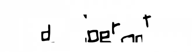
( Fonts by FatmaStudio - Fatmawati - Personal-use only. For commercial use please contact owner. )
A bold, expressive script font with flowing, cursive letters.
![Meylani font caratteri gratis]() Scaricare 99 Downloads@WebFont
Scaricare 99 Downloads@WebFont -
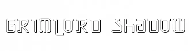
( Fonts by Daniel Zadorozny - www.iconian.com )
A futuristic, geometric font with hollow, outlined characters and a modern aesthetic.
![Grimlord Shadow font caratteri gratis]() Scaricare 99 Downloads@WebFont
Scaricare 99 Downloads@WebFont -
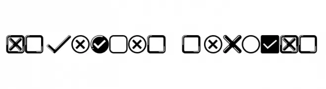
( Fonts by Vladimir Nikolic )
Bold, geometric icon set with check and X marks.
![Arpenter Regular font caratteri gratis]() Scaricare 99 Downloads@WebFont
Scaricare 99 Downloads@WebFont -
-
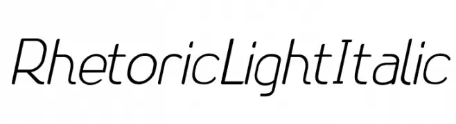
( Fonts by Zetafonts - Personal-use only. For commercial use please contact owner. )
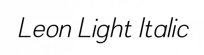
A sleek, modern italic font with thin strokes and balanced spacing.
![Leon Light Italic font caratteri gratis]() Scaricare 99 Downloads@WebFont
Scaricare 99 Downloads@WebFont -
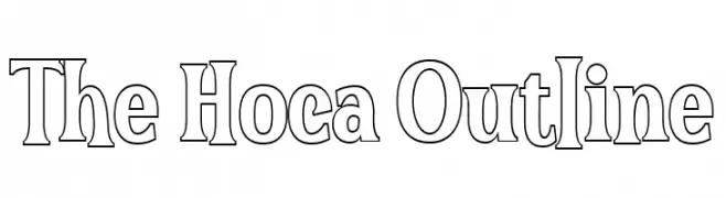
( Fonts by Afkari Studio )
A bold, decorative outline font with a modern and playful aesthetic.
![The Hoca Outline font caratteri gratis]() Scaricare 99 Downloads@WebFont
Scaricare 99 Downloads@WebFont -
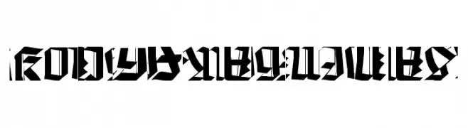
( Fonts by Manfred Klein - manfred-klein.ina-mar.com )
A bold, fragmented font with sharp angles and dynamic negative spaces.
![Kochfragments font caratteri gratis]() Scaricare 99 Downloads@WebFont
Scaricare 99 Downloads@WebFont -
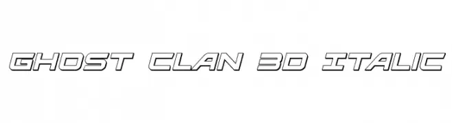
( Fonts by Daniel Zadorozny - www.iconian.com )
A bold, 3D italic font with a futuristic and geometric style.
![Ghost Clan 3D Italic font caratteri gratis]() Scaricare 99 Downloads@WebFont
Scaricare 99 Downloads@WebFont -
( Fonts by ShyFonts )
A bold, angular, and condensed font with a modern, geometric style.
![SF Junk Culture Condensed font caratteri gratis]() Scaricare 99 Downloads@WebFont
Scaricare 99 Downloads@WebFont

Quali sono i font più popolari adesso?
Poppins, Roboto, Montserrat, Open Sans e Lato sono molto usati per le forme pulite e l'ampia applicabilità — dall'identità di marca alle landing page e ai poster.
Quali font si usano spesso nei loghi?
Le sans serif geometriche (es. Poppins, famiglie in stile Gotham) sono scelte comuni per un branding pulito e scalabile. Per un tocco personale restano valide script e stili manoscritti. Abbina un display deciso per i titoli a un corpo testo neutro per riconoscibilità ed equilibrio.
Ogni quanto si aggiorna la lista?
Con regolarità, in base ai download e all'attività reale. Torna spesso per scoprire in anticipo le nuove preferite.
💡 Consiglio: aggiungi ai preferiti — le tendenze cambiano in fretta e i font top di oggi possono ispirare il rebranding di domani.