Benvenuto nelle Font Più Popolari — dove popolarità e qualità si incontrano. Qui trovi i font più scaricati e usati dell'anno. Se cerchi scelte sicure per logo, web o social, inizia da qui.
Ogni font top si distingue per equilibrio, leggibilità e versatilità. Troverai sans serif moderne, script eleganti, serif vintage e display minimalisti.
-
 Scaricare 97 Downloads@WebFont
 -
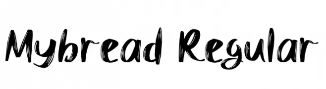
( Fonts by Si Panji )
A bold, graffiti-inspired font with sharp angles and dynamic curves.
![Locked Monster font caratteri gratis]() Scaricare 97 Downloads@WebFont
Scaricare 97 Downloads@WebFont -
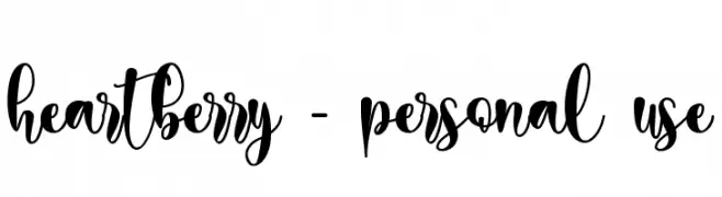
( Fonts by Letterara - Thomas Aradea - Personal-use only. For commercial use please contact owner. )
A playful, whimsical script font with a hand-drawn, cursive style.
![heartberry - personal use font caratteri gratis]() Scaricare 97 Downloads@WebFont
Scaricare 97 Downloads@WebFont -
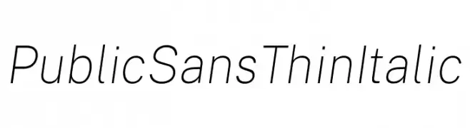
( Fonts by U.S. Web Design System )
A thin, modern, and elegant italic font with a minimalist design.
![Public Sans Thin Italic font caratteri gratis]() Scaricare 97 Downloads@WebFont
Scaricare 97 Downloads@WebFont -
( Fonts by Adien Gunarta - fontasticindonesia.blogspot.com )
A geometric, Hangeul-inspired font with bold lines and a modern, decorative style.
![Hangeul Lookslike Regular font caratteri gratis]() Scaricare 97 Downloads@WebFont
Scaricare 97 Downloads@WebFont -
-
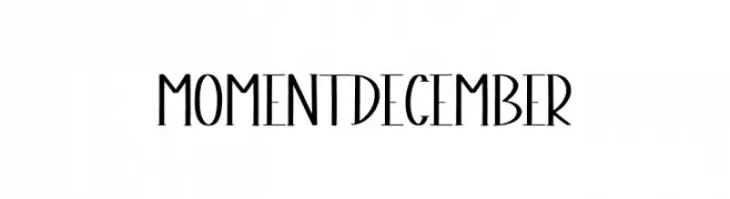
( Fonts by Scratchones )
A modern decorative font with tall, narrow characters.
![Moment December font caratteri gratis]() Scaricare 97 Downloads@WebFont
Scaricare 97 Downloads@WebFont -
( Fonts by www.paintblackeditions.org - Free for personal use only )
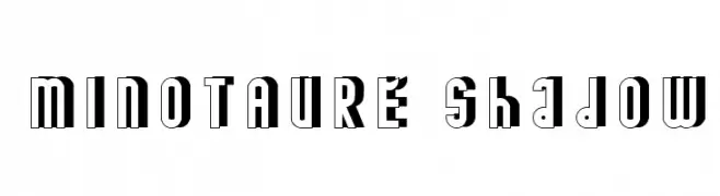
A bold, shadowed font with a three-dimensional, decorative style.
![MINOTAURE shadow font caratteri gratis]() Scaricare 97 Downloads@WebFont
Scaricare 97 Downloads@WebFont -
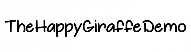
![The Happy Giraffe Demo font caratteri gratis]() Scaricare 97 Downloads@WebFont
Scaricare 97 Downloads@WebFont -
( Fonts by Daniel Zadorozny - www.iconian.com )
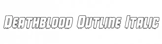
A bold, outlined font with a dripping effect, perfect for horror themes.
![Deathblood Outline Italic font caratteri gratis]() Scaricare 97 Downloads@WebFont
Scaricare 97 Downloads@WebFont -
( Fonts by Sabrcreative - Personal-use only. For commercial use please contact owner. )
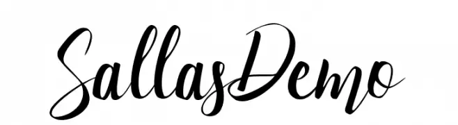
A modern, elegant script font with high contrast and flowing strokes.
![Sallas Demo font caratteri gratis]() Scaricare 97 Downloads@WebFont
Scaricare 97 Downloads@WebFont


Quali sono i font più popolari adesso?
Poppins, Roboto, Montserrat, Open Sans e Lato sono molto usati per le forme pulite e l'ampia applicabilità — dall'identità di marca alle landing page e ai poster.
Quali font si usano spesso nei loghi?
Le sans serif geometriche (es. Poppins, famiglie in stile Gotham) sono scelte comuni per un branding pulito e scalabile. Per un tocco personale restano valide script e stili manoscritti. Abbina un display deciso per i titoli a un corpo testo neutro per riconoscibilità ed equilibrio.
Ogni quanto si aggiorna la lista?
Con regolarità, in base ai download e all'attività reale. Torna spesso per scoprire in anticipo le nuove preferite.
💡 Consiglio: aggiungi ai preferiti — le tendenze cambiano in fretta e i font top di oggi possono ispirare il rebranding di domani.