Benvenuto nelle Font Più Popolari — dove popolarità e qualità si incontrano. Qui trovi i font più scaricati e usati dell'anno. Se cerchi scelte sicure per logo, web o social, inizia da qui.
Ogni font top si distingue per equilibrio, leggibilità e versatilità. Troverai sans serif moderne, script eleganti, serif vintage e display minimalisti.
-
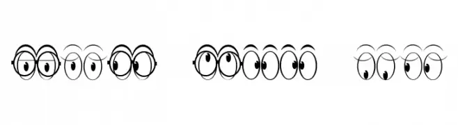
( Fonts by Jeff Levine. FREEWARE )
A whimsical font with characters designed as expressive cartoon eyes.
 Scaricare 97 Downloads@WebFont
 -
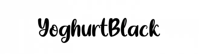
( Fonts by Awansenja Type - Personal-use only. For commercial use please contact owner. )
A bold, playful script font with a hand-drawn, friendly style.
![Yoghurt Black font caratteri gratis]() Scaricare 97 Downloads@WebFont
Scaricare 97 Downloads@WebFont -
Caratteri di letterhanna. For commercial use please contact the owner.
( Free for personal use only. With only $15 You can purchase the basic desktop license: https://letterhanna.com/ )
A decorative and ornate font with vintage flair, ideal for artistic projects.
![Kindred Rosewood Free Regular font caratteri gratis]() Scaricare 97 Downloads@WebFont
Scaricare 97 Downloads@WebFont -
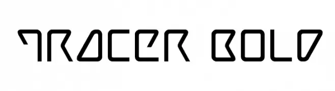
( Fonts by Iconian Fonts )
A futuristic, geometric font with angular, bold strokes.
![Tracer Bold font caratteri gratis]() Scaricare 97 Downloads@WebFont
Scaricare 97 Downloads@WebFont -
![Icons Social Media 15 font caratteri gratis]() Scaricare 97 Downloads@WebFont
Scaricare 97 Downloads@WebFont -
-
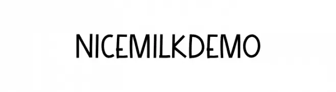
( Fonts by Salamahtype.com )
A playful, handwritten-style font with consistent stroke thickness.
![NicemilkDEMO font caratteri gratis]() Scaricare 97 Downloads@WebFont
Scaricare 97 Downloads@WebFont -
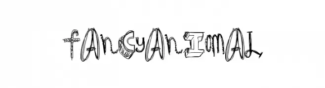
( Fonts by a Max Infeld - XEROGRAPHER FONTS - xerographer.blogspot.com . Personal-use only. For commercial use please contact owner. )
A playful, hand-drawn font with a whimsical and artistic style.
![FancyAnimal font caratteri gratis]() Scaricare 97 Downloads@WebFont
Scaricare 97 Downloads@WebFont -
![Tsukumogami font caratteri gratis]() Scaricare 97 Downloads@WebFont
Scaricare 97 Downloads@WebFont -
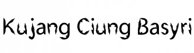
( Choirul Basyri - www.facebook.com/sedulur.sejati )
A bold, jagged font with thorn-like extensions for a wild, energetic look.
![Kujang Ciung Basyri font caratteri gratis]() Scaricare 97 Downloads@WebFont
Scaricare 97 Downloads@WebFont -
![Skater Skank - Regular Demo font caratteri gratis]() Scaricare 97 Downloads@WebFont
Scaricare 97 Downloads@WebFont


Quali sono i font più popolari adesso?
Poppins, Roboto, Montserrat, Open Sans e Lato sono molto usati per le forme pulite e l'ampia applicabilità — dall'identità di marca alle landing page e ai poster.
Quali font si usano spesso nei loghi?
Le sans serif geometriche (es. Poppins, famiglie in stile Gotham) sono scelte comuni per un branding pulito e scalabile. Per un tocco personale restano valide script e stili manoscritti. Abbina un display deciso per i titoli a un corpo testo neutro per riconoscibilità ed equilibrio.
Ogni quanto si aggiorna la lista?
Con regolarità, in base ai download e all'attività reale. Torna spesso per scoprire in anticipo le nuove preferite.
💡 Consiglio: aggiungi ai preferiti — le tendenze cambiano in fretta e i font top di oggi possono ispirare il rebranding di domani.