Benvenuto nelle Font Più Popolari — dove popolarità e qualità si incontrano. Qui trovi i font più scaricati e usati dell'anno. Se cerchi scelte sicure per logo, web o social, inizia da qui.
Ogni font top si distingue per equilibrio, leggibilità e versatilità. Troverai sans serif moderne, script eleganti, serif vintage e display minimalisti.
-
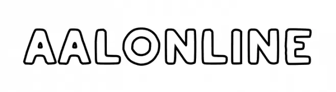
( Fonts by RBCS Studio )
A bold, outlined font with rounded edges and a playful style.
 Scaricare 96 Downloads@WebFont
 -
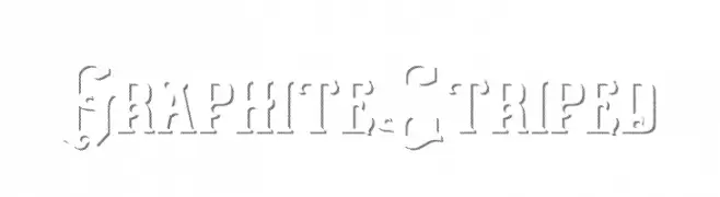
( Fonts by Burhan Afif - hanscostudio.com - Personal-use only. For commercial use please contact owner. )
A bold, striped decorative font with intricate detailing.
![Graphite Striped font caratteri gratis]() Scaricare 96 Downloads@WebFont
Scaricare 96 Downloads@WebFont -
( Fonts by Sophie Fraser )
An artistic, brush-stroke style font with dynamic and expressive characters.
![Fingers font caratteri gratis]() Scaricare 96 Downloads@WebFont
Scaricare 96 Downloads@WebFont -
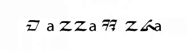
( Fonts by AurekFonts )
A futuristic and angular decorative font with a runic appearance.
![Sith AF font caratteri gratis]() Scaricare 96 Downloads@WebFont
Scaricare 96 Downloads@WebFont -
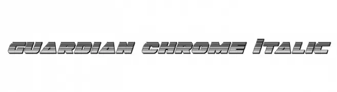
( Fonts by Daniel Zadorozny - www.iconian.com )
A bold, italicized font with a chrome-like, layered design.
![Guardian Chrome Italic font caratteri gratis]() Scaricare 96 Downloads@WebFont
Scaricare 96 Downloads@WebFont -
-
![mannasunda font caratteri gratis]() Scaricare 96 Downloads@WebFont
Scaricare 96 Downloads@WebFont -
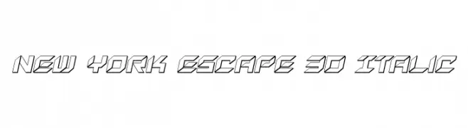
( Fonts by Daniel Zadorozny - www.iconian.com - Free for personal use )
A bold, geometric 3D italic font with a modern, dynamic style.
![New York Escape 3D Italic font caratteri gratis]() Scaricare 96 Downloads@WebFont
Scaricare 96 Downloads@WebFont -
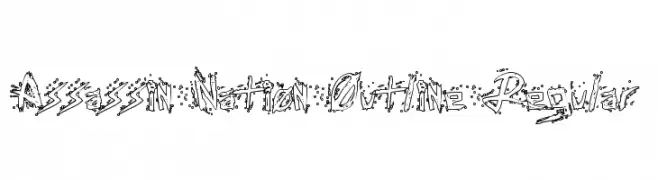
( Fonts by Daniel Zadorozny - www.iconian.com )
An edgy, graffiti-inspired outline font with a raw, urban feel.
![Assassin Nation Outline Regular font caratteri gratis]() Scaricare 96 Downloads@WebFont
Scaricare 96 Downloads@WebFont -
( Fonts by Wino S Kadir - weknow - www.revolge.com/shop/weknow/ - Personal-use only. For commercial use please contact owner. )
A modern, geometric font with maze-like structures and bold lines.
![never ending maze font caratteri gratis]() Scaricare 96 Downloads@WebFont
Scaricare 96 Downloads@WebFont -
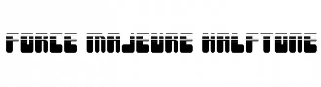
( Fonts by Iconian Fonts )
A bold, geometric font with a halftone effect, perfect for modern and futuristic designs.
![Force Majeure Halftone font caratteri gratis]() Scaricare 96 Downloads@WebFont
Scaricare 96 Downloads@WebFont


Quali sono i font più popolari adesso?
Poppins, Roboto, Montserrat, Open Sans e Lato sono molto usati per le forme pulite e l'ampia applicabilità — dall'identità di marca alle landing page e ai poster.
Quali font si usano spesso nei loghi?
Le sans serif geometriche (es. Poppins, famiglie in stile Gotham) sono scelte comuni per un branding pulito e scalabile. Per un tocco personale restano valide script e stili manoscritti. Abbina un display deciso per i titoli a un corpo testo neutro per riconoscibilità ed equilibrio.
Ogni quanto si aggiorna la lista?
Con regolarità, in base ai download e all'attività reale. Torna spesso per scoprire in anticipo le nuove preferite.
💡 Consiglio: aggiungi ai preferiti — le tendenze cambiano in fretta e i font top di oggi possono ispirare il rebranding di domani.