Benvenuto nelle Font Più Popolari — dove popolarità e qualità si incontrano. Qui trovi i font più scaricati e usati dell'anno. Se cerchi scelte sicure per logo, web o social, inizia da qui.
Ogni font top si distingue per equilibrio, leggibilità e versatilità. Troverai sans serif moderne, script eleganti, serif vintage e display minimalisti.
-
( Fonts by Maelle.K - Thomas Boucherie )
The image features decorative animal and character icons, not a font.
 Scaricare 96 Downloads@WebFont
 -
( Fonts by Darcy Baldwin {fontography} )
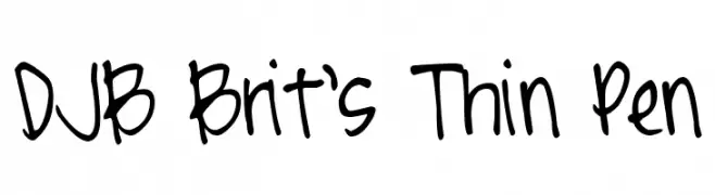
A playful, handwritten font with thin, uneven strokes and a casual style.
![DJB Brit's Thin Pen font caratteri gratis]() Scaricare 96 Downloads@WebFont
Scaricare 96 Downloads@WebFont -
![PixelheadHandmadebeta font caratteri gratis]() Scaricare 96 Downloads@WebFont
Scaricare 96 Downloads@WebFont -
( Fonts by Din Studio )
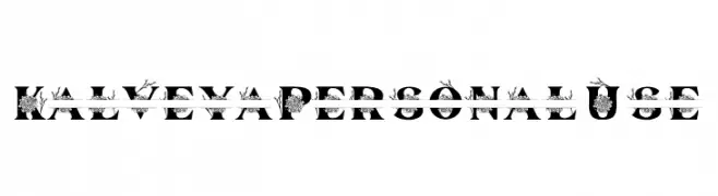
A decorative font with floral embellishments and bold, artistic letters.
![Kalveya Personal Use font caratteri gratis]() Scaricare 96 Downloads@WebFont
Scaricare 96 Downloads@WebFont -
( elharrak - elharrak fonts - el-harrak.blogspot.com/ )
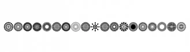
Highly decorative mandala-style symbol set with geometric and floral motifs.
![Font Mandalas pro 2018 font caratteri gratis]() Scaricare 96 Downloads@WebFont
Scaricare 96 Downloads@WebFont -
-
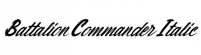
( Fonts by Kong Font - fontkong.com - Personal-use only. For commercial use please contact owner. )
A bold, italic cursive font with fluid, connected strokes.
![Battalion Commander Italic font caratteri gratis]() Scaricare 96 Downloads@WebFont
Scaricare 96 Downloads@WebFont -
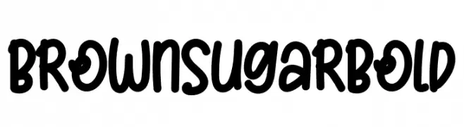
( Fonts by Aditya Rezki Apriyadi - Personal-use only. For commercial use please contact owner. )
A bold, playful handwritten font with rounded characters.
![Brown Sugar Bold font caratteri gratis]() Scaricare 96 Downloads@WebFont
Scaricare 96 Downloads@WebFont -
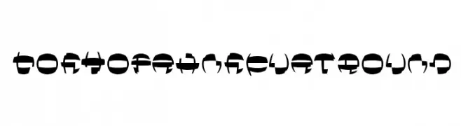
( Fonts by Manfred Klein. Free for private and charity use. Free for commercial with donation to organizations )
A bold, abstract font with geometric forms and high contrast strokes.
![TokyoFrankfurtRound font caratteri gratis]() Scaricare 96 Downloads@WebFont
Scaricare 96 Downloads@WebFont -
![PWAlternate font caratteri gratis]() Scaricare 96 Downloads@WebFont
Scaricare 96 Downloads@WebFont -
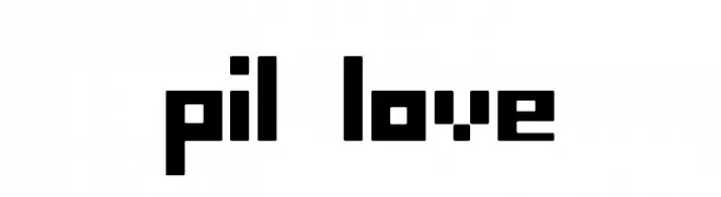
( Fonts by Pil )
A bold, pixelated font with a retro digital aesthetic.
![pil love font caratteri gratis]() Scaricare 96 Downloads@WebFont
Scaricare 96 Downloads@WebFont

Quali sono i font più popolari adesso?
Poppins, Roboto, Montserrat, Open Sans e Lato sono molto usati per le forme pulite e l'ampia applicabilità — dall'identità di marca alle landing page e ai poster.
Quali font si usano spesso nei loghi?
Le sans serif geometriche (es. Poppins, famiglie in stile Gotham) sono scelte comuni per un branding pulito e scalabile. Per un tocco personale restano valide script e stili manoscritti. Abbina un display deciso per i titoli a un corpo testo neutro per riconoscibilità ed equilibrio.
Ogni quanto si aggiorna la lista?
Con regolarità, in base ai download e all'attività reale. Torna spesso per scoprire in anticipo le nuove preferite.
💡 Consiglio: aggiungi ai preferiti — le tendenze cambiano in fretta e i font top di oggi possono ispirare il rebranding di domani.