Benvenuto nelle Font Più Popolari — dove popolarità e qualità si incontrano. Qui trovi i font più scaricati e usati dell'anno. Se cerchi scelte sicure per logo, web o social, inizia da qui.
Ogni font top si distingue per equilibrio, leggibilità e versatilità. Troverai sans serif moderne, script eleganti, serif vintage e display minimalisti.
-
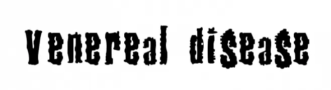
( Fonts by Satriotype - Satriotype - Bagas Satrio - Personal-use only. For commercial use please contact owner. )
A bold, flowing script font with elegant cursive letterforms.
 Scaricare 492 Downloads@WebFont
 -
![Venereal Disease font caratteri gratis]() Scaricare 492 Downloads@WebFont
Scaricare 492 Downloads@WebFont -
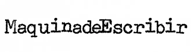
( Fonts by www.woodcutter.es - woodcutter Manero - Personal-use only. For commercial use please contact owner. )
A vintage, monospaced typewriter-style font with a textured, distressed look.
![Maquina de Escribir font caratteri gratis]() Scaricare 492 Downloads@WebFont
Scaricare 492 Downloads@WebFont -
![Liquid Nite font caratteri gratis]() Scaricare 492 Downloads@WebFont
Scaricare 492 Downloads@WebFont -
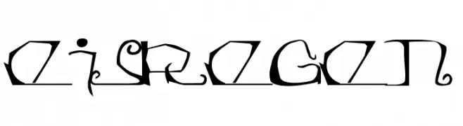
![Eisregen font caratteri gratis]() Scaricare 492 Downloads@WebFont
Scaricare 492 Downloads@WebFont -
-
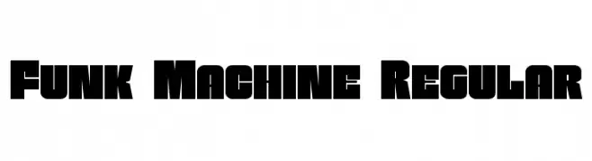
( Fonts by Iconian Fonts )
A bold, blocky font with strong, uniform strokes and minimal spacing.
![Funk Machine Regular font caratteri gratis]() Scaricare 492 Downloads@WebFont
Scaricare 492 Downloads@WebFont -
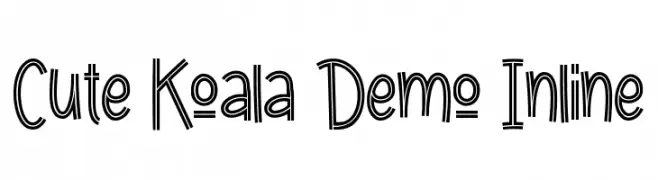
( Fonts by Calligraphy Fonts )
A playful, inline decorative font with a bold and dynamic style.
![Cute Koala Demo Inline font caratteri gratis]() Scaricare 492 Downloads@WebFont
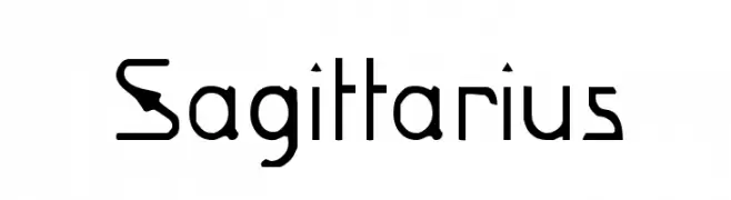
Scaricare 492 Downloads@WebFont -
![Sagittarius font caratteri gratis]() Scaricare 492 Downloads@WebFont
Scaricare 492 Downloads@WebFont -
Caratteri di coen. For commercial use please contact the owner.
![UHU font caratteri gratis]() Scaricare 492 Downloads@WebFont
Scaricare 492 Downloads@WebFont -
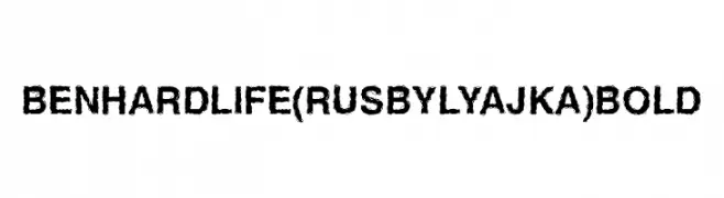
( Fonts by FONTS BY LYAJKA - Personal-use only. For commercial use please contact owner. )
A rugged, distressed font with a bold, textured appearance.
![Ben Hard Life(RUS BY LYAJKA) Bold font caratteri gratis]() Scaricare 492 Downloads@WebFont
Scaricare 492 Downloads@WebFont -
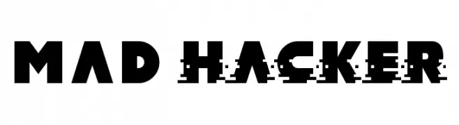
( Fonts by Darrell Flood )
A bold, geometric font with a modern, edgy aesthetic and a unique glitch effect.
![MAD hacker font caratteri gratis]() Scaricare 492 Downloads@WebFont
Scaricare 492 Downloads@WebFont -
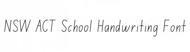
( DaShiz )
A clean, legible handwriting font ideal for educational materials.
![NSW ACT School Handwriting Font font caratteri gratis]() Scaricare 492 Downloads@WebFont
Scaricare 492 Downloads@WebFont -
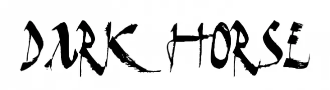
( Fonts by Daniel Zadorozny - www.iconian.com )
A bold, brush-style font with dynamic, flowing strokes and artistic flair.
![Dark Horse font caratteri gratis]() Scaricare 492 Downloads@WebFont
Scaricare 492 Downloads@WebFont -
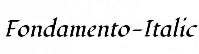
( Copyright (c) 2011 by Brian J. Bonislawsky DBA Astigmatic (AOETI) )
An elegant and flowing italic font with moderate contrast and graceful curves.
![Fondamento-Italic font caratteri gratis]() Scaricare 492 Downloads@WebFont
Scaricare 492 Downloads@WebFont -
( Fonts by Nadine Dickmann )
A playful, casual handwritten font with consistent stroke width and informal style.
![NB font caratteri gratis]() Scaricare 492 Downloads@WebFont
Scaricare 492 Downloads@WebFont -
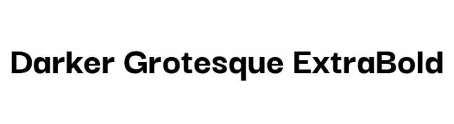
( Copyright 2019, Gabriel Lam, TypeRant. )
A bold, modern typeface with thick strokes and geometric structure.
![Darker Grotesque ExtraBold font caratteri gratis]() Scaricare 492 Downloads@WebFont
Scaricare 492 Downloads@WebFont -
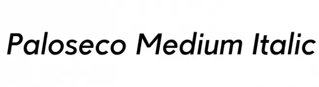
![Paloseco Medium Italic font caratteri gratis]() Scaricare 492 Downloads@WebFont
Scaricare 492 Downloads@WebFont -
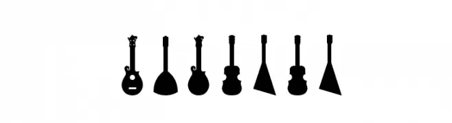
![Ukulele font caratteri gratis]() Scaricare 492 Downloads@WebFont
Scaricare 492 Downloads@WebFont -
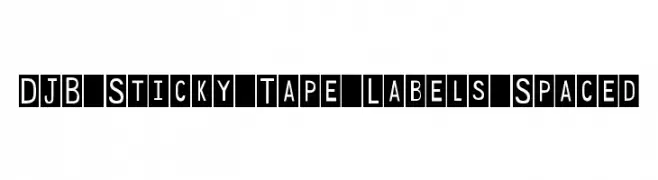
( Fonts by Darcy Baldwin {fontography} )
A bold, geometric font with characters enclosed in squares, offering a modern and structured appearance.
![DJB Sticky Tape Labels Spaced font caratteri gratis]() Scaricare 492 Downloads@WebFont
Scaricare 492 Downloads@WebFont -
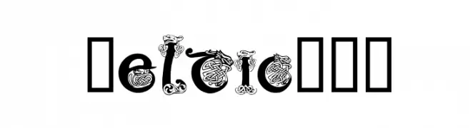
![Celtic101 font caratteri gratis]() Scaricare 492 Downloads@WebFont
Scaricare 492 Downloads@WebFont -
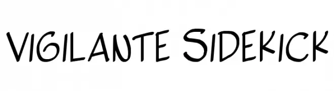
( Fonts by Press Gang Studios - Andeh Pinkard - www.pressgang-studios.com )
A playful, handwritten font with a dynamic and informal style.
![Vigilante Sidekick font caratteri gratis]() Scaricare 492 Downloads@WebFont
Scaricare 492 Downloads@WebFont -
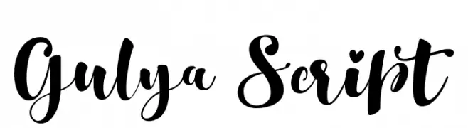
( aldedesign - Alde Saputro - creativemarket.com/aldedesign?u=aldedesign )
A playful and elegant script font with flowing, interconnected letters.
![Gulya Script font caratteri gratis]() Scaricare 491 Downloads@WebFont
Scaricare 491 Downloads@WebFont -
( Fonts by Jérémie Dupuis )
A bold serif font with strong strokes and pronounced serifs, ideal for impactful headlines.
![Ghostlight Bold font caratteri gratis]() Scaricare 491 Downloads@WebFont
Scaricare 491 Downloads@WebFont -
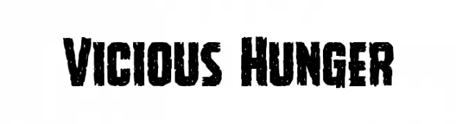
( Fonts by Daniel Zadorozny - www.iconian.com )
A bold, distressed font with a rugged, graffiti-like appearance.
![Vicious Hunger font caratteri gratis]() Scaricare 491 Downloads@WebFont
Scaricare 491 Downloads@WebFont -
![Flux Architect Italic font caratteri gratis]() Scaricare 491 Downloads@WebFont
Scaricare 491 Downloads@WebFont -
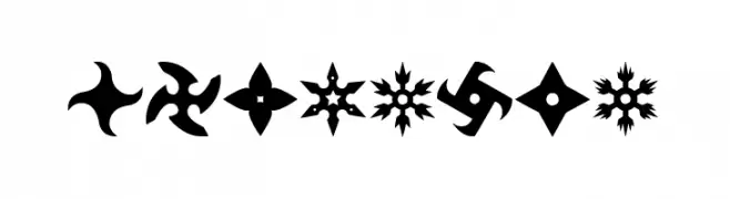
( Fonts by Woodcutter )
A bold decorative font featuring shuriken silhouettes as glyphs.
![Shuriken font caratteri gratis]() Scaricare 491 Downloads@WebFont
Scaricare 491 Downloads@WebFont -
( Fonts by Castcraft Software - OPTI Fonts Archive - opti.netii.net - Personal-use only. For commercial use please contact owner. )
A classic serif font with elegant strokes and balanced proportions.
![OPTIShawmut-SpecialSupp font caratteri gratis]() Scaricare 491 Downloads@WebFont
Scaricare 491 Downloads@WebFont -
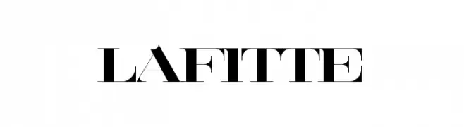
![Lafitte font caratteri gratis]() Scaricare 491 Downloads@WebFont
Scaricare 491 Downloads@WebFont -
( Fonts by Afeef Falah )
A playful, character-filled font with unique, expressive details.
![Salcedo Regular font caratteri gratis]() Scaricare 491 Downloads@WebFont
Scaricare 491 Downloads@WebFont -
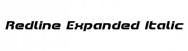
( Fonts by Iconian Fonts )
A bold, expanded, and italicized font with a modern and dynamic style.
![Redline Expanded Italic font caratteri gratis]() Scaricare 491 Downloads@WebFont
Scaricare 491 Downloads@WebFont -
( Fonts by Apostrophic Lab )
A bold, playful font with a handwritten style and wide, rounded letters.
![Komika Display Kaps Wide font caratteri gratis]() Scaricare 491 Downloads@WebFont
Scaricare 491 Downloads@WebFont -
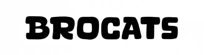
( Fonts by Khurasan )
A bold, playful font with rounded edges and a retro-modern style.
![Brocats font caratteri gratis]() Scaricare 491 Downloads@WebFont
Scaricare 491 Downloads@WebFont -
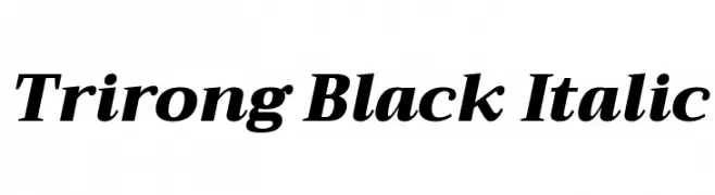
( Copyright (c) 2015, Cadson Demak (info@cadsondemak.com) )
A bold, italic serif font with high contrast and elegant style.
![Trirong Black Italic font caratteri gratis]() Scaricare 491 Downloads@WebFont
Scaricare 491 Downloads@WebFont -
( Fonts by Zarma Type Foundry - Azzam Ridhamalik - Personal-use only. For commercial use please contact owner. )
A classic serif font with a modern twist, featuring sharp serifs and smooth curves.
![Stockers font caratteri gratis]() Scaricare 491 Downloads@WebFont
Scaricare 491 Downloads@WebFont -
![FlowerSketches font caratteri gratis]() Scaricare 491 Downloads@WebFont
Scaricare 491 Downloads@WebFont


Quali sono i font più popolari adesso?
Poppins, Roboto, Montserrat, Open Sans e Lato sono molto usati per le forme pulite e l'ampia applicabilità — dall'identità di marca alle landing page e ai poster.
Quali font si usano spesso nei loghi?
Le sans serif geometriche (es. Poppins, famiglie in stile Gotham) sono scelte comuni per un branding pulito e scalabile. Per un tocco personale restano valide script e stili manoscritti. Abbina un display deciso per i titoli a un corpo testo neutro per riconoscibilità ed equilibrio.
Ogni quanto si aggiorna la lista?
Con regolarità, in base ai download e all'attività reale. Torna spesso per scoprire in anticipo le nuove preferite.
💡 Consiglio: aggiungi ai preferiti — le tendenze cambiano in fretta e i font top di oggi possono ispirare il rebranding di domani.