Benvenuto nelle Font Più Popolari — dove popolarità e qualità si incontrano. Qui trovi i font più scaricati e usati dell'anno. Se cerchi scelte sicure per logo, web o social, inizia da qui.
Ogni font top si distingue per equilibrio, leggibilità e versatilità. Troverai sans serif moderne, script eleganti, serif vintage e display minimalisti.
-
( Alternika )
An ornate Gothic font with intricate details and dramatic flourishes.
 Scaricare 95 Downloads@WebFont
 -
( Fonts by PremiereGraphics )
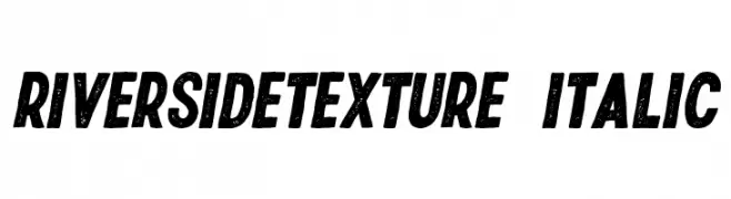
Bold, textured, italic font with a vintage, distressed look.
![RiversideTexture-Italic font caratteri gratis]() Scaricare 95 Downloads@WebFont
Scaricare 95 Downloads@WebFont -
( Fonts by Bumbayo Font Fabrik - bumbayo.blogspot.com )
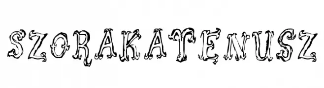
An ornate, decorative font with whimsical, fantasy-like detailing.
![Szorakatenusz font caratteri gratis]() Scaricare 95 Downloads@WebFont
Scaricare 95 Downloads@WebFont -
( Fonts by a Neale Davidson - www.pixelsagas.com. Personal-use only. For commercial use please contact owner. )
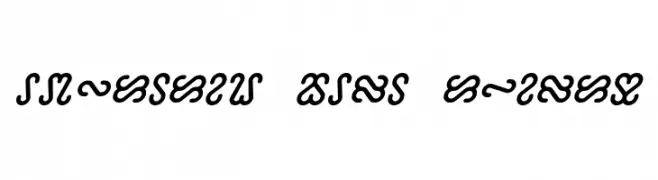
A bold, italic font with serpentine, decorative characters.
![Ophidian Bold Italic font caratteri gratis]() Scaricare 95 Downloads@WebFont
Scaricare 95 Downloads@WebFont -
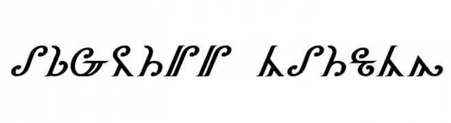
![Thorass Italic font caratteri gratis]() Scaricare 95 Downloads@WebFont
Scaricare 95 Downloads@WebFont -
-
( Fonts by Vladimir Nikolic )
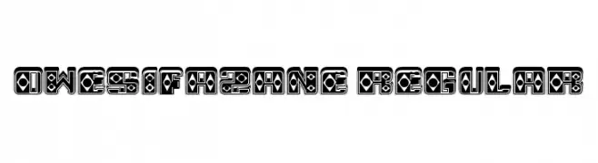
A bold, decorative font with intricate geometric patterns and strong contrast.
![Owesifazane Regular font caratteri gratis]() Scaricare 95 Downloads@WebFont
Scaricare 95 Downloads@WebFont -
( Free - new.myfonts.com/foundry/Intellecta_Design/?refby=paulow )
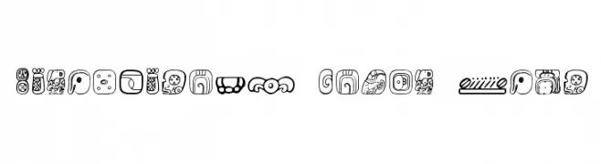
A decorative font inspired by Mesoamerican symbols, featuring intricate and artistic glyphs.
![MesoAmerica Dings Four font caratteri gratis]() Scaricare 95 Downloads@WebFont
Scaricare 95 Downloads@WebFont -
( Fonts by Indriyanti )
A playful, handwritten font with a casual and friendly style.
![Playing Bumb font caratteri gratis]() Scaricare 95 Downloads@WebFont
Scaricare 95 Downloads@WebFont -
( Fonts by Java Pep - Personal-use only. For commercial use please contact owner. )
Elegant cursive font with flowing, connected letters and a sophisticated style.
![The Expressions font caratteri gratis]() Scaricare 95 Downloads@WebFont
Scaricare 95 Downloads@WebFont -
( Fonts by Tom Chalky )
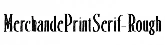
A rough, textured serif font with a vintage, handcrafted style.
![MerchandePrintSerif-Rough font caratteri gratis]() Scaricare 95 Downloads@WebFont
Scaricare 95 Downloads@WebFont


Quali sono i font più popolari adesso?
Poppins, Roboto, Montserrat, Open Sans e Lato sono molto usati per le forme pulite e l'ampia applicabilità — dall'identità di marca alle landing page e ai poster.
Quali font si usano spesso nei loghi?
Le sans serif geometriche (es. Poppins, famiglie in stile Gotham) sono scelte comuni per un branding pulito e scalabile. Per un tocco personale restano valide script e stili manoscritti. Abbina un display deciso per i titoli a un corpo testo neutro per riconoscibilità ed equilibrio.
Ogni quanto si aggiorna la lista?
Con regolarità, in base ai download e all'attività reale. Torna spesso per scoprire in anticipo le nuove preferite.
💡 Consiglio: aggiungi ai preferiti — le tendenze cambiano in fretta e i font top di oggi possono ispirare il rebranding di domani.