Benvenuto nelle Font Più Popolari — dove popolarità e qualità si incontrano. Qui trovi i font più scaricati e usati dell'anno. Se cerchi scelte sicure per logo, web o social, inizia da qui.
Ogni font top si distingue per equilibrio, leggibilità e versatilità. Troverai sans serif moderne, script eleganti, serif vintage e display minimalisti.
-
( Fonts by Burhan Afif - hanscostudio.com - Personal-use only. For commercial use please contact owner. )
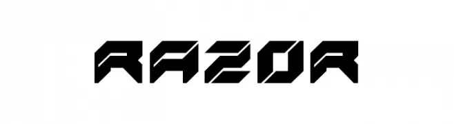
A bold, angular font with a futuristic and dynamic design.
 Scaricare 94 Downloads@WebFont
 -
![Stray Cat Black Condensed font caratteri gratis]() Scaricare 94 Downloads@WebFont
Scaricare 94 Downloads@WebFont -
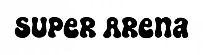
( Fonts by fsuarez913 )
A bold, playful font with thick, rounded characters and a bubbly appearance.
![Super Arena font caratteri gratis]() Scaricare 94 Downloads@WebFont
Scaricare 94 Downloads@WebFont -
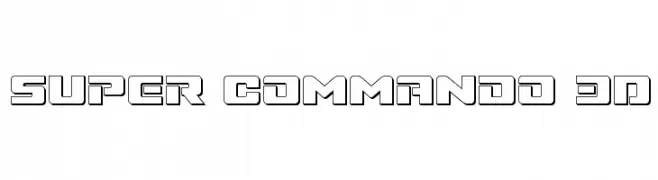
( Fonts by Daniel Zadorozny - www.iconian.com )
A bold, geometric font with a 3D effect, perfect for futuristic designs.
![Super Commando 3D font caratteri gratis]() Scaricare 94 Downloads@WebFont
Scaricare 94 Downloads@WebFont -
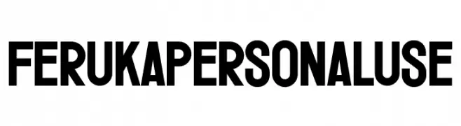
( Fonts by twinletter - Rozikan - Personal-use only. For commercial use please contact owner. )
A bold, geometric font with uniform strokes and tight spacing.
![Feruka Personal Use font caratteri gratis]() Scaricare 94 Downloads@WebFont
Scaricare 94 Downloads@WebFont -
-
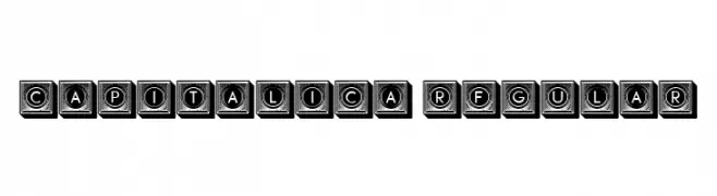
( Fonts by Vladimir Nikolic )
A bold, 3D geometric font with uppercase letters in cube-like structures.
![Capitalica Regular font caratteri gratis]() Scaricare 94 Downloads@WebFont
Scaricare 94 Downloads@WebFont -
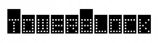
( Fonts by Darrell Flood )
A digital, dot-matrix style font with a modern and futuristic look.
![Tower Block font caratteri gratis]() Scaricare 94 Downloads@WebFont
Scaricare 94 Downloads@WebFont -
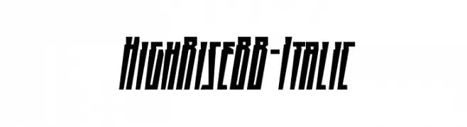
( Fonts by www.blambot.com )
A bold, italic, and condensed font with a modern, angular style.
![HighRiseBB-Italic font caratteri gratis]() Scaricare 94 Downloads@WebFont
Scaricare 94 Downloads@WebFont -
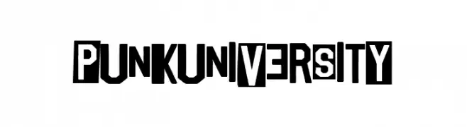
( Fonts by Woodcutter )
A bold, edgy font with irregular, blocky letterforms and a rebellious style.
![Punk University font caratteri gratis]() Scaricare 94 Downloads@WebFont
Scaricare 94 Downloads@WebFont -
( Fonts by Geronimo Fonts - Personal-use only. For commercial use please contact owner. )
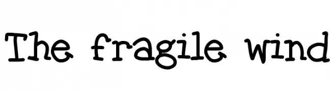
A playful, handwritten font with a whimsical and casual style.
![The fragile wind font caratteri gratis]() Scaricare 94 Downloads@WebFont
Scaricare 94 Downloads@WebFont

Quali sono i font più popolari adesso?
Poppins, Roboto, Montserrat, Open Sans e Lato sono molto usati per le forme pulite e l'ampia applicabilità — dall'identità di marca alle landing page e ai poster.
Quali font si usano spesso nei loghi?
Le sans serif geometriche (es. Poppins, famiglie in stile Gotham) sono scelte comuni per un branding pulito e scalabile. Per un tocco personale restano valide script e stili manoscritti. Abbina un display deciso per i titoli a un corpo testo neutro per riconoscibilità ed equilibrio.
Ogni quanto si aggiorna la lista?
Con regolarità, in base ai download e all'attività reale. Torna spesso per scoprire in anticipo le nuove preferite.
💡 Consiglio: aggiungi ai preferiti — le tendenze cambiano in fretta e i font top di oggi possono ispirare il rebranding di domani.