Benvenuto nelle Font Più Popolari — dove popolarità e qualità si incontrano. Qui trovi i font più scaricati e usati dell'anno. Se cerchi scelte sicure per logo, web o social, inizia da qui.
Ogni font top si distingue per equilibrio, leggibilità e versatilità. Troverai sans serif moderne, script eleganti, serif vintage e display minimalisti.
-
( Fonts by Dondon Nillo )
A modern, italicized font with sharp angles and a dynamic style.
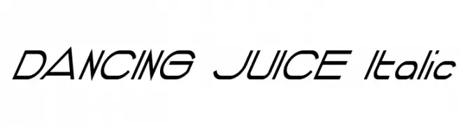 Scaricare 90 Downloads@WebFont
 -
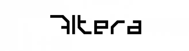
( balazs95 )
A futuristic, geometric font with sharp angles and consistent stroke width.
![Altera font caratteri gratis]() Scaricare 90 Downloads@WebFont
Scaricare 90 Downloads@WebFont -
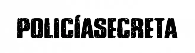
( Fonts by Woodcutter )
A bold, distressed font with a grunge texture and vintage appeal.
![Policía Secreta font caratteri gratis]() Scaricare 90 Downloads@WebFont
Scaricare 90 Downloads@WebFont -
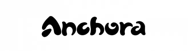
( Fonts by LetterStock )
A bold, playful font with rounded, bulbous characters and whimsical flourishes.
![Anchora font caratteri gratis]() Scaricare 90 Downloads@WebFont
Scaricare 90 Downloads@WebFont -
![Cubism Connect Regular font caratteri gratis]() Scaricare 90 Downloads@WebFont
Scaricare 90 Downloads@WebFont -
-
( Fonts by Bumbayo Font Fabrik - Personal-use only. For commercial use please contact owner. )
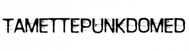
A distressed, grunge-style font with a bold, rugged appearance.
![TamettePunkdomed font caratteri gratis]() Scaricare 90 Downloads@WebFont
Scaricare 90 Downloads@WebFont -
( Fonts by Rochart Studio )
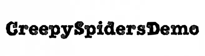
A bold, decorative font with quirky, spiral-adorned characters, ideal for spooky themes.
![Creepy Spiders Demo font caratteri gratis]() Scaricare 90 Downloads@WebFont
Scaricare 90 Downloads@WebFont -
( Fonts by Woodcutter Manero - http://www.woodcutter.es - Personal-use only. For commercial use please contact owner. )
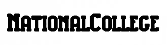
A bold, vintage-inspired font with strong, geometric characters.
![National College font caratteri gratis]() Scaricare 90 Downloads@WebFont
Scaricare 90 Downloads@WebFont -
( Maulana Creative - Gilang Maulana - maulanacreative.net/ )
An elegant, flowing script font with high contrast and graceful curves.
![Allia font caratteri gratis]() Scaricare 90 Downloads@WebFont
Scaricare 90 Downloads@WebFont -
( Fonts by a Typeface Leone - www.tipografialeone.net. Personal-use only. For commercial use please contact owner. )
A bold italic font with heart motifs, perfect for romantic themes.
![Dream Love Valentine Bold Italic font caratteri gratis]() Scaricare 90 Downloads@WebFont
Scaricare 90 Downloads@WebFont


Quali sono i font più popolari adesso?
Poppins, Roboto, Montserrat, Open Sans e Lato sono molto usati per le forme pulite e l'ampia applicabilità — dall'identità di marca alle landing page e ai poster.
Quali font si usano spesso nei loghi?
Le sans serif geometriche (es. Poppins, famiglie in stile Gotham) sono scelte comuni per un branding pulito e scalabile. Per un tocco personale restano valide script e stili manoscritti. Abbina un display deciso per i titoli a un corpo testo neutro per riconoscibilità ed equilibrio.
Ogni quanto si aggiorna la lista?
Con regolarità, in base ai download e all'attività reale. Torna spesso per scoprire in anticipo le nuove preferite.
💡 Consiglio: aggiungi ai preferiti — le tendenze cambiano in fretta e i font top di oggi possono ispirare il rebranding di domani.