Benvenuto nelle Font Più Popolari — dove popolarità e qualità si incontrano. Qui trovi i font più scaricati e usati dell'anno. Se cerchi scelte sicure per logo, web o social, inizia da qui.
Ogni font top si distingue per equilibrio, leggibilità e versatilità. Troverai sans serif moderne, script eleganti, serif vintage e display minimalisti.
-
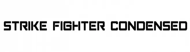
( Fonts by Iconian Fonts )
A bold, geometric, and condensed font with a modern, futuristic style.
 Scaricare 475 Downloads@WebFont
 -
( Fonts by Don Marciano - Personal-use only. For commercial use please contact owner. )
A bold, rounded font with a playful and modern aesthetic.
![Yeyey font caratteri gratis]() Scaricare 475 Downloads@WebFont
Scaricare 475 Downloads@WebFont -
( Fonts by Woodcutter Manero - http://www.woodcutter.es - Personal-use only. For commercial use please contact owner. )
A bold, fragmented font with a shattered glass effect.
![Broken World font caratteri gratis]() Scaricare 475 Downloads@WebFont
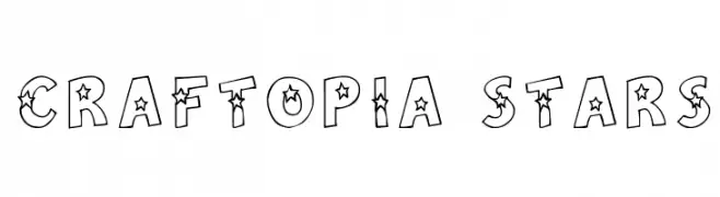
Scaricare 475 Downloads@WebFont -
![Craftopia Stars font caratteri gratis]() Scaricare 475 Downloads@WebFont
Scaricare 475 Downloads@WebFont -
( Mas Anis Studio - Naufal Anis - creativemarket.com/naufalans?u=naufalans )
A playful, whimsical handwritten font with flowing cursive letterforms.
![Richie Youthfield Alt font caratteri gratis]() Scaricare 475 Downloads@WebFont
Scaricare 475 Downloads@WebFont -
-
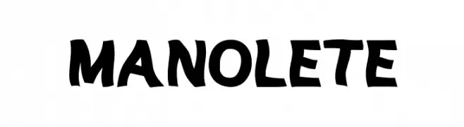
( Fonts by Woodcutter )
A bold, hand-drawn font with a playful and dynamic style.
![MANOLETE font caratteri gratis]() Scaricare 475 Downloads@WebFont
Scaricare 475 Downloads@WebFont -
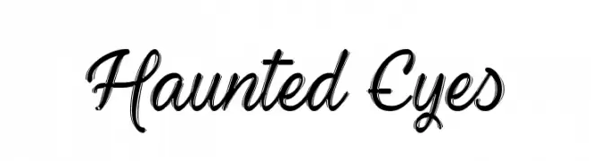
![Haunted Eyes font caratteri gratis]() Scaricare 475 Downloads@WebFont
Scaricare 475 Downloads@WebFont -
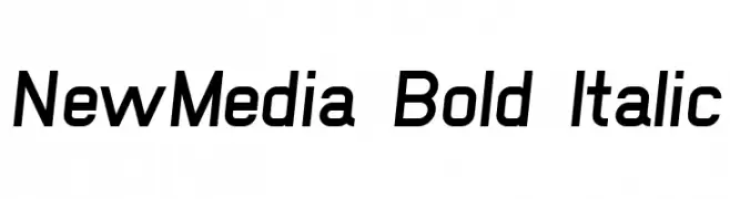
![NewMedia Bold Italic font caratteri gratis]() Scaricare 475 Downloads@WebFont
Scaricare 475 Downloads@WebFont -
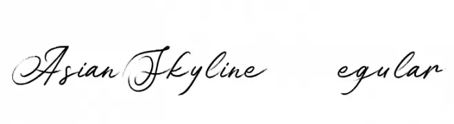
( Konstantine Studio - konstantinestudio.com/ )
An elegant, flowing script font with a hand-drawn, calligraphic style.
![Asian Skyline DEMO Regular font caratteri gratis]() Scaricare 475 Downloads@WebFont
Scaricare 475 Downloads@WebFont -
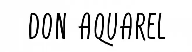
( Fonts by Adien Gunarta - fontasticindonesia.blogspot.com )
A playful, hand-drawn font with tall, narrow letters and a dynamic tilt.
![Don Aquarel font caratteri gratis]() Scaricare 474 Downloads@WebFont
Scaricare 474 Downloads@WebFont -
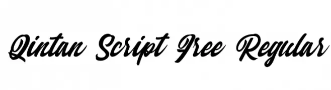
( Haris Purnama - creativemarket.com/RitsType )
A dynamic script font with fluid, interconnected strokes and elegant style.
![Qintan Script Free Regular font caratteri gratis]() Scaricare 474 Downloads@WebFont
Scaricare 474 Downloads@WebFont -
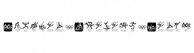
![Olympic Beijing Picto font caratteri gratis]() Scaricare 474 Downloads@WebFont
Scaricare 474 Downloads@WebFont -
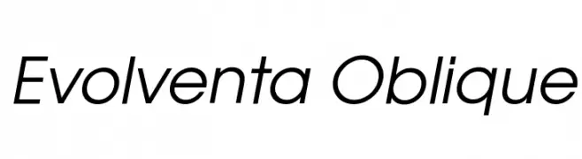
![Evolventa Oblique font caratteri gratis]() Scaricare 474 Downloads@WebFont
Scaricare 474 Downloads@WebFont -
( Fonts by Maelle.K - Thomas Boucherie )
An elegant and artistic font with elongated, flowing letterforms.
![Anacondas font caratteri gratis]() Scaricare 474 Downloads@WebFont
Scaricare 474 Downloads@WebFont -
( Fonts by Apostrophic Lab )
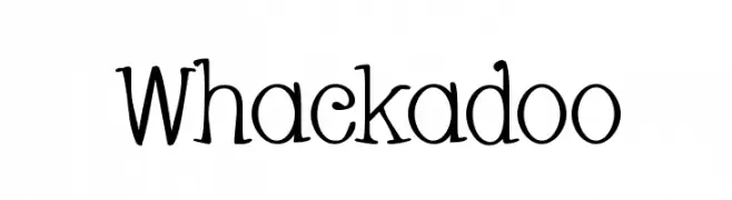
A playful and whimsical font with curly, irregular letterforms.
![Whackadoo font caratteri gratis]() Scaricare 474 Downloads@WebFont
Scaricare 474 Downloads@WebFont -
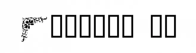
![Corners 1a font caratteri gratis]() Scaricare 474 Downloads@WebFont
Scaricare 474 Downloads@WebFont -
( Fonts by Uusimaa Type Foundry Inc - Personal-use only. For commercial use please contact owner. )
A modern sans-serif font with clean lines and a geometric touch.
![splekta font caratteri gratis]() Scaricare 474 Downloads@WebFont
Scaricare 474 Downloads@WebFont -
( Fonts by Uwe Borchert - Personal-use only. For commercial use please contact owner. )
A modern, geometric sans-serif font with a clean and professional appearance.
![Jakob font caratteri gratis]() Scaricare 474 Downloads@WebFont
Scaricare 474 Downloads@WebFont -
( Corey Mitchell )
A bold, angular, and italicized font with a futuristic and dynamic style.
![Tekno Italic font caratteri gratis]() Scaricare 474 Downloads@WebFont
Scaricare 474 Downloads@WebFont -
( Fonts by Andi Moz )
A playful, whimsical font with flowing uppercase and bold lowercase characters.
![Food Chicken font caratteri gratis]() Scaricare 474 Downloads@WebFont
Scaricare 474 Downloads@WebFont -
( Copyright (c) 2015 Indian Type Foundry (info@indiantypefoundry.com) )
A clean, modern sans-serif font with a light weight and excellent readability.
![Hind Kochi Light font caratteri gratis]() Scaricare 474 Downloads@WebFont
Scaricare 474 Downloads@WebFont -
( Fonts by a Max Infeld - XEROGRAPHER FONTS - xerographer.blogspot.com . Personal-use only. For commercial use please contact owner. )
A bold, jagged font with a hairy, chaotic style.
![HairyFun font caratteri gratis]() Scaricare 474 Downloads@WebFont
Scaricare 474 Downloads@WebFont -
( Fonts by Matias Romero )
A classic serif font with bold, elegant characters and sharp serifs.
![Aleijadinho font caratteri gratis]() Scaricare 474 Downloads@WebFont
Scaricare 474 Downloads@WebFont -
( Fonts by Rick Mueller )
A bold, distressed font with star patterns and a vintage feel.
![StarshineMF font caratteri gratis]() Scaricare 474 Downloads@WebFont
Scaricare 474 Downloads@WebFont -
![VTCGoblinHand font caratteri gratis]() Scaricare 474 Downloads@WebFont
Scaricare 474 Downloads@WebFont -
![Funky Knut font caratteri gratis]() Scaricare 474 Downloads@WebFont
Scaricare 474 Downloads@WebFont -
![Nordica Classic Ultra Light font caratteri gratis]() Scaricare 474 Downloads@WebFont
Scaricare 474 Downloads@WebFont -
( Fonts by Zarma Type Foundry - Azzam Ridhamalik - Personal-use only. For commercial use please contact owner. )
A playful and flowing script font with smooth, rounded edges and interconnected letters.
![Beauty Adesha Regular font caratteri gratis]() Scaricare 474 Downloads@WebFont
Scaricare 474 Downloads@WebFont -
![JESSIE Normal font caratteri gratis]() Scaricare 474 Downloads@WebFont
Scaricare 474 Downloads@WebFont -
![M+ 2m thin font caratteri gratis]() Scaricare 474 Downloads@WebFont
Scaricare 474 Downloads@WebFont -
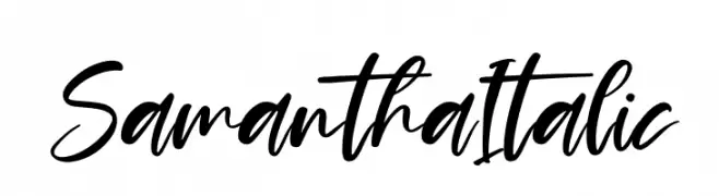
( Fonts by Perspectype Studio - Personal-use only. For commercial use please contact owner. )
A modern, cursive font with elegant, flowing strokes and a handwritten appearance.
![Samantha Italic font caratteri gratis]() Scaricare 474 Downloads@WebFont
Scaricare 474 Downloads@WebFont -
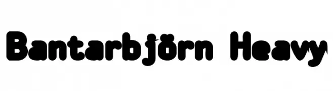
( Fonts by TarmSaft Font Factory - http://www.aska.nu/tarmsaft/ )
A bold, playful font with rounded, thick strokes and a friendly appearance.
![Bantarbjörn Heavy font caratteri gratis]() Scaricare 474 Downloads@WebFont
Scaricare 474 Downloads@WebFont -
( William Cunningham - NerdyDesign.com )
A classic serif font with elegant strokes and pronounced serifs.
![Halion font caratteri gratis]() Scaricare 474 Downloads@WebFont
Scaricare 474 Downloads@WebFont -
( Fonts by Daniel Zadorozny - www.iconian.com )
A bold, futuristic font with geometric shapes and sharp angles.
![Ozda Expanded font caratteri gratis]() Scaricare 474 Downloads@WebFont
Scaricare 474 Downloads@WebFont -
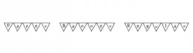
( Free for personal use - byjanam.blogspot.com )
A playful, decorative font with characters in triangular banners.
![Paper Banner Regular font caratteri gratis]() Scaricare 474 Downloads@WebFont
Scaricare 474 Downloads@WebFont


Quali sono i font più popolari adesso?
Poppins, Roboto, Montserrat, Open Sans e Lato sono molto usati per le forme pulite e l'ampia applicabilità — dall'identità di marca alle landing page e ai poster.
Quali font si usano spesso nei loghi?
Le sans serif geometriche (es. Poppins, famiglie in stile Gotham) sono scelte comuni per un branding pulito e scalabile. Per un tocco personale restano valide script e stili manoscritti. Abbina un display deciso per i titoli a un corpo testo neutro per riconoscibilità ed equilibrio.
Ogni quanto si aggiorna la lista?
Con regolarità, in base ai download e all'attività reale. Torna spesso per scoprire in anticipo le nuove preferite.
💡 Consiglio: aggiungi ai preferiti — le tendenze cambiano in fretta e i font top di oggi possono ispirare il rebranding di domani.