Benvenuto nelle Font Più Popolari — dove popolarità e qualità si incontrano. Qui trovi i font più scaricati e usati dell'anno. Se cerchi scelte sicure per logo, web o social, inizia da qui.
Ogni font top si distingue per equilibrio, leggibilità e versatilità. Troverai sans serif moderne, script eleganti, serif vintage e display minimalisti.
-
( Fonts by Letterena Studios )
A graceful, cursive script font with a natural handwriting style.
 Scaricare 89 Downloads@WebFont
 -
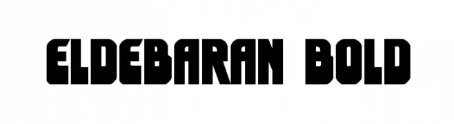
( Fonts by Daniel Zadorozny - www.iconian.com - Free for personal use )
A bold, geometric font with a futuristic and impactful design.
![Eldebaran Bold font caratteri gratis]() Scaricare 89 Downloads@WebFont
Scaricare 89 Downloads@WebFont -
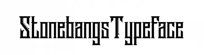
( Ryan Prasetya - creativemarket.com/lostvoltype )
A bold, gothic-inspired typeface with sharp, angular edges.
![StonebangsTypeface font caratteri gratis]() Scaricare 89 Downloads@WebFont
Scaricare 89 Downloads@WebFont -
( Fonts by Scratchones )
A whimsical, hand-drawn script font with flowing, connected strokes.
![Welcome Valentine font caratteri gratis]() Scaricare 89 Downloads@WebFont
Scaricare 89 Downloads@WebFont -
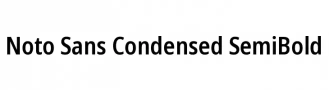
( Fonts by Google )
A modern, sans-serif typeface with condensed, semi-bold letterforms.
![Noto Sans Condensed SemiBold font caratteri gratis]() Scaricare 89 Downloads@WebFont
Scaricare 89 Downloads@WebFont -
-
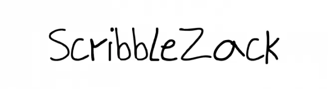
( doodeler.deviantart.com/ )
A playful, hand-drawn font with a casual, scribble-like style.
![ScribbleZack font caratteri gratis]() Scaricare 89 Downloads@WebFont
Scaricare 89 Downloads@WebFont -
( Fonts by Ef Studio - Personal-use only. For commercial use please contact owner. )
An elegant script font with flowing, interconnected letters and ornate details.
![Keukenhof font caratteri gratis]() Scaricare 89 Downloads@WebFont
Scaricare 89 Downloads@WebFont -
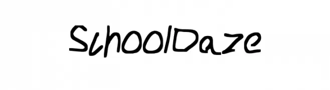
![School_Daze font caratteri gratis]() Scaricare 89 Downloads@WebFont
Scaricare 89 Downloads@WebFont -
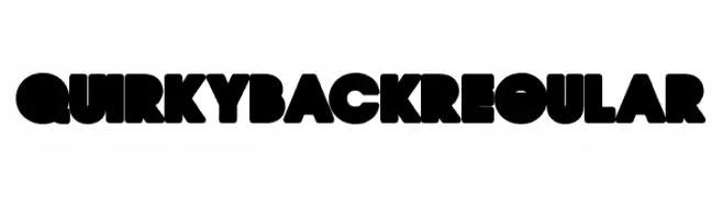
( Fonts by Billy Argel )
A bold, playful font with thick, rounded characters and a retro vibe.
![QUIRKY BACK Regular font caratteri gratis]() Scaricare 89 Downloads@WebFont
Scaricare 89 Downloads@WebFont -
( Fonts by wep - Wahyu Eka Prasetya - Personal-use only. For commercial use please contact owner. )
A bold, decorative font with a gothic flair and unique serifs.
![Aidilfitri font caratteri gratis]() Scaricare 89 Downloads@WebFont
Scaricare 89 Downloads@WebFont


Quali sono i font più popolari adesso?
Poppins, Roboto, Montserrat, Open Sans e Lato sono molto usati per le forme pulite e l'ampia applicabilità — dall'identità di marca alle landing page e ai poster.
Quali font si usano spesso nei loghi?
Le sans serif geometriche (es. Poppins, famiglie in stile Gotham) sono scelte comuni per un branding pulito e scalabile. Per un tocco personale restano valide script e stili manoscritti. Abbina un display deciso per i titoli a un corpo testo neutro per riconoscibilità ed equilibrio.
Ogni quanto si aggiorna la lista?
Con regolarità, in base ai download e all'attività reale. Torna spesso per scoprire in anticipo le nuove preferite.
💡 Consiglio: aggiungi ai preferiti — le tendenze cambiano in fretta e i font top di oggi possono ispirare il rebranding di domani.