Benvenuto nelle Font Più Popolari — dove popolarità e qualità si incontrano. Qui trovi i font più scaricati e usati dell'anno. Se cerchi scelte sicure per logo, web o social, inizia da qui.
Ogni font top si distingue per equilibrio, leggibilità e versatilità. Troverai sans serif moderne, script eleganti, serif vintage e display minimalisti.
-
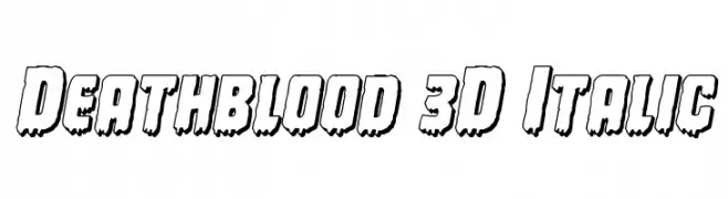
( Fonts by Daniel Zadorozny - www.iconian.com )
A bold, 3D italic font with a dripping effect, perfect for horror-themed designs.
 Scaricare 89 Downloads@WebFont
 -
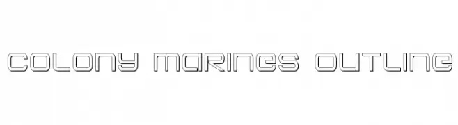
( Fonts by Iconian Fonts )
A futuristic, geometric outline font with a modern and technical style.
![Colony Marines Outline font caratteri gratis]() Scaricare 89 Downloads@WebFont
Scaricare 89 Downloads@WebFont -
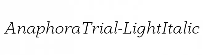
( Zetafonts - www.zetafonts.com )
A light, italicized font with a refined and elegant style.
![AnaphoraTrial-LightItalic font caratteri gratis]() Scaricare 89 Downloads@WebFont
Scaricare 89 Downloads@WebFont -
![Squishy font caratteri gratis]() Scaricare 89 Downloads@WebFont
Scaricare 89 Downloads@WebFont -
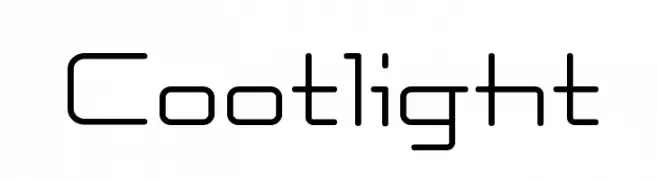
( Fonts by Masato Shimojima - Personal-use only. For commercial use please contact owner. )
A modern, geometric font with clean lines and rounded edges.
![Cootlight font caratteri gratis]() Scaricare 89 Downloads@WebFont
Scaricare 89 Downloads@WebFont -
-
( Fonts by Manfred Klein. Free for private and charity use. Free for commercial with donation to organizations )
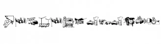
Illustrative, automotive-themed pictogram font.
![RefuelStation font caratteri gratis]() Scaricare 89 Downloads@WebFont
Scaricare 89 Downloads@WebFont -
( Jecko Development - www.jeckodevelopment.com/ )
A bold, decorative font with a striped pattern, perfect for creative projects.
![JDFantasyBold font caratteri gratis]() Scaricare 89 Downloads@WebFont
Scaricare 89 Downloads@WebFont -
( Fonts by Woodcutter )
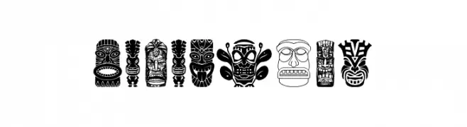
A decorative display font with tiki idol illustrations as characters.
![Tiki Idols font caratteri gratis]() Scaricare 89 Downloads@WebFont
Scaricare 89 Downloads@WebFont -
( Fonts by elharrak )
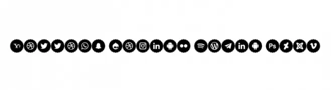
Uniform, scalloped circular icons for various social media and tech brands.
![Bottons Social Media 2019 font caratteri gratis]() Scaricare 89 Downloads@WebFont
Scaricare 89 Downloads@WebFont -
( Fonts by Daniel Zadorozny - www.iconian.com - Free for personal use )
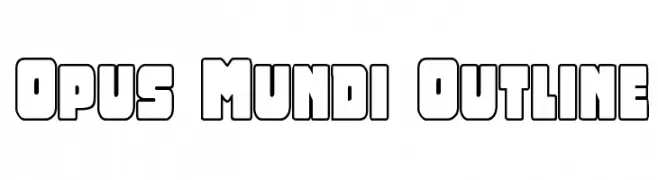
A bold, outlined font with a modern, geometric style.
![Opus Mundi Outline font caratteri gratis]() Scaricare 89 Downloads@WebFont
Scaricare 89 Downloads@WebFont


Quali sono i font più popolari adesso?
Poppins, Roboto, Montserrat, Open Sans e Lato sono molto usati per le forme pulite e l'ampia applicabilità — dall'identità di marca alle landing page e ai poster.
Quali font si usano spesso nei loghi?
Le sans serif geometriche (es. Poppins, famiglie in stile Gotham) sono scelte comuni per un branding pulito e scalabile. Per un tocco personale restano valide script e stili manoscritti. Abbina un display deciso per i titoli a un corpo testo neutro per riconoscibilità ed equilibrio.
Ogni quanto si aggiorna la lista?
Con regolarità, in base ai download e all'attività reale. Torna spesso per scoprire in anticipo le nuove preferite.
💡 Consiglio: aggiungi ai preferiti — le tendenze cambiano in fretta e i font top di oggi possono ispirare il rebranding di domani.