Benvenuto nelle Font Più Popolari — dove popolarità e qualità si incontrano. Qui trovi i font più scaricati e usati dell'anno. Se cerchi scelte sicure per logo, web o social, inizia da qui.
Ogni font top si distingue per equilibrio, leggibilità e versatilità. Troverai sans serif moderne, script eleganti, serif vintage e display minimalisti.
-
( Fonts by Graham Meade - GemFonts )
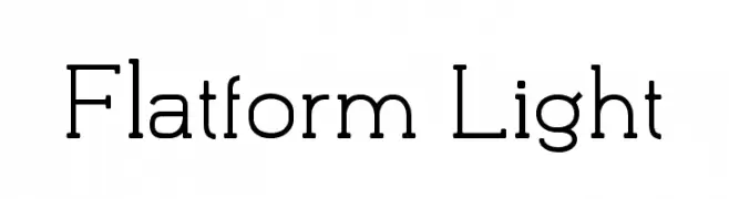
A bold, angular font with a distinctive, edgy style.
 Scaricare 478 Downloads@WebFont
 -
![Flatform Light font caratteri gratis]() Scaricare 478 Downloads@WebFont
Scaricare 478 Downloads@WebFont -
( Demo font. To purchase the full version, you can order it online at www.schoolhousefonts.com )
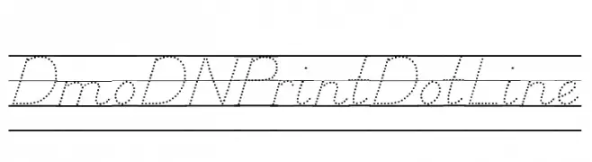
A dotted line font ideal for handwriting practice and educational materials.
![DmoDNPrintDotLine font caratteri gratis]() Scaricare 478 Downloads@WebFont
Scaricare 478 Downloads@WebFont -
( THESE ARE SHAREWARE FONTS ! NOT FREEWARE ! PLEASE VISIT www.fuelfonts.com )
A tall, elegant serif font with high contrast and elongated vertical lines.
![Parkland Serif font caratteri gratis]() Scaricare 478 Downloads@WebFont
Scaricare 478 Downloads@WebFont -
( Fonts by imagex )
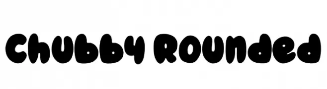
A playful, chubby, and rounded font with a bold, whimsical style.
![Chubby Rounded font caratteri gratis]() Scaricare 478 Downloads@WebFont
Scaricare 478 Downloads@WebFont -
( Fonts by Misti Hammers - mistifonts.com - Personal-use only. For commercial use please contact owner. )
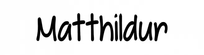
A playful handwritten font with rounded, irregular letterforms.
![Matthildur font caratteri gratis]() Scaricare 478 Downloads@WebFont
Scaricare 478 Downloads@WebFont -
( Copyright (c) 2015 Indian Type Foundry (info@indiantypefoundry.com) )
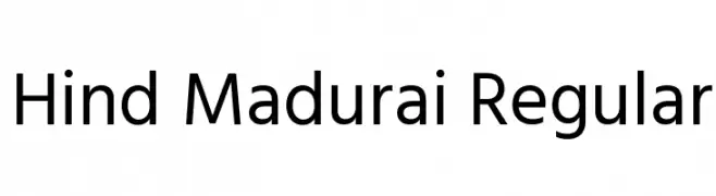
A clean, modern sans-serif font with uniform stroke width and high legibility.
![Hind Madurai Regular font caratteri gratis]() Scaricare 478 Downloads@WebFont
Scaricare 478 Downloads@WebFont -
( Fonts by www.matchfonts.com - Michel Bujardet )
A bold, decorative font with a vintage and ornate style.
![Bujardet Freres [Unregistered] font caratteri gratis]() Scaricare 478 Downloads@WebFont
Scaricare 478 Downloads@WebFont -
( Fonts by Daniel Zadorozny - www.iconian.com )
A bold, futuristic font with geometric shapes and overlapping elements.
![Han Solo Overlap font caratteri gratis]() Scaricare 478 Downloads@WebFont
Scaricare 478 Downloads@WebFont -
( Noto is a trademark of Google Inc. Noto fonts are open source. All Noto fonts are published under the SIL Open Font License, Version 1.1 )
A bold, modern font with clean lines and high legibility.
![Noto Sans Hebrew Bold font caratteri gratis]() Scaricare 478 Downloads@WebFont
Scaricare 478 Downloads@WebFont -
( Fonts by Katatrad Team - Personal-use only. For commercial use please contact owner. )
A sleek, modern, extra-light font with a clean and minimalistic design.
![Readiness ExtraLight font caratteri gratis]() Scaricare 478 Downloads@WebFont
Scaricare 478 Downloads@WebFont -
( www.funken-schlag.de )
A bold, expressive handwritten font with dynamic brush-like strokes.
![Anilin font caratteri gratis]() Scaricare 478 Downloads@WebFont
Scaricare 478 Downloads@WebFont -
( Fonts by Daniel Zadorozny - www.iconian.com )
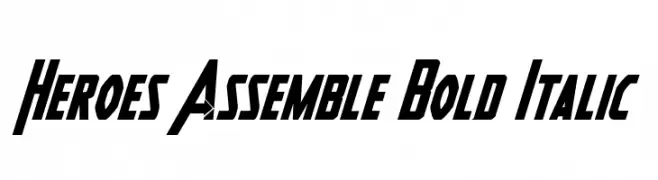
A bold, italicized font with a dynamic and heroic style.
![Heroes Assemble Bold Italic font caratteri gratis]() Scaricare 478 Downloads@WebFont
Scaricare 478 Downloads@WebFont -
( Free on condition that you make a donation of 5€ favor of an organization dealing with global warming. http://www.sergiolelli.it )
A refined, high-contrast serif font with elegant, slender characters.
![GershwinLight font caratteri gratis]() Scaricare 478 Downloads@WebFont
Scaricare 478 Downloads@WebFont -
( Free for a personal use. For a commercial use please visit www.kevinandamanda.com )
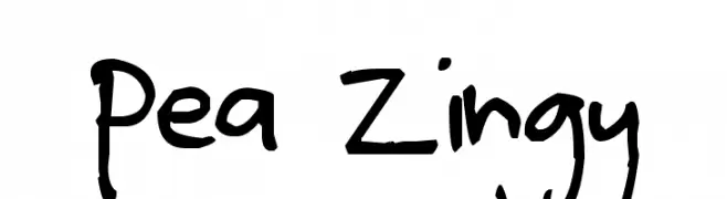
A playful, handwritten font with bold strokes and medium contrast.
![Pea Zingy font caratteri gratis]() Scaricare 478 Downloads@WebFont
Scaricare 478 Downloads@WebFont -
![Yesie font caratteri gratis]() Scaricare 478 Downloads@WebFont
Scaricare 478 Downloads@WebFont -
( Fonts by www.lifewithouttaffy.com )
A bold, vintage-inspired font with thick, block-like characters and tight spacing.
![Fisticuffs font caratteri gratis]() Scaricare 478 Downloads@WebFont
Scaricare 478 Downloads@WebFont -
( Fonts by www.monofonts.com. Personal-use only. For commercial use please contact owner. )
A bold, geometric font with a vintage touch, perfect for impactful designs.
![Vintage Straps Bold font caratteri gratis]() Scaricare 478 Downloads@WebFont
Scaricare 478 Downloads@WebFont -
( truefonts.blogspot.com )
A bold, modern font with clean, geometric lines and consistent stroke thickness.
![katakana tfb font caratteri gratis]() Scaricare 478 Downloads@WebFont
Scaricare 478 Downloads@WebFont -
( Fonts by Alit Suarnegara - Alit Design - www.alitdesign.net - Personal-use only. For commercial use please contact owner. )
A lively, handwritten font with expressive strokes and a personal touch.
![Southern font caratteri gratis]() Scaricare 478 Downloads@WebFont
Scaricare 478 Downloads@WebFont -
( Fonts by Daniel Zadorozny - www.iconian.com - Free for personal use )
A bold, futuristic font with geometric shapes and a sci-fi aesthetic.
![Lord of the Sith font caratteri gratis]() Scaricare 478 Downloads@WebFont
Scaricare 478 Downloads@WebFont -
( Fonts by Daniel Zadorozny - www.iconian.com - Personal-use only. For commercial use please contact owner. )
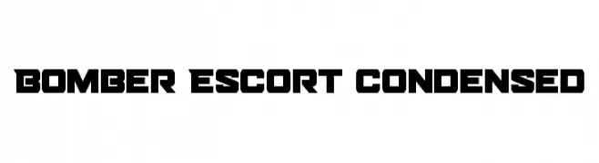
A bold, angular, and condensed font with a strong, geometric design.
![Bomber Escort Condensed font caratteri gratis]() Scaricare 478 Downloads@WebFont
Scaricare 478 Downloads@WebFont -
![Sassoun font caratteri gratis]() Scaricare 478 Downloads@WebFont
Scaricare 478 Downloads@WebFont -
( Fonts by Arkandis Digital Foundry )
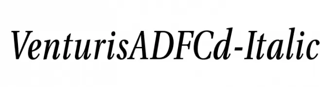
A classic italic serif typeface with elegant curves and a refined appearance.
![VenturisADFCd-Italic font caratteri gratis]() Scaricare 477 Downloads@WebFont
Scaricare 477 Downloads@WebFont -
( Fonts by Cloutierfontes - Steve Cloutier - www.cloutierfontes.ca - Personal-use only. For commercial use please contact owner. )
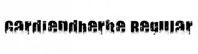
A bold, textured font with a natural, overgrown foliage effect.
![Gardiendherbe Regular font caratteri gratis]() Scaricare 477 Downloads@WebFont
Scaricare 477 Downloads@WebFont -
( https://www.behance.net/konstantinestudio )
A bold, textured font with a rugged, dynamic style.
![Upjohn - Rough font caratteri gratis]() Scaricare 477 Downloads@WebFont
Scaricare 477 Downloads@WebFont -
( Fonts by Manfred Klein - manfred-klein.ina-mar.com )
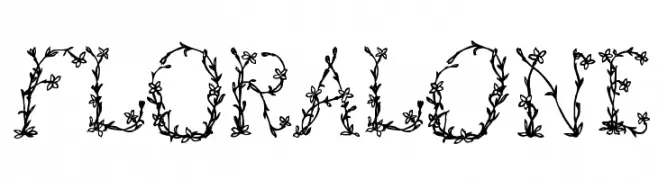
A decorative font with intricate floral designs on each letter.
![FloralOne font caratteri gratis]() Scaricare 477 Downloads@WebFont
Scaricare 477 Downloads@WebFont -
![Modern Day Maharaja font caratteri gratis]() Scaricare 477 Downloads@WebFont
Scaricare 477 Downloads@WebFont -
![fs sor Regular font caratteri gratis]() Scaricare 477 Downloads@WebFont
Scaricare 477 Downloads@WebFont -
![Gondoliere font caratteri gratis]() Scaricare 477 Downloads@WebFont
Scaricare 477 Downloads@WebFont -
( Fonts by Manfred Klein - manfred-klein.ina-mar.com )
A bold, dramatic font with sharp angles and a strong presence.
![Reclamare font caratteri gratis]() Scaricare 477 Downloads@WebFont
Scaricare 477 Downloads@WebFont -
( Fonts by Have Fun with Fonts )
A bold, playful font with a slight slant and moderate contrast.
![HFF Air Apparent font caratteri gratis]() Scaricare 477 Downloads@WebFont
Scaricare 477 Downloads@WebFont -
( Fonts by Rochadi Sudarma [Rochart Studio] - Personal-use only. For commercial use please contact owner. )
A bold, expressive handwritten font with a brush-like texture.
![Dellana font caratteri gratis]() Scaricare 477 Downloads@WebFont
Scaricare 477 Downloads@WebFont -
( Fonts by or from www.graffitifonts.net )
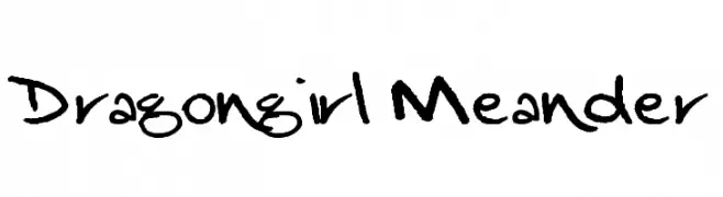
A playful, casual handwritten font with dynamic, irregular strokes.
![Dragongirl Meander font caratteri gratis]() Scaricare 477 Downloads@WebFont
Scaricare 477 Downloads@WebFont -
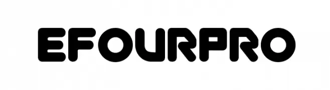
![efourpro font caratteri gratis]() Scaricare 477 Downloads@WebFont
Scaricare 477 Downloads@WebFont

![Bujardet Freres [Unregistered] font caratteri gratis](https://d144mzi0q5mijx.cloudfront.net/img/B/U/Bujardet-Freres-Unregistered.webp)


Quali sono i font più popolari adesso?
Poppins, Roboto, Montserrat, Open Sans e Lato sono molto usati per le forme pulite e l'ampia applicabilità — dall'identità di marca alle landing page e ai poster.
Quali font si usano spesso nei loghi?
Le sans serif geometriche (es. Poppins, famiglie in stile Gotham) sono scelte comuni per un branding pulito e scalabile. Per un tocco personale restano valide script e stili manoscritti. Abbina un display deciso per i titoli a un corpo testo neutro per riconoscibilità ed equilibrio.
Ogni quanto si aggiorna la lista?
Con regolarità, in base ai download e all'attività reale. Torna spesso per scoprire in anticipo le nuove preferite.
💡 Consiglio: aggiungi ai preferiti — le tendenze cambiano in fretta e i font top di oggi possono ispirare il rebranding di domani.