Benvenuto nelle Font Più Popolari — dove popolarità e qualità si incontrano. Qui trovi i font più scaricati e usati dell'anno. Se cerchi scelte sicure per logo, web o social, inizia da qui.
Ogni font top si distingue per equilibrio, leggibilità e versatilità. Troverai sans serif moderne, script eleganti, serif vintage e display minimalisti.
-
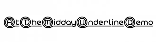
( Studio Typo - www.studiotypo.com )
A modern, double-line font with circular and underlined elements.
 Scaricare 86 Downloads@WebFont
 -
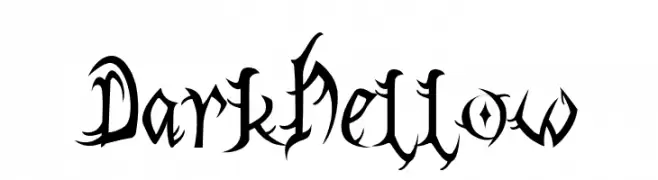
( Fonts by Blackletter Studio )
A bold, gothic-style font with sharp, angular edges and dramatic flair.
![DarkHellow font caratteri gratis]() Scaricare 86 Downloads@WebFont
Scaricare 86 Downloads@WebFont -
( Fonts by Kotak Kuning Studio - kotakkuning.com - Personal-use only. For commercial use please contact owner. )
An elegant script font with flowing, interconnected letters and ornate swashes.
![Marmia font caratteri gratis]() Scaricare 86 Downloads@WebFont
Scaricare 86 Downloads@WebFont -
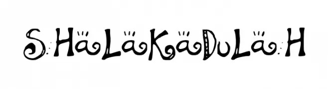
![SHaLaKaDuLaH font caratteri gratis]() Scaricare 86 Downloads@WebFont
Scaricare 86 Downloads@WebFont -
( Kelsey Ann G )
A charming, elegant handwritten font with fluid, slightly italicized strokes.
![delicieux font caratteri gratis]() Scaricare 86 Downloads@WebFont
Scaricare 86 Downloads@WebFont -
-
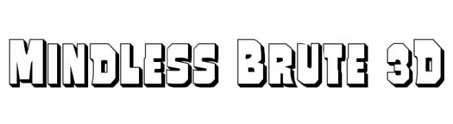
( Fonts by Iconian Fonts )
A bold, 3D geometric font with a strong, impactful presence.
![Mindless Brute 3D font caratteri gratis]() Scaricare 86 Downloads@WebFont
Scaricare 86 Downloads@WebFont -
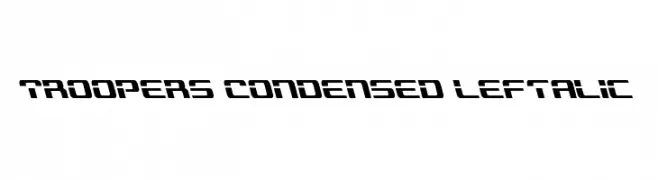
( Fonts by Daniel Zadorozny - www.iconian.com )
A futuristic, condensed, and left-italic font with a bold, geometric design.
![Troopers Condensed Leftalic font caratteri gratis]() Scaricare 86 Downloads@WebFont
Scaricare 86 Downloads@WebFont -
( Fonts by Daniel Zadorozny - www.iconian.com - Free for personal use )
A bold, italicized font with a dynamic, modern style and strong geometric features.
![Lamprey Academy Italic font caratteri gratis]() Scaricare 86 Downloads@WebFont
Scaricare 86 Downloads@WebFont -
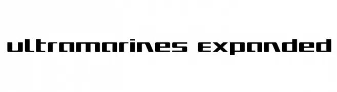
( Fonts by Daniel Zadorozny - www.iconian.com )
A bold, futuristic font with geometric shapes and sharp angles.
![Ultramarines Expanded font caratteri gratis]() Scaricare 86 Downloads@WebFont
Scaricare 86 Downloads@WebFont -
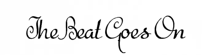
( Intellecta Design - Paulo W - new.myfonts.com/foundry/Intellecta_Design/?refby=paulow )
An artistic script font with elegant, flowing lines and intricate loops.
![The Beat Goes On font caratteri gratis]() Scaricare 86 Downloads@WebFont
Scaricare 86 Downloads@WebFont


Quali sono i font più popolari adesso?
Poppins, Roboto, Montserrat, Open Sans e Lato sono molto usati per le forme pulite e l'ampia applicabilità — dall'identità di marca alle landing page e ai poster.
Quali font si usano spesso nei loghi?
Le sans serif geometriche (es. Poppins, famiglie in stile Gotham) sono scelte comuni per un branding pulito e scalabile. Per un tocco personale restano valide script e stili manoscritti. Abbina un display deciso per i titoli a un corpo testo neutro per riconoscibilità ed equilibrio.
Ogni quanto si aggiorna la lista?
Con regolarità, in base ai download e all'attività reale. Torna spesso per scoprire in anticipo le nuove preferite.
💡 Consiglio: aggiungi ai preferiti — le tendenze cambiano in fretta e i font top di oggi possono ispirare il rebranding di domani.