Benvenuto nelle Font Più Popolari — dove popolarità e qualità si incontrano. Qui trovi i font più scaricati e usati dell'anno. Se cerchi scelte sicure per logo, web o social, inizia da qui.
Ogni font top si distingue per equilibrio, leggibilità e versatilità. Troverai sans serif moderne, script eleganti, serif vintage e display minimalisti.
-
( Fonts by Toto )
A whimsical and playful font with decorative elements and expressive forms.
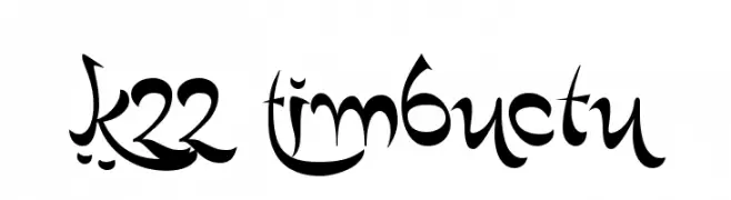 Scaricare 474 Downloads@WebFont
 -
( Fonts by Vladimir Nikolic )
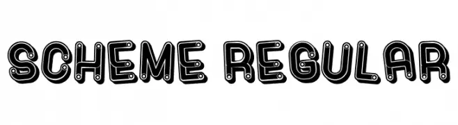
A bold, playful font with a unique outlined and filled design.
![Scheme Regular font caratteri gratis]() Scaricare 474 Downloads@WebFont
Scaricare 474 Downloads@WebFont -
( Fonts by Kevin Christopher - www.kcfonts.com. Personal-use only. For commercial use please contact owner. )
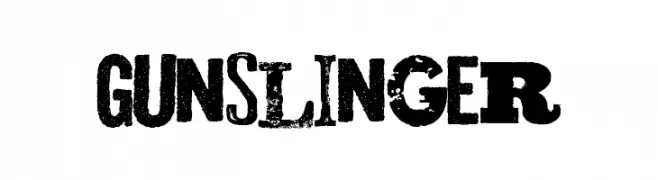
A bold, distressed font with a rugged, vintage aesthetic.
![Gunslinger font caratteri gratis]() Scaricare 474 Downloads@WebFont
Scaricare 474 Downloads@WebFont -
( Fonts by Out of Step Font Company - Dan Steinbok - outofstepfontco.com - Personal-use only. For commercial use please contact owner. )
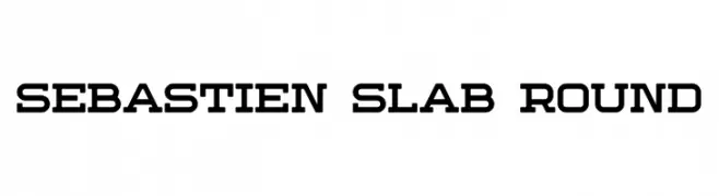
A bold slab serif font with rounded edges, perfect for impactful headlines.
![Sebastien Slab Round font caratteri gratis]() Scaricare 474 Downloads@WebFont
Scaricare 474 Downloads@WebFont -
( Fonts by Chris Vile )
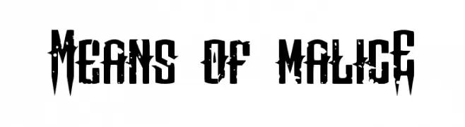
A bold, distressed font with sharp, angular edges and a rugged appearance.
![Means of malicE font caratteri gratis]() Scaricare 474 Downloads@WebFont
Scaricare 474 Downloads@WebFont -
( www.facebook.com/eky.com.my )
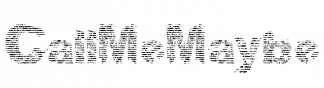
A distressed, textured font with a rugged, vintage look.
![CallMeMaybe font caratteri gratis]() Scaricare 474 Downloads@WebFont
Scaricare 474 Downloads@WebFont -
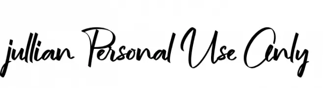
![jullian Personal Use Only font caratteri gratis]() Scaricare 474 Downloads@WebFont
Scaricare 474 Downloads@WebFont -
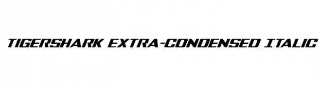
( Fonts by Daniel Zadorozny - www.iconian.com - Free for personal use )
A bold, extra-condensed italic font with a dynamic and modern style.
![Tigershark Extra-Condensed Italic font caratteri gratis]() Scaricare 474 Downloads@WebFont
Scaricare 474 Downloads@WebFont -
( Copyright (c) 2010, Danh Hong (khmertype.blogspot.com) )
A modern, geometric sans-serif font with uniform stroke widths and clear characters.
![Dangrek font caratteri gratis]() Scaricare 474 Downloads@WebFont
Scaricare 474 Downloads@WebFont -
( Copyright (c) 2011, Dan Sayers (i@iotic.com) )
A light, elegant serif font with a graceful italic slant.
![Averia Serif Libre Light Italic font caratteri gratis]() Scaricare 474 Downloads@WebFont
Scaricare 474 Downloads@WebFont -
( Fonts by a Max Infeld - XEROGRAPHER FONTS - xerographer.blogspot.com . Personal-use only. For commercial use please contact owner. )
A bold, distressed font with a grunge, vintage aesthetic.
![ThirdRail font caratteri gratis]() Scaricare 474 Downloads@WebFont
Scaricare 474 Downloads@WebFont -
( Fonts by www.aka-acid.com )
A bold, expressive handwritten font with dynamic strokes.
![Aka-AcidGR-Angry font caratteri gratis]() Scaricare 474 Downloads@WebFont
Scaricare 474 Downloads@WebFont -
( Download for Personal Use. For Commercial: http://www.k-type.com )
A bold, italic font with a modern and dynamic style.
![ExciteBoldItalic font caratteri gratis]() Scaricare 474 Downloads@WebFont
Scaricare 474 Downloads@WebFont -
( Fonts by www.typodermicfonts.com - Ray Larabie )
A modern, geometric sans-serif font with clean lines and uniform strokes.
![PakenhamRg-Regular font caratteri gratis]() Scaricare 474 Downloads@WebFont
Scaricare 474 Downloads@WebFont -
![Poor Little Peppina font caratteri gratis]() Scaricare 474 Downloads@WebFont
Scaricare 474 Downloads@WebFont -
![The Gwathmey font caratteri gratis]() Scaricare 474 Downloads@WebFont
Scaricare 474 Downloads@WebFont -
( Fonts by www.peter-wiegel.de. Personal-use only. For commercial use please contact owner. )
A playful, cursive font with elegant connections and a whimsical style.
![BienchenSAS-Regular font caratteri gratis]() Scaricare 474 Downloads@WebFont
Scaricare 474 Downloads@WebFont -
![ticker font caratteri gratis]() Scaricare 474 Downloads@WebFont
Scaricare 474 Downloads@WebFont -
( Fonts by feorag - Personal-use only. For commercial use please contact owner. )
A vintage, handcrafted font with a rustic and artistic style.
![Chapbook-Regular font caratteri gratis]() Scaricare 474 Downloads@WebFont
Scaricare 474 Downloads@WebFont -
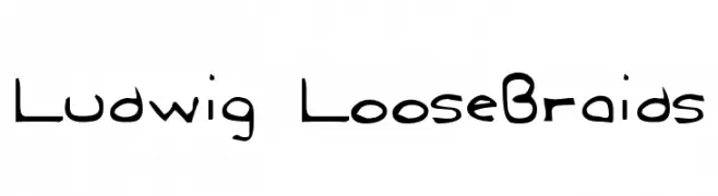
![Ludwig LooseBraids font caratteri gratis]() Scaricare 474 Downloads@WebFont
Scaricare 474 Downloads@WebFont -
( Fonts by Chris Glover - https://fontbundles.net/sunkissedminimalist - Personal-use only. For commercial use please contact owner. )
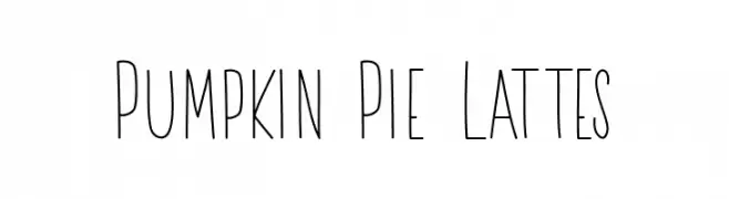
A playful, handwritten font with tall, narrow letters and a casual style.
![Pumpkin Pie Lattes font caratteri gratis]() Scaricare 474 Downloads@WebFont
Scaricare 474 Downloads@WebFont -
( Fonts by Roland Huse - rolandhuse.com )
A clean, minimalist font with thin, uniform lines and balanced spacing.
![poor weekdays font caratteri gratis]() Scaricare 474 Downloads@WebFont
Scaricare 474 Downloads@WebFont -
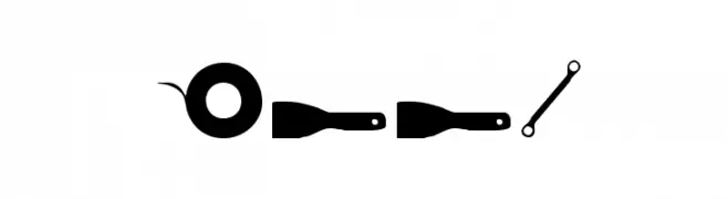
( Fonts by Daniel Zadorozny - www.iconian.com )
A decorative tool-themed font with each character depicted as a tool silhouette.
![Tool font caratteri gratis]() Scaricare 474 Downloads@WebFont
Scaricare 474 Downloads@WebFont -
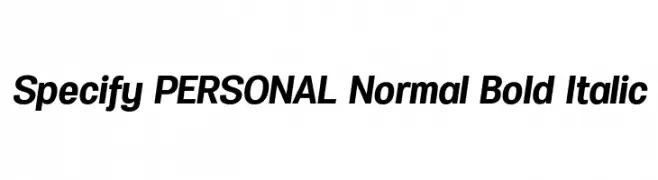
( Måns Grebäck - www.mansgreback.com )
A bold, italicized font with a modern and dynamic style.
![Specify PERSONAL Normal Bold Italic font caratteri gratis]() Scaricare 474 Downloads@WebFont
Scaricare 474 Downloads@WebFont -
( Fonts by Uli Steinwandel )
A bold, hand-drawn font with a rough, textured style and dynamic character shapes.
![Angst Medium font caratteri gratis]() Scaricare 474 Downloads@WebFont
Scaricare 474 Downloads@WebFont -
( Fonts by Hanoded )
A bold, brushstroke font with a textured, artistic style.
![DK Sushi Bar Regular font caratteri gratis]() Scaricare 474 Downloads@WebFont
Scaricare 474 Downloads@WebFont -
( Factory738 - creativemarket.com/factory738 )
A bold, geometric font with angular lines and tight spacing.
![Dalmation Demo font caratteri gratis]() Scaricare 474 Downloads@WebFont
Scaricare 474 Downloads@WebFont -
![Autocars & Rolling Bikes Italic font caratteri gratis]() Scaricare 474 Downloads@WebFont
Scaricare 474 Downloads@WebFont -
( Fonts by Manuel Ramos - www.infinitismo.com - Personal-use only. For commercial use please contact owner. )
A geometric, minimalist font with thin, angular strokes and a futuristic look.
![REGARD font caratteri gratis]() Scaricare 474 Downloads@WebFont
Scaricare 474 Downloads@WebFont -
![Rosewell Script Demo font caratteri gratis]() Scaricare 474 Downloads@WebFont
Scaricare 474 Downloads@WebFont -
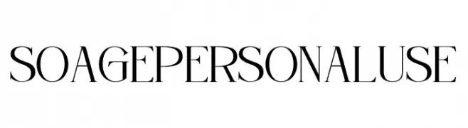
( Fonts by Din Studio - Donis Miftahudin - Personal-use only. For commercial use please contact owner. )
A sophisticated serif font with high contrast and elegant serifs.
![Soage Personal Use font caratteri gratis]() Scaricare 474 Downloads@WebFont
Scaricare 474 Downloads@WebFont -
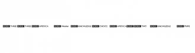
![BBC Striped Channel Logos font caratteri gratis]() Scaricare 473 Downloads@WebFont
Scaricare 473 Downloads@WebFont -
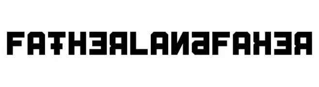
![Fatherland Faker font caratteri gratis]() Scaricare 473 Downloads@WebFont
Scaricare 473 Downloads@WebFont -
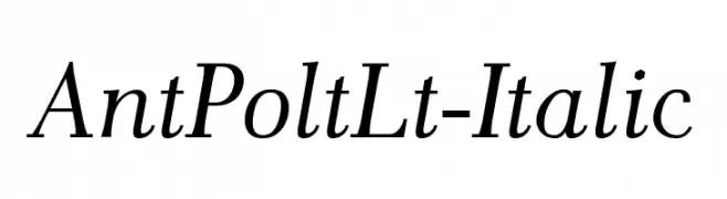
![AntPoltLt-Italic font caratteri gratis]() Scaricare 473 Downloads@WebFont
Scaricare 473 Downloads@WebFont -
![Vassallo Regular font caratteri gratis]() Scaricare 473 Downloads@WebFont
Scaricare 473 Downloads@WebFont


Quali sono i font più popolari adesso?
Poppins, Roboto, Montserrat, Open Sans e Lato sono molto usati per le forme pulite e l'ampia applicabilità — dall'identità di marca alle landing page e ai poster.
Quali font si usano spesso nei loghi?
Le sans serif geometriche (es. Poppins, famiglie in stile Gotham) sono scelte comuni per un branding pulito e scalabile. Per un tocco personale restano valide script e stili manoscritti. Abbina un display deciso per i titoli a un corpo testo neutro per riconoscibilità ed equilibrio.
Ogni quanto si aggiorna la lista?
Con regolarità, in base ai download e all'attività reale. Torna spesso per scoprire in anticipo le nuove preferite.
💡 Consiglio: aggiungi ai preferiti — le tendenze cambiano in fretta e i font top di oggi possono ispirare il rebranding di domani.