Benvenuto nelle Font Più Popolari — dove popolarità e qualità si incontrano. Qui trovi i font più scaricati e usati dell'anno. Se cerchi scelte sicure per logo, web o social, inizia da qui.
Ogni font top si distingue per equilibrio, leggibilità e versatilità. Troverai sans serif moderne, script eleganti, serif vintage e display minimalisti.
-
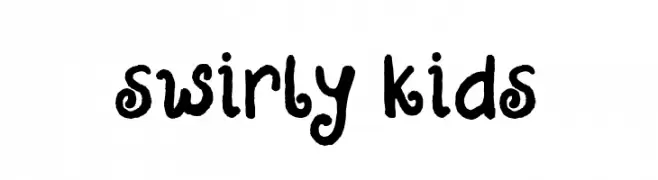
( Fonts by Atjcloth Studio )
A playful, hand-drawn font with swirly, childlike characteristics.
 Scaricare 85 Downloads@WebFont
 -
( Fonts by Mans Greback - Personal-use only. For commercial use please contact owner. )
A bold, modern serif font with dynamic strokes and sharp serifs.
![MollySerifCPERSONAL-Bold font caratteri gratis]() Scaricare 85 Downloads@WebFont
Scaricare 85 Downloads@WebFont -
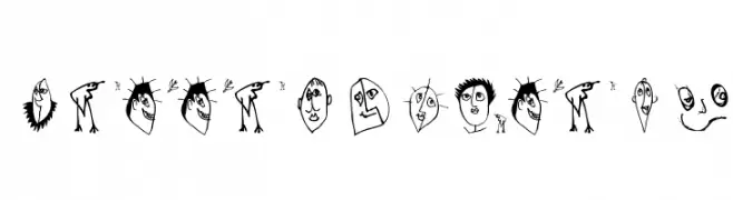
( Fonts by Vladimir Nikolic )
A novelty font composed of illustrated cow faces for each character.
![Prins Regular font caratteri gratis]() Scaricare 85 Downloads@WebFont
Scaricare 85 Downloads@WebFont -
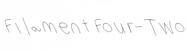
( Fonts by Cannot Into Space Fonts )
A playful, handwritten font with a casual and whimsical style.
![Filament Four-Two font caratteri gratis]() Scaricare 85 Downloads@WebFont
Scaricare 85 Downloads@WebFont -
( Fonts by Manfred Klein. Free for private and charity use. Free for commercial with donation to organizations )
A playful, hand-drawn font with whimsical, artistic characters.
![Zettelkasten15 font caratteri gratis]() Scaricare 85 Downloads@WebFont
Scaricare 85 Downloads@WebFont -
-
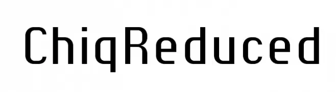
( ingoFonts - Ingo Zimmermann - www.ingofonts.com )
A modern, geometric sans-serif font with clean lines and uniform strokes.
![ChiqReduced font caratteri gratis]() Scaricare 85 Downloads@WebFont
Scaricare 85 Downloads@WebFont -
( Fonts by Storytype Studio )
A sophisticated script font with flowing, interconnected letters and elegant swirls.
![Bidalari Hearter font caratteri gratis]() Scaricare 85 Downloads@WebFont
Scaricare 85 Downloads@WebFont -
![PostIndexHand2 Bold font caratteri gratis]() Scaricare 85 Downloads@WebFont
Scaricare 85 Downloads@WebFont -
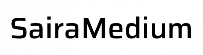
( Fonts by Omnibus Type )
A modern, geometric sans-serif font with a clean and professional appearance.
![Saira Medium font caratteri gratis]() Scaricare 85 Downloads@WebFont
Scaricare 85 Downloads@WebFont -
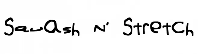
![Squash N' Stretch font caratteri gratis]() Scaricare 85 Downloads@WebFont
Scaricare 85 Downloads@WebFont


Quali sono i font più popolari adesso?
Poppins, Roboto, Montserrat, Open Sans e Lato sono molto usati per le forme pulite e l'ampia applicabilità — dall'identità di marca alle landing page e ai poster.
Quali font si usano spesso nei loghi?
Le sans serif geometriche (es. Poppins, famiglie in stile Gotham) sono scelte comuni per un branding pulito e scalabile. Per un tocco personale restano valide script e stili manoscritti. Abbina un display deciso per i titoli a un corpo testo neutro per riconoscibilità ed equilibrio.
Ogni quanto si aggiorna la lista?
Con regolarità, in base ai download e all'attività reale. Torna spesso per scoprire in anticipo le nuove preferite.
💡 Consiglio: aggiungi ai preferiti — le tendenze cambiano in fretta e i font top di oggi possono ispirare il rebranding di domani.