Benvenuto nelle Font Più Popolari — dove popolarità e qualità si incontrano. Qui trovi i font più scaricati e usati dell'anno. Se cerchi scelte sicure per logo, web o social, inizia da qui.
Ogni font top si distingue per equilibrio, leggibilità e versatilità. Troverai sans serif moderne, script eleganti, serif vintage e display minimalisti.
-
 Scaricare 85 Downloads@WebFont
 -
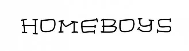
![homeboys font caratteri gratis]() Scaricare 85 Downloads@WebFont
Scaricare 85 Downloads@WebFont -
( Fonts by Zanatlija - Personal-use only. For commercial use please contact owner. )
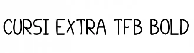
A playful, hand-drawn font with rounded edges and a whimsical style.
![cursi extra tfb bold font caratteri gratis]() Scaricare 85 Downloads@WebFont
Scaricare 85 Downloads@WebFont -
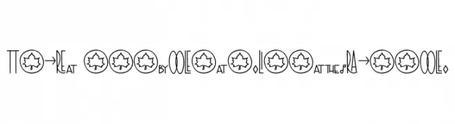
![TheRa-SymbolsandLigaturesBold font caratteri gratis]() Scaricare 85 Downloads@WebFont
Scaricare 85 Downloads@WebFont -
( Fonts by Matej Hofman - Personal-use only. For commercial use please contact owner. )
A pixelated, retro-style font with a digital display aesthetic.
![pixel point Regular font caratteri gratis]() Scaricare 85 Downloads@WebFont
Scaricare 85 Downloads@WebFont -
-
( Fonts by a Max Infeld - XEROGRAPHER FONTS - xerographer.blogspot.com . Personal-use only. For commercial use please contact owner. )
A bold, graffiti-inspired font with playful, dynamic characters and unique heart-shaped elements.
![HeartHole font caratteri gratis]() Scaricare 85 Downloads@WebFont
Scaricare 85 Downloads@WebFont -
( Fonts by Wino S Kadir - weknow - www.revolge.com/shop/weknow/ - Personal-use only. For commercial use please contact owner. )
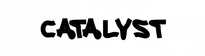
A bold, dynamic font with playful and energetic characters.
![CATALYST font caratteri gratis]() Scaricare 85 Downloads@WebFont
Scaricare 85 Downloads@WebFont -
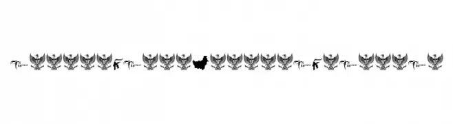
![IndonesianaKhatulistiwania font caratteri gratis]() Scaricare 85 Downloads@WebFont
Scaricare 85 Downloads@WebFont -
( Fonts by Manfred Klein. Free for private and charity use. Free for commercial with donation to organizations )
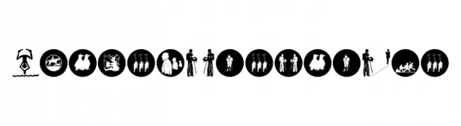
A pictorial silhouette font featuring human figures and group scenes.
![SilhouPeopleTwo font caratteri gratis]() Scaricare 85 Downloads@WebFont
Scaricare 85 Downloads@WebFont -
( Twicolabs Fontdation - Fahrizal Tawakkal - fontdation.com )
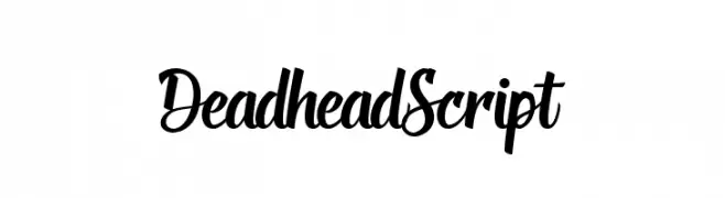
A bold, flowing script font with elegant, dynamic letterforms.
![DeadheadScript font caratteri gratis]() Scaricare 85 Downloads@WebFont
Scaricare 85 Downloads@WebFont

Quali sono i font più popolari adesso?
Poppins, Roboto, Montserrat, Open Sans e Lato sono molto usati per le forme pulite e l'ampia applicabilità — dall'identità di marca alle landing page e ai poster.
Quali font si usano spesso nei loghi?
Le sans serif geometriche (es. Poppins, famiglie in stile Gotham) sono scelte comuni per un branding pulito e scalabile. Per un tocco personale restano valide script e stili manoscritti. Abbina un display deciso per i titoli a un corpo testo neutro per riconoscibilità ed equilibrio.
Ogni quanto si aggiorna la lista?
Con regolarità, in base ai download e all'attività reale. Torna spesso per scoprire in anticipo le nuove preferite.
💡 Consiglio: aggiungi ai preferiti — le tendenze cambiano in fretta e i font top di oggi possono ispirare il rebranding di domani.