Benvenuto nelle Font Più Popolari — dove popolarità e qualità si incontrano. Qui trovi i font più scaricati e usati dell'anno. Se cerchi scelte sicure per logo, web o social, inizia da qui.
Ogni font top si distingue per equilibrio, leggibilità e versatilità. Troverai sans serif moderne, script eleganti, serif vintage e display minimalisti.
-
 Scaricare 470 Downloads@WebFont
 -
( Fonts by dartcanada.tripod.com - Darren Rigby )
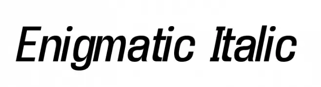
A sleek, modern italic font with clean lines and consistent stroke width.
![Enigmatic Italic font caratteri gratis]() Scaricare 470 Downloads
Scaricare 470 Downloads -
( Fonts by Graham Meade - GemFonts )
A bold, jagged font with a dynamic, energetic style.
![WTF font caratteri gratis]() Scaricare 470 Downloads@WebFont
Scaricare 470 Downloads@WebFont -
Caratteri di NicholasJudy456. For commercial use please contact the owner.
( Here's More of the House Fonts )
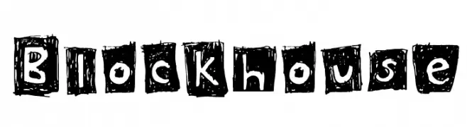
A bold, hand-drawn font with a textured, block-like appearance.
![Blockhouse font caratteri gratis]() Scaricare 470 Downloads@WebFont
Scaricare 470 Downloads@WebFont -
( Fonts by Nick Curtis - www.nicksfonts.com )
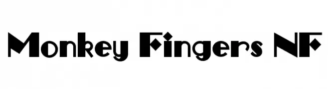
A bold, geometric font with playful and artistic elements.
![Monkey Fingers NF font caratteri gratis]() Scaricare 470 Downloads@WebFont
Scaricare 470 Downloads@WebFont -
( THESE ARE SHAREWARE FONTS ! NOT FREEWARE ! PLEASE VISIT www.fuelfonts.com )
A bold, futuristic font with geometric shapes and star embellishments.
![ion font caratteri gratis]() Scaricare 470 Downloads@WebFont
Scaricare 470 Downloads@WebFont -
( Fonts by Mocha Frappuccino - Personal-use only. For commercial use please contact owner. )
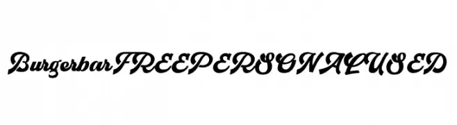
A bold, dynamic script font with sweeping curves and dramatic slants.
![Burgerbar FREE PERSONAL USED font caratteri gratis]() Scaricare 470 Downloads@WebFont
Scaricare 470 Downloads@WebFont -
( Fonts by Kong Font )
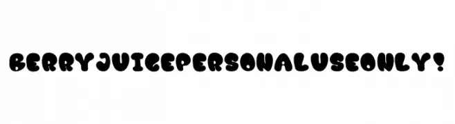
A playful, bold font with rounded, bubble-like characters.
![Berry Juice PERSONAL USE ONLY! font caratteri gratis]() Scaricare 470 Downloads@WebFont
Scaricare 470 Downloads@WebFont -
( Fonts by www.DigitalDreamDesign.net )
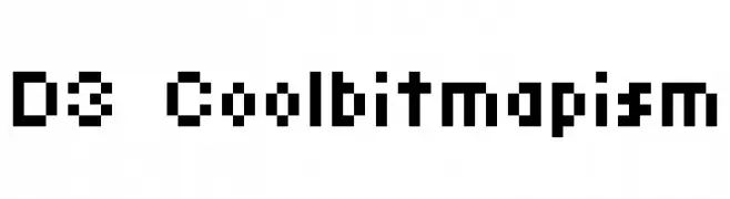
A pixelated, retro-style font with a digital, tech-inspired aesthetic.
![D3 Coolbitmapism font caratteri gratis]() Scaricare 470 Downloads@WebFont
Scaricare 470 Downloads@WebFont -
![Little Jack font caratteri gratis]() Scaricare 470 Downloads@WebFont
Scaricare 470 Downloads@WebFont -
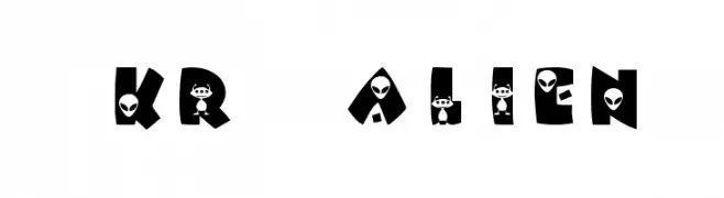
![KR Alien font caratteri gratis]() Scaricare 470 Downloads@WebFont
Scaricare 470 Downloads@WebFont -
( Fonts by Daniel Zadorozny - www.iconian.com - Free for personal use )
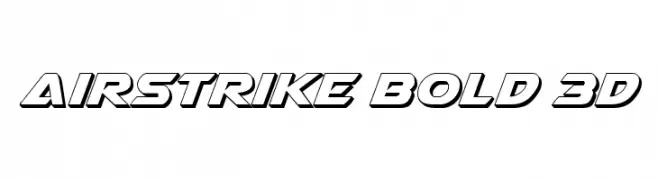
A bold, 3D font with angular lines and a shadowed effect for depth.
![Airstrike Bold 3D font caratteri gratis]() Scaricare 470 Downloads@WebFont
Scaricare 470 Downloads@WebFont -
( Zetafonts - www.zetafonts.com )
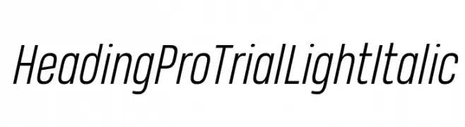
A sleek, modern, light italic font with a slightly condensed style.
![Heading Pro Trial Light Italic font caratteri gratis]() Scaricare 470 Downloads@WebFont
Scaricare 470 Downloads@WebFont -
( Fonts by Perspectype Studio - Letterena.com - Personal-use only. For commercial use please contact owner. )
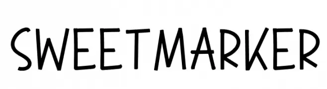
A playful, hand-drawn marker-style font with a casual and friendly appearance.
![SWEET MARKER font caratteri gratis]() Scaricare 470 Downloads@WebFont
Scaricare 470 Downloads@WebFont -
( Fonts by Manushi Parikh, Satya Rajpurohit - Personal-use only. For commercial use please contact owner. )
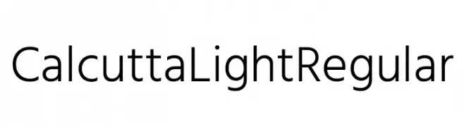
A clean, modern sans-serif font with uniform geometric letterforms.
![Calcutta Light Regular font caratteri gratis]() Scaricare 470 Downloads@WebFont
Scaricare 470 Downloads@WebFont -
( Fonts by Darcy Baldwin - darcybaldwin.com. Free for personal use only )
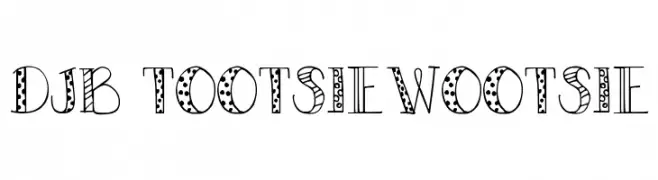
A playful, decorative font with polka dots and stripes, perfect for creative projects.
![DJB TOOTSIEWOOTSIE font caratteri gratis]() Scaricare 470 Downloads@WebFont
Scaricare 470 Downloads@WebFont -
( Fonts by ShyFonts )
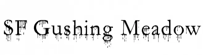
A bold, dripping font with a gothic flair and high contrast strokes.
![SF Gushing Meadow font caratteri gratis]() Scaricare 470 Downloads@WebFont
Scaricare 470 Downloads@WebFont -
( Fonts by Creative Lab - Creative LAB - Personal-use only. For commercial use please contact owner. )
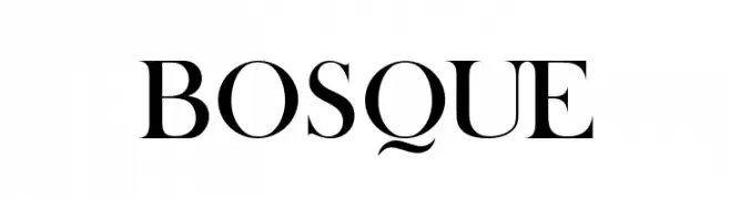
A classic serif font with elegant strokes and refined serifs.
![BOSQUE font caratteri gratis]() Scaricare 470 Downloads@WebFont
Scaricare 470 Downloads@WebFont -
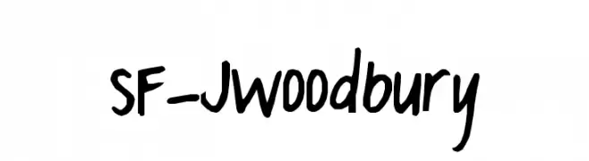
![SF-JWoodbury font caratteri gratis]() Scaricare 470 Downloads@WebFont
Scaricare 470 Downloads@WebFont -
![Himchuli Bold font caratteri gratis]() Scaricare 470 Downloads@WebFont
Scaricare 470 Downloads@WebFont -
( Fonts by Noah Type - noahtype.com - Personal-use only. For commercial use please contact owner. )
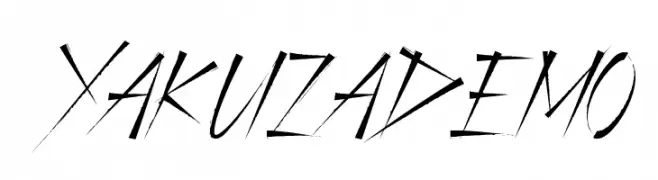
A dynamic, edgy font with sharp, angular strokes and a hand-drawn feel.
![Yakuza Demo font caratteri gratis]() Scaricare 470 Downloads@WebFont
Scaricare 470 Downloads@WebFont -
( Fonts by Sharkshock )
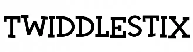
A playful, bold font with quirky serifs and a lively twist.
![Twiddlestix font caratteri gratis]() Scaricare 470 Downloads@WebFont
Scaricare 470 Downloads@WebFont -
( Typodermic Fonts - Ray Larabie - www.typodermicfonts.com/ )
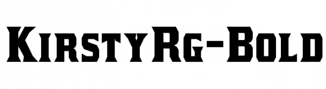
A bold, angular font with a vintage yet modern style, perfect for striking headlines.
![KirstyRg-Bold font caratteri gratis]() Scaricare 470 Downloads@WebFont
Scaricare 470 Downloads@WebFont -
( Fonts by Yadhie Setiawan - typelinestudio.com - Personal-use only. For commercial use please contact owner. )
A dynamic and fluid script font with elegant, flowing strokes.
![Benthol font caratteri gratis]() Scaricare 470 Downloads@WebFont
Scaricare 470 Downloads@WebFont -
( Fonts by Kirk Shelton - www.kirkshelton.com )
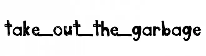
A playful, hand-drawn font with a rough, textured appearance.
![take_out_the_garbage font caratteri gratis]() Scaricare 470 Downloads@WebFont
Scaricare 470 Downloads@WebFont -
( Copyright (c) 2011, Agustina Mingote (agustinamingote@gmail.com) )
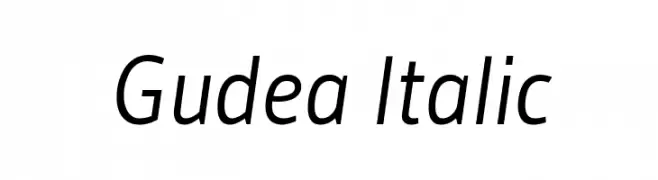
A modern sans-serif italic font with clean lines and balanced proportions.
![Gudea Italic font caratteri gratis]() Scaricare 470 Downloads@WebFont
Scaricare 470 Downloads@WebFont -
( Fonts by backpacker.gr )
A bold, italicized font with high contrast and tight spacing, perfect for impactful designs.
![BPDiet-UltraBlackItalic font caratteri gratis]() Scaricare 470 Downloads@WebFont
Scaricare 470 Downloads@WebFont -
( Copyright (c) 2011 by Sorkin Type Co (www.sorkintype.com) )
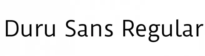
A clean, modern sans-serif typeface with balanced proportions and excellent readability.
![Duru Sans Regular font caratteri gratis]() Scaricare 470 Downloads@WebFont
Scaricare 470 Downloads@WebFont -
( Fonts by Paul Reid - tracertong.co.uk )
A bold, playful font with a hand-drawn, whimsical style.
![LuggerBug font caratteri gratis]() Scaricare 470 Downloads
Scaricare 470 Downloads -
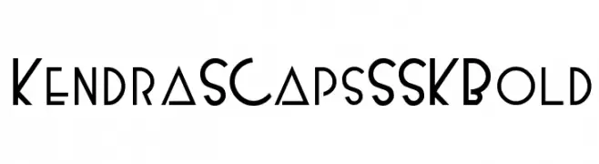
![KendraSCapsSSK Bold font caratteri gratis]() Scaricare 470 Downloads@WebFont
Scaricare 470 Downloads@WebFont -
![Ofaly Demo font caratteri gratis]() Scaricare 470 Downloads@WebFont
Scaricare 470 Downloads@WebFont -
( Fonts by Daniel Zadorozny - www.iconian.com - Free for personal use )
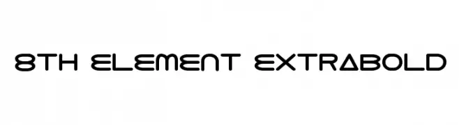
A futuristic, geometric font with bold, rounded characters and minimal contrast.
![8th Element ExtraBold font caratteri gratis]() Scaricare 470 Downloads@WebFont
Scaricare 470 Downloads@WebFont -
( Fonts by Brittney Murphy Design )
A playful handwritten font with a pencil sketch style.
![[Pencilized] font caratteri gratis]() Scaricare 470 Downloads@WebFont
Scaricare 470 Downloads@WebFont -
( Fonts by Inermedia Studio )
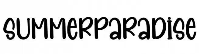
A playful, bold font with rounded, smooth letterforms and a whimsical, handwritten style.
![Summer Paradise font caratteri gratis]() Scaricare 470 Downloads@WebFont
Scaricare 470 Downloads@WebFont -
![chunk font caratteri gratis]() Scaricare 470 Downloads@WebFont
Scaricare 470 Downloads@WebFont


![[Pencilized] font caratteri gratis](https://d144mzi0q5mijx.cloudfront.net/img/0/P/Pencilized.webp)

Quali sono i font più popolari adesso?
Poppins, Roboto, Montserrat, Open Sans e Lato sono molto usati per le forme pulite e l'ampia applicabilità — dall'identità di marca alle landing page e ai poster.
Quali font si usano spesso nei loghi?
Le sans serif geometriche (es. Poppins, famiglie in stile Gotham) sono scelte comuni per un branding pulito e scalabile. Per un tocco personale restano valide script e stili manoscritti. Abbina un display deciso per i titoli a un corpo testo neutro per riconoscibilità ed equilibrio.
Ogni quanto si aggiorna la lista?
Con regolarità, in base ai download e all'attività reale. Torna spesso per scoprire in anticipo le nuove preferite.
💡 Consiglio: aggiungi ai preferiti — le tendenze cambiano in fretta e i font top di oggi possono ispirare il rebranding di domani.