Benvenuto nelle Font Più Popolari — dove popolarità e qualità si incontrano. Qui trovi i font più scaricati e usati dell'anno. Se cerchi scelte sicure per logo, web o social, inizia da qui.
Ogni font top si distingue per equilibrio, leggibilità e versatilità. Troverai sans serif moderne, script eleganti, serif vintage e display minimalisti.
-
( Fonts by Greg Medina - www.dcoxy.com - Personal-use only. For commercial use please contact owner. )
A bold, elegant script font with ornate swashes and flowing curves.
 Scaricare 83 Downloads@WebFont
 -
( Fonts by Makashi - Maqsum Kamil - Personal-use only. For commercial use please contact owner. )
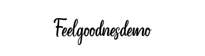
A lively and elegant script font with fluid, connected letterforms.
![Feelgoodnes_demo font caratteri gratis]() Scaricare 83 Downloads@WebFont
Scaricare 83 Downloads@WebFont -
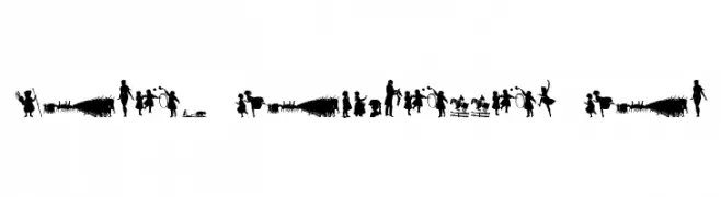
![Mixed Silhouettes Six font caratteri gratis]() Scaricare 83 Downloads@WebFont
Scaricare 83 Downloads@WebFont -
( weknow - Wino S Kadir - www.creativefabrica.com/designer/weknow/ )
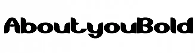
A bold, playful font with thick, rounded strokes and a dynamic style.
![About you Bold font caratteri gratis]() Scaricare 83 Downloads@WebFont
Scaricare 83 Downloads@WebFont -
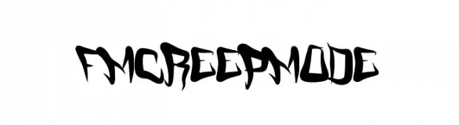
![FMCreepMode font caratteri gratis]() Scaricare 83 Downloads@WebFont
Scaricare 83 Downloads@WebFont -
-
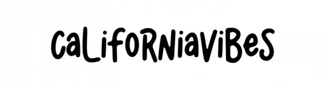
( Fonts by Alpaprana - Personal-use only. For commercial use please contact owner. )
A playful, bold, and rounded font with a casual and dynamic style.
![California Vibes font caratteri gratis]() Scaricare 83 Downloads@WebFont
Scaricare 83 Downloads@WebFont -
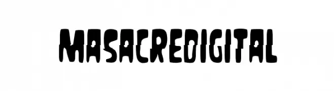
( Fonts by Woodcutter )
A bold, distressed font with a grunge aesthetic and irregular edges.
![Masacre Digital font caratteri gratis]() Scaricare 83 Downloads@WebFont
Scaricare 83 Downloads@WebFont -
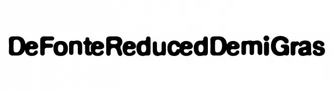
( Fonts by ingoFonts - Ingo Zimmermann - Personal-use only. For commercial use please contact owner. )
A bold, rounded font with a playful and approachable style.
![DeFonte Reduced DemiGras font caratteri gratis]() Scaricare 83 Downloads@WebFont
Scaricare 83 Downloads@WebFont -
( Fonts by blue studio09 - Personal-use only. For commercial use please contact owner. )
A sophisticated script font with flowing, interconnected letters and elegant flourishes.
![Carllitos font caratteri gratis]() Scaricare 83 Downloads@WebFont
Scaricare 83 Downloads@WebFont -
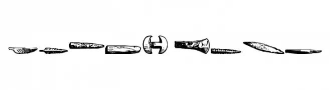
![Stone Army font caratteri gratis]() Scaricare 83 Downloads@WebFont
Scaricare 83 Downloads@WebFont

Quali sono i font più popolari adesso?
Poppins, Roboto, Montserrat, Open Sans e Lato sono molto usati per le forme pulite e l'ampia applicabilità — dall'identità di marca alle landing page e ai poster.
Quali font si usano spesso nei loghi?
Le sans serif geometriche (es. Poppins, famiglie in stile Gotham) sono scelte comuni per un branding pulito e scalabile. Per un tocco personale restano valide script e stili manoscritti. Abbina un display deciso per i titoli a un corpo testo neutro per riconoscibilità ed equilibrio.
Ogni quanto si aggiorna la lista?
Con regolarità, in base ai download e all'attività reale. Torna spesso per scoprire in anticipo le nuove preferite.
💡 Consiglio: aggiungi ai preferiti — le tendenze cambiano in fretta e i font top di oggi possono ispirare il rebranding di domani.