Benvenuto nelle Font Più Popolari — dove popolarità e qualità si incontrano. Qui trovi i font più scaricati e usati dell'anno. Se cerchi scelte sicure per logo, web o social, inizia da qui.
Ogni font top si distingue per equilibrio, leggibilità e versatilità. Troverai sans serif moderne, script eleganti, serif vintage e display minimalisti.
-
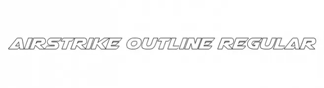
( Fonts by Daniel Zadorozny - www.iconian.com - Free for personal use )
A bold, geometric outline font with a futuristic and dynamic style.
 Scaricare 469 Downloads@WebFont
 -
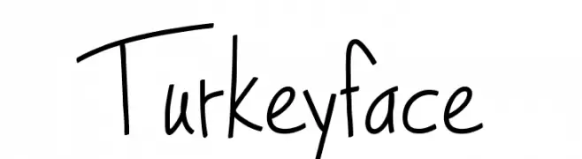
( Fonts by Lee Batchelor http://leeviathan.com/portfolio/fonts/ )
A playful, handwritten font with a casual and whimsical style.
![Turkeyface font caratteri gratis]() Scaricare 469 Downloads@WebFont
Scaricare 469 Downloads@WebFont -
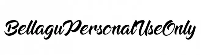
( Fonts by Ahmad Rofingi - AR Studio - Personal-use only. For commercial use please contact owner. )
An elegant, flowing script font with bold, cursive strokes.
![Bellagu Personal Use Only font caratteri gratis]() Scaricare 469 Downloads@WebFont
Scaricare 469 Downloads@WebFont -
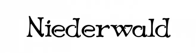
![Niederwald font caratteri gratis]() Scaricare 469 Downloads@WebFont
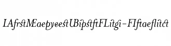
Scaricare 469 Downloads@WebFont -
![MrsEavesJustLig-Italic font caratteri gratis]() Scaricare 469 Downloads
Scaricare 469 Downloads -
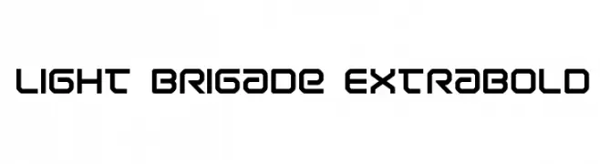
( Iconian Fonts - Daniel Zadorozny - www.iconian.com )
A bold, geometric font with a modern and futuristic style.
![Light Brigade ExtraBold font caratteri gratis]() Scaricare 469 Downloads@WebFont
Scaricare 469 Downloads@WebFont -
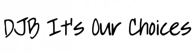
![DJB It's Our Choices font caratteri gratis]() Scaricare 469 Downloads@WebFont
Scaricare 469 Downloads@WebFont -
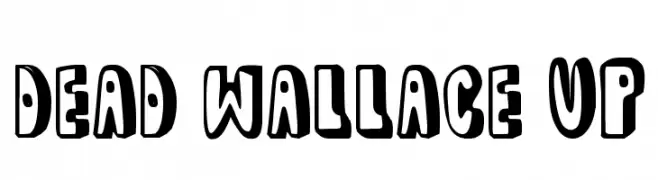
( Fonts by www.paintblackeditions.org - Free for personal use only )
A bold, playful font with a cartoonish, three-dimensional style.
![dead wallace UP font caratteri gratis]() Scaricare 469 Downloads@WebFont
Scaricare 469 Downloads@WebFont -
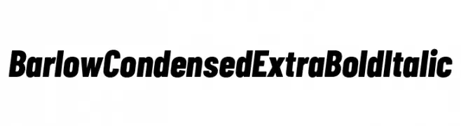
( Fonts by Tribby )
A bold, condensed, and italic sans-serif font with high contrast and tight spacing.
![Barlow Condensed ExtraBold Italic font caratteri gratis]() Scaricare 469 Downloads@WebFont
Scaricare 469 Downloads@WebFont -
( Fonts by Fikry Alif - Fikryal studio - https://www.creativefabrica.com/designer/mfikryalif/ref/222304/ - Personal-use only. For commercial use please contact owner. )
A lively, expressive handwritten font with fluid strokes.
![Bethoven font caratteri gratis]() Scaricare 469 Downloads@WebFont
Scaricare 469 Downloads@WebFont -
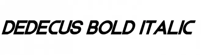
( Fonts by Chris Vile - fontmonger.com - Personal-use only. For commercial use please contact owner. )
A bold, italicized font with angular lines and a modern, futuristic style.
![Dedecus Bold Italic font caratteri gratis]() Scaricare 469 Downloads@WebFont
Scaricare 469 Downloads@WebFont -
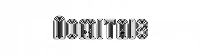
( Fonts by www.peter-wiegel.de. Personal-use only. For commercial use please contact owner. )
A bold, decorative font with triple-line outlines and geometric structure.
![Nomitais font caratteri gratis]() Scaricare 469 Downloads@WebFont
Scaricare 469 Downloads@WebFont -
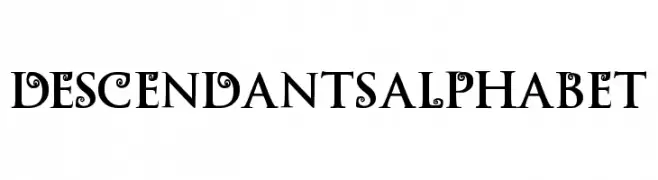
![Descendants Alphabet font caratteri gratis]() Scaricare 469 Downloads@WebFont
Scaricare 469 Downloads@WebFont -
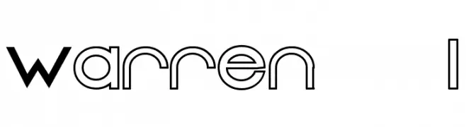
![Warren 1 font caratteri gratis]() Scaricare 469 Downloads@WebFont
Scaricare 469 Downloads@WebFont -
( Fonts by BLKBK Fonts - www.blkbk.shop - Personal-use only. For commercial use please contact owner. Commerciali Caratteri )
A bold, hand-drawn font with a rustic and organic feel.
![Hall Trash font caratteri gratis]() Scaricare 469 Downloads
Scaricare 469 Downloads -
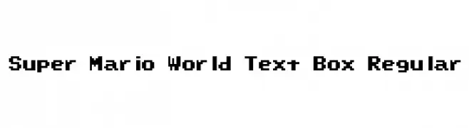
![Super Mario World Text Box Regular font caratteri gratis]() Scaricare 469 Downloads@WebFont
Scaricare 469 Downloads@WebFont -
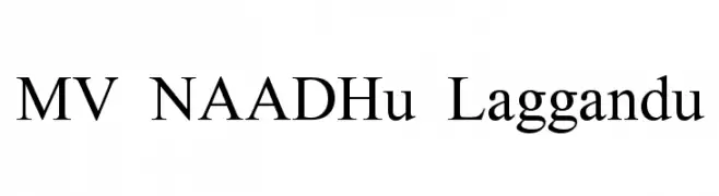
![MV NAADHu Laggandu font caratteri gratis]() Scaricare 469 Downloads@WebFont
Scaricare 469 Downloads@WebFont -
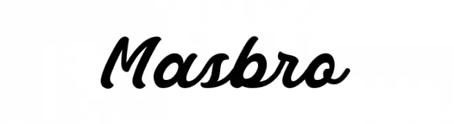
( 7NTypes - Situjuh Nazara - 7ntypes.com )
A bold, flowing script font with elegant, cursive letterforms.
![Masbro font caratteri gratis]() Scaricare 469 Downloads@WebFont
Scaricare 469 Downloads@WebFont -
( Free for a personal use. For a commercial use please visit www.kevinandamanda.com )
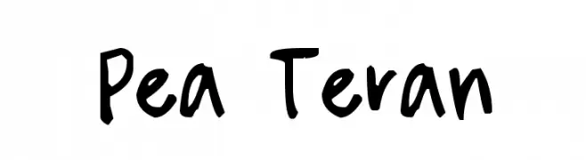
A bold, handwritten font with a playful and informal style.
![Pea Teran font caratteri gratis]() Scaricare 469 Downloads@WebFont
Scaricare 469 Downloads@WebFont -
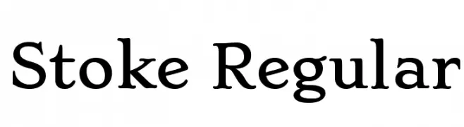
( Copyright (c) 2011 by Sorkin Type Co (www.sorkintype.com), with Reserved Font Name "Stoke". )
A classic serif typeface with elegant curves and moderate contrast.
![Stoke Regular font caratteri gratis]() Scaricare 469 Downloads@WebFont
Scaricare 469 Downloads@WebFont -
( Fonts by Paul Reid - tracertong.co.uk )
A bold, playful font with a hand-drawn, whimsical style.
![LuggerBug font caratteri gratis]() Scaricare 469 Downloads
Scaricare 469 Downloads -
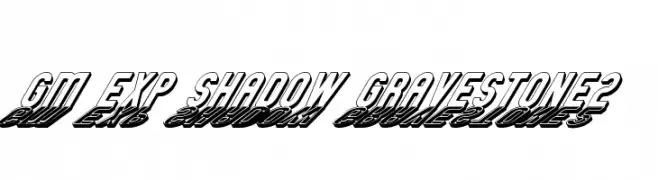
![GM Exp Shadow Gravestone2 font caratteri gratis]() Scaricare 469 Downloads@WebFont
Scaricare 469 Downloads@WebFont -
( Fonts by Katatrad Team - Personal-use only. For commercial use please contact owner. )
A bold, italic font with a strong, dynamic presence.
![Readiness ExtraBold Italic font caratteri gratis]() Scaricare 469 Downloads@WebFont
Scaricare 469 Downloads@WebFont -
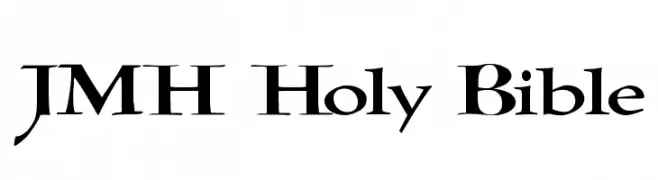
![JMH Holy Bible font caratteri gratis]() Scaricare 469 Downloads@WebFont
Scaricare 469 Downloads@WebFont -
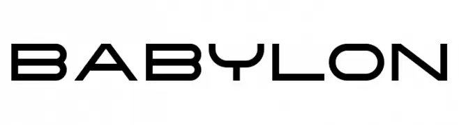
( Fonts by Haksen Studio - Sarwo Edhi Prayitno - Personal-use only. For commercial use please contact owner. )
A modern, geometric font with a futuristic and sleek design.
![Babylon font caratteri gratis]() Scaricare 469 Downloads@WebFont
Scaricare 469 Downloads@WebFont -
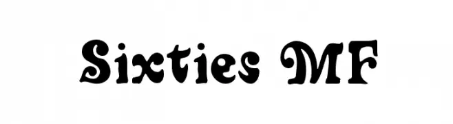
![Sixties MF font caratteri gratis]() Scaricare 469 Downloads@WebFont
Scaricare 469 Downloads@WebFont -
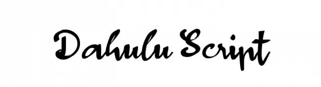
( Fonts by Wahyu Eka Prasetya - wepfont.com - Personal-use only. For commercial use please contact owner. )
A bold, expressive script font with dynamic calligraphic flair.
![Dahulu Script font caratteri gratis]() Scaricare 469 Downloads@WebFont
Scaricare 469 Downloads@WebFont -
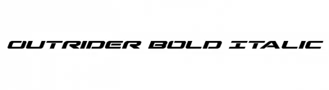
( Fonts by Daniel Zadorozny - www.iconian.com )
A bold, italicized font with a futuristic and dynamic style.
![Outrider Bold Italic font caratteri gratis]() Scaricare 469 Downloads@WebFont
Scaricare 469 Downloads@WebFont -
![persische Keilschrift font caratteri gratis]() Scaricare 469 Downloads@WebFont
Scaricare 469 Downloads@WebFont -
( Fonts by a Max Infeld - XEROGRAPHER FONTS - xerographer.blogspot.com . Personal-use only. For commercial use please contact owner. )
A bold, distressed font with a cracked texture for an edgy look.
![ElectricalNeue font caratteri gratis]() Scaricare 469 Downloads@WebFont
Scaricare 469 Downloads@WebFont -
( Fonts by www.urbanhookupz.com )
A bold graffiti-style font with dynamic, energetic characters.
![MESTIZOS UNIDOS -URBAN HOOKUPZ font caratteri gratis]() Scaricare 469 Downloads@WebFont
Scaricare 469 Downloads@WebFont -
( Fonts by Tlatous Type )
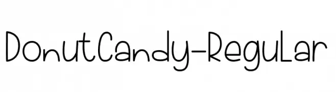
A playful, handwritten font with a casual and friendly appearance.
![DonutCandy-Regular font caratteri gratis]() Scaricare 469 Downloads@WebFont
Scaricare 469 Downloads@WebFont -
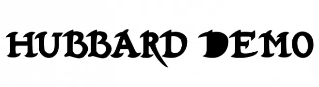
![Hubbard Demo font caratteri gratis]() Scaricare 469 Downloads@WebFont
Scaricare 469 Downloads@WebFont -
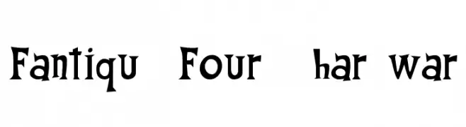
![Fantique Four Shareware font caratteri gratis]() Scaricare 469 Downloads@WebFont
Scaricare 469 Downloads@WebFont -
![Spork Thug font caratteri gratis]() Scaricare 469 Downloads@WebFont
Scaricare 469 Downloads@WebFont


Quali sono i font più popolari adesso?
Poppins, Roboto, Montserrat, Open Sans e Lato sono molto usati per le forme pulite e l'ampia applicabilità — dall'identità di marca alle landing page e ai poster.
Quali font si usano spesso nei loghi?
Le sans serif geometriche (es. Poppins, famiglie in stile Gotham) sono scelte comuni per un branding pulito e scalabile. Per un tocco personale restano valide script e stili manoscritti. Abbina un display deciso per i titoli a un corpo testo neutro per riconoscibilità ed equilibrio.
Ogni quanto si aggiorna la lista?
Con regolarità, in base ai download e all'attività reale. Torna spesso per scoprire in anticipo le nuove preferite.
💡 Consiglio: aggiungi ai preferiti — le tendenze cambiano in fretta e i font top di oggi possono ispirare il rebranding di domani.