Benvenuto nelle Font Più Popolari — dove popolarità e qualità si incontrano. Qui trovi i font più scaricati e usati dell'anno. Se cerchi scelte sicure per logo, web o social, inizia da qui.
Ogni font top si distingue per equilibrio, leggibilità e versatilità. Troverai sans serif moderne, script eleganti, serif vintage e display minimalisti.
-
( Fonts by James Kilfiger - Personal-use only. For commercial use please contact owner. )
A modern, rounded font with uniform stroke width and excellent readability.
 Scaricare 468 Downloads@WebFont
 -
( Fonts by Daniel Zadorozny - www.iconian.com - Free for personal use )
A bold, italicized font with smooth, rounded strokes and an extended form.
![Action Man Extended Italic font caratteri gratis]() Scaricare 468 Downloads@WebFont
Scaricare 468 Downloads@WebFont -
( Fonts by Billy Argel - Personal-use only. For commercial use please contact owner. )
A bold, vintage-style font with thick, angular letters.
![BEARDBONE PERSONAL USE font caratteri gratis]() Scaricare 468 Downloads@WebFont
Scaricare 468 Downloads@WebFont -
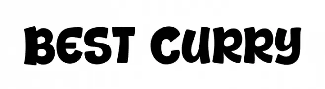
( Fonts by Khurasan )
A bold, rounded font with a playful and energetic style.
![Best Curry font caratteri gratis]() Scaricare 468 Downloads@WebFont
Scaricare 468 Downloads@WebFont -
( Fonts by imagex )
A bold, distressed font with a cracked effect, perfect for impactful designs.
![Crunchy Time font caratteri gratis]() Scaricare 468 Downloads@WebFont
Scaricare 468 Downloads@WebFont -
Caratteri di defharo. For commercial use please contact the owner.
![TheBlackBox font caratteri gratis]() Scaricare 468 Downloads@WebFont
Scaricare 468 Downloads@WebFont -
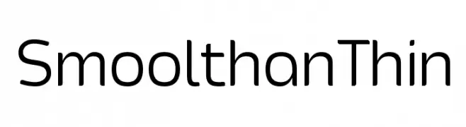
( Fonts by a Situjuh Nazara - c7n1.wordpress.com. Personal-use only. For commercial use please contact owner. )
A modern, thin sans-serif font with clean lines and a minimalist design.
![Smoolthan Thin font caratteri gratis]() Scaricare 468 Downloads@WebFont
Scaricare 468 Downloads@WebFont -
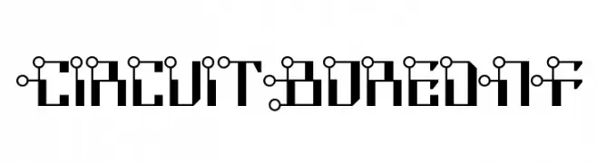
( Fonts by Nick Curtis - www.nicksfonts.com )
A futuristic, circuit-inspired font with bold geometric shapes and mechanical aesthetics.
![CircuitBoredNF font caratteri gratis]() Scaricare 468 Downloads@WebFont
Scaricare 468 Downloads@WebFont -
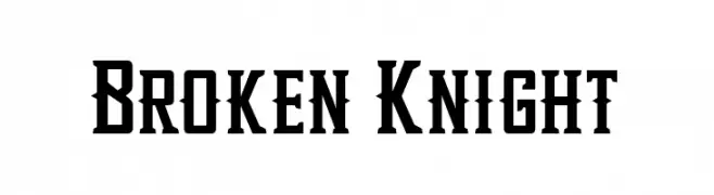
( Fonts by EkoZero7 - Personal-use only. For commercial use please contact owner. )
A bold, angular serif font with a gothic influence and high contrast.
![Broken Knight font caratteri gratis]() Scaricare 468 Downloads@WebFont
Scaricare 468 Downloads@WebFont -
( Fonts by Mocha Frappuccino - Personal-use only. For commercial use please contact owner. )
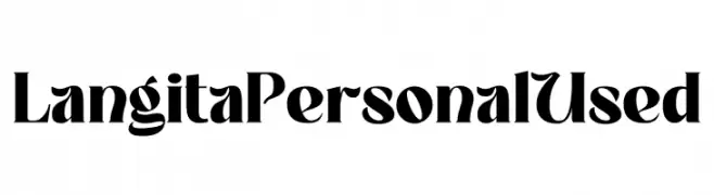
A bold, high-contrast font with dramatic serifs and elegant curves.
![Langita Personal Used font caratteri gratis]() Scaricare 468 Downloads@WebFont
Scaricare 468 Downloads@WebFont -
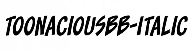
( Fonts by www.blambot.com )
A bold, italicized font with a playful, cartoonish style.
![ToonaciousBB-Italic font caratteri gratis]() Scaricare 468 Downloads@WebFont
Scaricare 468 Downloads@WebFont -
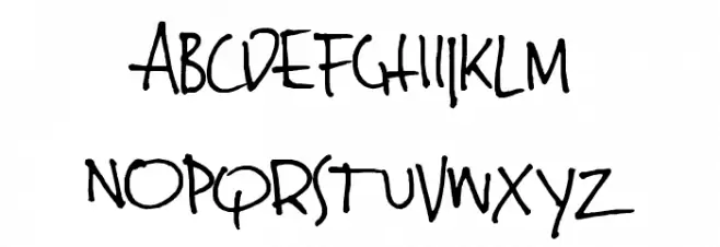
( Fonts by or from www.graffitifonts.net )
A playful, informal handwritten font with a whimsical style.
![JinkyA font caratteri gratis]() Scaricare 468 Downloads@WebFont
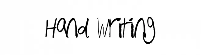
Scaricare 468 Downloads@WebFont -
![Hand Writing font caratteri gratis]() Scaricare 468 Downloads@WebFont
Scaricare 468 Downloads@WebFont -
( Fonts by David Kerkhoff - www.hanodedphotography.com )
A bold, expressive handwritten font with fluid strokes and a playful style.
![Same Same But Different font caratteri gratis]() Scaricare 468 Downloads@WebFont
Scaricare 468 Downloads@WebFont -
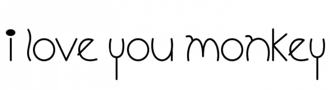
![I Love You Monkey font caratteri gratis]() Scaricare 468 Downloads@WebFont
Scaricare 468 Downloads@WebFont -
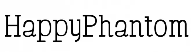
( Free for Personal Use. To use commercially please visit the http://www.nymFont.com )
A modern serif font with clean lines and balanced proportions.
![HappyPhantom font caratteri gratis]() Scaricare 468 Downloads@WebFont
Scaricare 468 Downloads@WebFont -
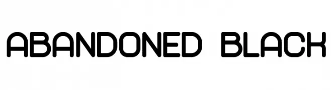
( Vladimir Nikolic - www.coroflot.com/vladimirnikolic )
A bold, rounded font with a modern and clean aesthetic.
![Abandoned Black font caratteri gratis]() Scaricare 468 Downloads@WebFont
Scaricare 468 Downloads@WebFont -
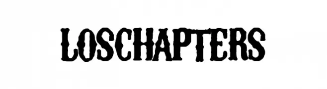
( Fonts by Woodcutter Manero - www.woodcutter.es - Personal-use only. For commercial use please contact owner. )
A bold, textured font with a vintage, distressed style.
![Los Chapters font caratteri gratis]() Scaricare 468 Downloads@WebFont
Scaricare 468 Downloads@WebFont -
Caratteri di typotopia. For commercial use please contact the owner.
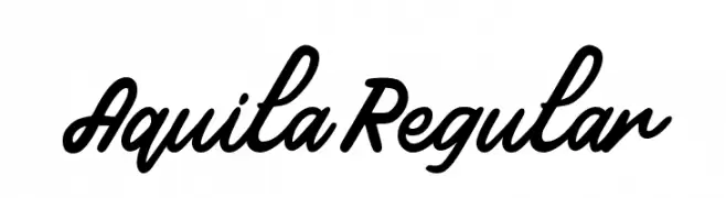
( Fonts by Typotopia - Typotopia.co - Personal Use Only, for Commercial Use, please contact us )
A bold, flowing script font with a natural handwriting style.
![Aquila Regular font caratteri gratis]() Scaricare 468 Downloads@WebFont
Scaricare 468 Downloads@WebFont -
![KR Wings of Love font caratteri gratis]() Scaricare 468 Downloads@WebFont
Scaricare 468 Downloads@WebFont -
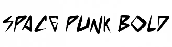
( Free for personal use - www.pressgang-studios.com )
A bold, angular font with a futuristic and edgy style.
![space punk Bold font caratteri gratis]() Scaricare 468 Downloads@WebFont
Scaricare 468 Downloads@WebFont -
![Caledo-Light font caratteri gratis]() Scaricare 468 Downloads@WebFont
Scaricare 468 Downloads@WebFont -
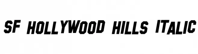
( Fonts by ShyFonts )
A bold, italic font with sharp angles and a modern, dynamic style.
![SF Hollywood Hills Italic font caratteri gratis]() Scaricare 468 Downloads@WebFont
Scaricare 468 Downloads@WebFont -
( http://www.typhoontype.net/category/fonts/ Commerciali Caratteri )
An elegant and flowing script font with intricate swirls and loops.
![Lovely Home font caratteri gratis]() Scaricare 468 Downloads
Scaricare 468 Downloads -
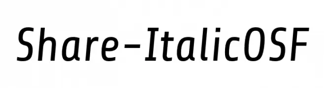
( Fonts by Carrois Type Design / Ralph du Carrois )
A modern, italicized font with clean lines and balanced proportions.
![Share-ItalicOSF font caratteri gratis]() Scaricare 468 Downloads@WebFont
Scaricare 468 Downloads@WebFont -
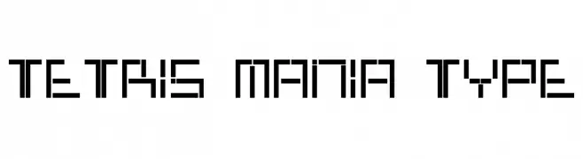
![Tetris Mania Type font caratteri gratis]() Scaricare 468 Downloads@WebFont
Scaricare 468 Downloads@WebFont -
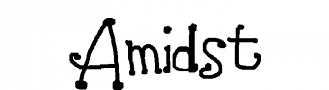
![Amidst font caratteri gratis]() Scaricare 468 Downloads@WebFont
Scaricare 468 Downloads@WebFont -
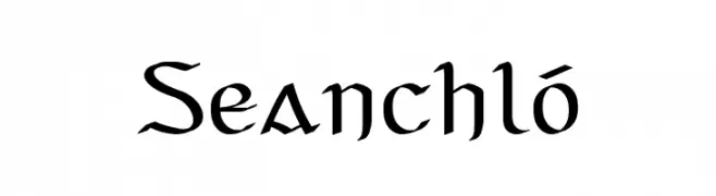
![Seanchló font caratteri gratis]() Scaricare 468 Downloads@WebFont
Scaricare 468 Downloads@WebFont -
( Fonts by Kreative Korporation - www.kreativekorp.com )
A pixelated, retro-style font with a blocky, geometric design.
![Monterey font caratteri gratis]() Scaricare 468 Downloads@WebFont
Scaricare 468 Downloads@WebFont -
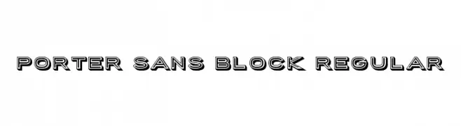
( Public domain / GPL / OFL - www.finck.co )
A bold, three-dimensional sans-serif font with a modern and impactful style.
![Porter Sans Block Regular font caratteri gratis]() Scaricare 468 Downloads@WebFont
Scaricare 468 Downloads@WebFont -
( Fonts by Blue Vinyl - Jess Latham - www.bvfonts.com )
A collection of bold, 1980s-themed icons and graphics.
![Awesome 80s font caratteri gratis]() Scaricare 468 Downloads@WebFont
Scaricare 468 Downloads@WebFont -
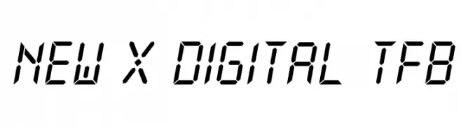
( Free for personal use - truefonts.blogspot.com )
A digital, futuristic font with angular, segmented characters.
![New X Digital tfb font caratteri gratis]() Scaricare 468 Downloads@WebFont
Scaricare 468 Downloads@WebFont -
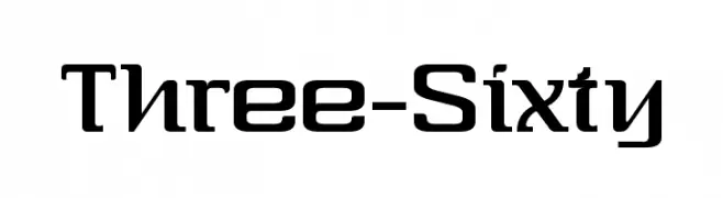
( Fonts by dartcanada.tripod.com - Darren Rigby )
A bold, geometric font with a modern and futuristic style.
![Three-Sixty font caratteri gratis]() Scaricare 468 Downloads@WebFont
Scaricare 468 Downloads@WebFont -
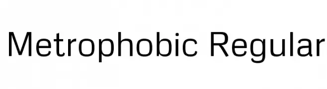
( Copyright 2011 The Metrophobic Project Authors (contact@sansoxygen.com), with Reserved Font Name ‘Metrophobic’. )
A clean, modern sans-serif font with uniform stroke width and balanced spacing.
![Metrophobic Regular font caratteri gratis]() Scaricare 468 Downloads@WebFont
Scaricare 468 Downloads@WebFont -
( Fonts by Mr Fisk - Mike Larsson - fontorama.net )
Expressive handwritten style with fluid, dynamic strokes.
![Dear Theo font caratteri gratis]() Scaricare 468 Downloads@WebFont
Scaricare 468 Downloads@WebFont


Quali sono i font più popolari adesso?
Poppins, Roboto, Montserrat, Open Sans e Lato sono molto usati per le forme pulite e l'ampia applicabilità — dall'identità di marca alle landing page e ai poster.
Quali font si usano spesso nei loghi?
Le sans serif geometriche (es. Poppins, famiglie in stile Gotham) sono scelte comuni per un branding pulito e scalabile. Per un tocco personale restano valide script e stili manoscritti. Abbina un display deciso per i titoli a un corpo testo neutro per riconoscibilità ed equilibrio.
Ogni quanto si aggiorna la lista?
Con regolarità, in base ai download e all'attività reale. Torna spesso per scoprire in anticipo le nuove preferite.
💡 Consiglio: aggiungi ai preferiti — le tendenze cambiano in fretta e i font top di oggi possono ispirare il rebranding di domani.