Benvenuto nelle Font Più Popolari — dove popolarità e qualità si incontrano. Qui trovi i font più scaricati e usati dell'anno. Se cerchi scelte sicure per logo, web o social, inizia da qui.
Ogni font top si distingue per equilibrio, leggibilità e versatilità. Troverai sans serif moderne, script eleganti, serif vintage e display minimalisti.
-
 Scaricare 83 Downloads@WebFont
 -
( Fonts by Hanoded - David Kerkhoff - Personal-use only. For commercial use please contact owner. )
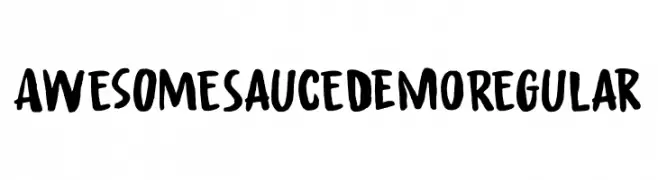
A bold, hand-painted font with a playful and artistic style.
![Awesome Sauce DEMO Regular font caratteri gratis]() Scaricare 83 Downloads@WebFont
Scaricare 83 Downloads@WebFont -
( Fonts by Leonard Posavec - leosupply.co - Personal-use only. For commercial use please contact owner. )
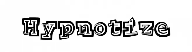
A bold, playful font with a three-dimensional outline and whimsical style.
![Hypnotize font caratteri gratis]() Scaricare 83 Downloads@WebFont
Scaricare 83 Downloads@WebFont -
![Font Color icon font caratteri gratis]() Scaricare 83 Downloads@WebFont
Scaricare 83 Downloads@WebFont -
( Fonts by Craft Supply Co. )
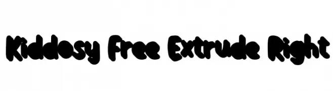
A bold, playful font with a rounded, extruded style and tight spacing.
![Kiddosy Free Extrude Right font caratteri gratis]() Scaricare 83 Downloads@WebFont
Scaricare 83 Downloads@WebFont -
-
( Iconian Fonts - Daniel Zadorozny - www.iconian.com )
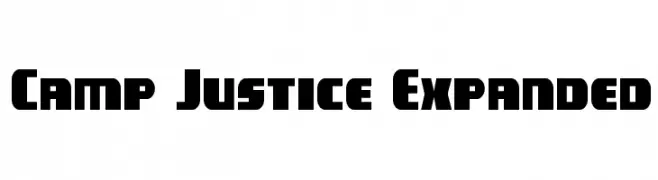
A bold, wide, and modern font with a strong, impactful presence.
![Camp Justice Expanded font caratteri gratis]() Scaricare 83 Downloads@WebFont
Scaricare 83 Downloads@WebFont -
( Fonts by Geronimo Fonts - Personal-use only. For commercial use please contact owner. )
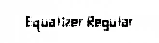
A modern, dot-based font inspired by digital displays.
![Equalizer Regular font caratteri gratis]() Scaricare 83 Downloads@WebFont
Scaricare 83 Downloads@WebFont -
( Fonts by EvasUniqueFonts )
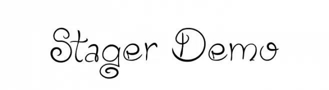
A whimsical and decorative font with elegant, flowing letterforms and unique curls.
![Stager Demo font caratteri gratis]() Scaricare 83 Downloads@WebFont
Scaricare 83 Downloads@WebFont -
( Fonts by Daniel Zadorozny - www.iconian.com - Free for personal use )
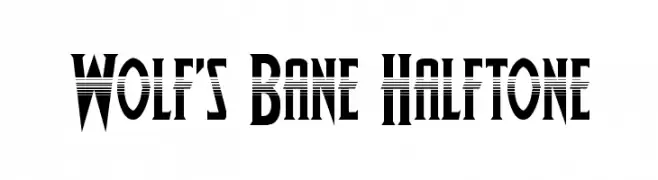
A bold, geometric font with a halftone effect and sharp angles.
![Wolf's Bane Halftone font caratteri gratis]() Scaricare 83 Downloads@WebFont
Scaricare 83 Downloads@WebFont -
( Fonts by Daniel Zadorozny - www.iconian.com )
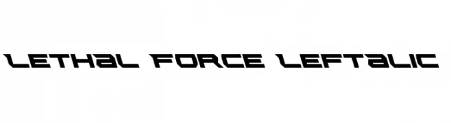
A bold, angular font with a futuristic and aggressive style.
![Lethal Force Leftalic font caratteri gratis]() Scaricare 83 Downloads@WebFont
Scaricare 83 Downloads@WebFont
Quali sono i font più popolari adesso?
Poppins, Roboto, Montserrat, Open Sans e Lato sono molto usati per le forme pulite e l'ampia applicabilità — dall'identità di marca alle landing page e ai poster.
Quali font si usano spesso nei loghi?
Le sans serif geometriche (es. Poppins, famiglie in stile Gotham) sono scelte comuni per un branding pulito e scalabile. Per un tocco personale restano valide script e stili manoscritti. Abbina un display deciso per i titoli a un corpo testo neutro per riconoscibilità ed equilibrio.
Ogni quanto si aggiorna la lista?
Con regolarità, in base ai download e all'attività reale. Torna spesso per scoprire in anticipo le nuove preferite.
💡 Consiglio: aggiungi ai preferiti — le tendenze cambiano in fretta e i font top di oggi possono ispirare il rebranding di domani.