Benvenuto nelle Font Più Popolari — dove popolarità e qualità si incontrano. Qui trovi i font più scaricati e usati dell'anno. Se cerchi scelte sicure per logo, web o social, inizia da qui.
Ogni font top si distingue per equilibrio, leggibilità e versatilità. Troverai sans serif moderne, script eleganti, serif vintage e display minimalisti.
-
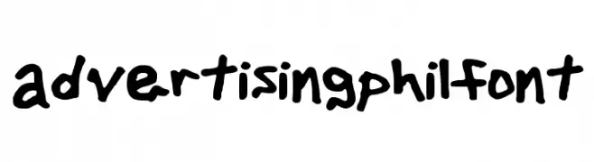
( WWW.TWITTER.COM/ADVERTISINGPHIL )
A playful, bold handwritten font with an informal and organic style.
 Scaricare 464 Downloads@WebFont
 -
( Fonts by dustBUST - Andreas Nylin )
A pixelated, glitch-style font with a bold, textured appearance.
![Virus43 font caratteri gratis]() Scaricare 464 Downloads@WebFont
Scaricare 464 Downloads@WebFont -
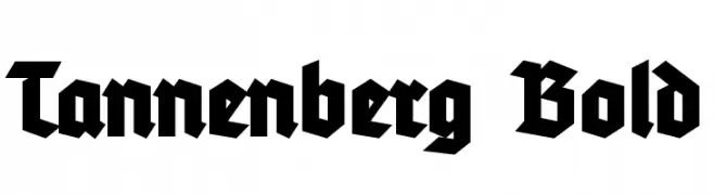
( Fonts by Typographer Mediengestaltung - Personal-use only. For commercial use please contact owner. )
A bold, angular Blackletter-style font with strong vertical emphasis.
![Tannenberg Bold font caratteri gratis]() Scaricare 464 Downloads@WebFont
Scaricare 464 Downloads@WebFont -
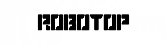
( Sembodo Studio )
A bold, geometric font with a futuristic and industrial design.
![ROBOTOP font caratteri gratis]() Scaricare 464 Downloads@WebFont
Scaricare 464 Downloads@WebFont -
( Fonts by www.urbanhookupz.com )
A bold graffiti-style font with dynamic, energetic characters.
![MESTIZOS UNIDOS -URBAN HOOKUPZ font caratteri gratis]() Scaricare 464 Downloads@WebFont
Scaricare 464 Downloads@WebFont -
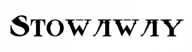
( Fonts by Rick Mueller )
A bold, vintage serif font with high contrast and dramatic serifs.
![Stowaway font caratteri gratis]() Scaricare 464 Downloads@WebFont
Scaricare 464 Downloads@WebFont -
( Iconian Fonts - Daniel Zadorozny - www.iconian.com )
A modern, geometric font with a futuristic and sleek design.
![Phoenicia Lower Case font caratteri gratis]() Scaricare 464 Downloads@WebFont
Scaricare 464 Downloads@WebFont -
![KurierCondMedium-Regular font caratteri gratis]() Scaricare 464 Downloads@WebFont
Scaricare 464 Downloads@WebFont -
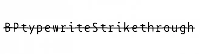
( Fonts by backpacker.gr )
A typewriter-style font with a modern strikethrough effect.
![BPtypewriteStrikethrough font caratteri gratis]() Scaricare 464 Downloads@WebFont
Scaricare 464 Downloads@WebFont -
![Khek Sambot font caratteri gratis]() Scaricare 464 Downloads@WebFont
Scaricare 464 Downloads@WebFont -
( Fonts by a Neale Davidson - www.pixelsagas.com. Personal-use only. For commercial use please contact owner. )
A sleek, modern, condensed italic font with consistent stroke thickness.
![Montalban Condensed Italic font caratteri gratis]() Scaricare 464 Downloads@WebFont
Scaricare 464 Downloads@WebFont -
![Comic Black Rabbit font caratteri gratis]() Scaricare 464 Downloads@WebFont
Scaricare 464 Downloads@WebFont -
( Fonts by Edric Studio www.creativefabrica.com/designer/edricstudio/ - Personal-use only. For commercial use please contact owner. )
A bold, modern stencil-like font with geometric cuts and angles.
![ALDITH font caratteri gratis]() Scaricare 464 Downloads@WebFont
Scaricare 464 Downloads@WebFont -
( Fonts by Daniel Zadorozny - www.iconian.com - Free for personal use )
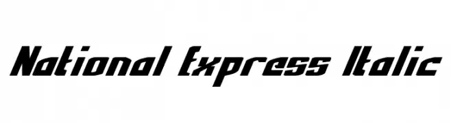
A bold, italic font with sharp angles and a modern, dynamic style.
![National Express Italic font caratteri gratis]() Scaricare 464 Downloads@WebFont
Scaricare 464 Downloads@WebFont -
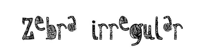
![Zebra irregular font caratteri gratis]() Scaricare 464 Downloads@WebFont
Scaricare 464 Downloads@WebFont -
( Fonts by Typographer Mediengestaltung - Personal-use only. For commercial use please contact owner. )
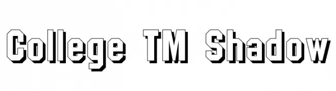
A bold, three-dimensional font with a strong geometric structure and shadow effect.
![College TM Shadow font caratteri gratis]() Scaricare 464 Downloads@WebFont
Scaricare 464 Downloads@WebFont -
( Fonts by Fat Cat Fonts - Jennifer Dickert - Personal-use only. For commercial use please contact owner. )
A classic serif font with elegant strokes and moderate contrast.
![Sanford font caratteri gratis]() Scaricare 463 Downloads@WebFont
Scaricare 463 Downloads@WebFont -
( Fonts by junkohanhero )
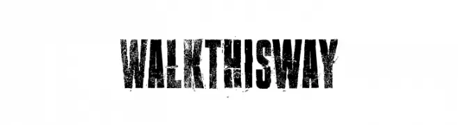
A bold, distressed font with a gritty, textured appearance.
![Walk this way font caratteri gratis]() Scaricare 463 Downloads@WebFont
Scaricare 463 Downloads@WebFont -
( Fonts by Iordanis Passas )
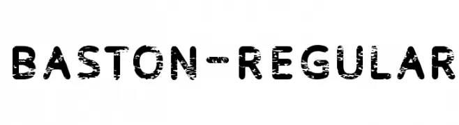
A bold, distressed font with a grunge texture for an edgy, vintage look.
![Baston-Regular font caratteri gratis]() Scaricare 463 Downloads@WebFont
Scaricare 463 Downloads@WebFont -
( Fonts by SnailFonts )
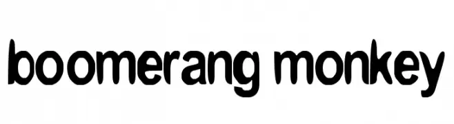
A playful, bold font with a whimsical, cartoon-like style and rounded edges.
![boomerang monkey font caratteri gratis]() Scaricare 463 Downloads@WebFont
Scaricare 463 Downloads@WebFont -
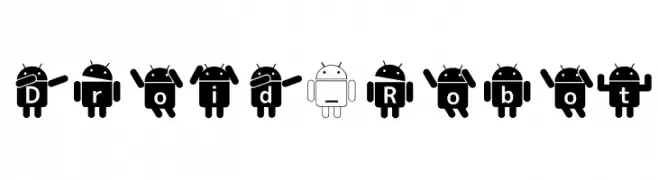
Caratteri di mikan. For commercial use please contact the owner.
![Droid_Robot font caratteri gratis]() Scaricare 463 Downloads@WebFont
Scaricare 463 Downloads@WebFont -
( Copyright (c) 2015, Christian Thalmann and the Cormorant Project Authors (github.com/CatharsisFonts/Cormorant) )
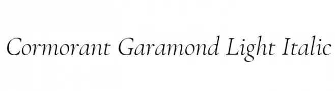
A light, italic serif font with elegant, classic styling and moderate contrast.
![Cormorant Garamond Light Italic font caratteri gratis]() Scaricare 463 Downloads@WebFont
Scaricare 463 Downloads@WebFont -
( Skeddles - Sam Keddy - samkeddy.com/ )
A pixelated, blocky font with a retro digital aesthetic.
![Thintel Regular font caratteri gratis]() Scaricare 463 Downloads@WebFont
Scaricare 463 Downloads@WebFont -
( Fonts by Daniel Zadorozny - www.iconian.com )
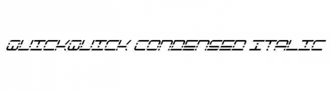
A futuristic, condensed, and italicized font with bold, angular lines.
![QuickQuick Condensed Italic font caratteri gratis]() Scaricare 463 Downloads@WebFont
Scaricare 463 Downloads@WebFont -
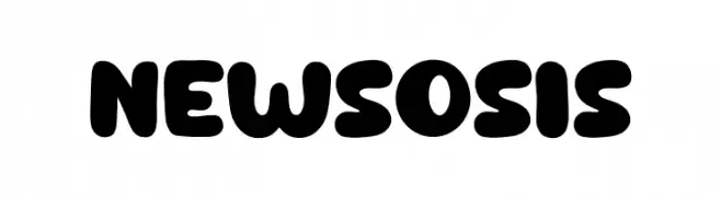
( Fonts by Khurasan )
A bold, playful font with rounded, bubbly characters and a retro vibe.
![New Sosis font caratteri gratis]() Scaricare 463 Downloads@WebFont
Scaricare 463 Downloads@WebFont -
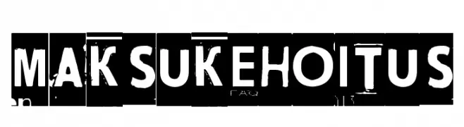
( Fonts by www.junkohanhero.com )
A bold, distressed font with a grunge, cut-out style.
![Maksukehoitus font caratteri gratis]() Scaricare 463 Downloads@WebFont
Scaricare 463 Downloads@WebFont -
![RDHoney font caratteri gratis]() Scaricare 463 Downloads@WebFont
Scaricare 463 Downloads@WebFont -
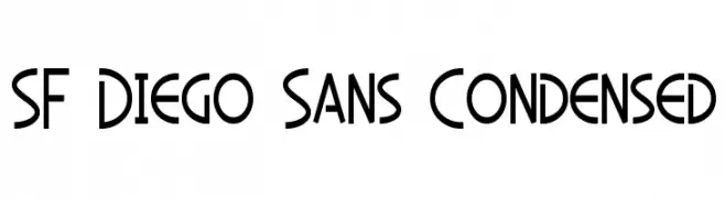
![SF Diego Sans Condensed font caratteri gratis]() Scaricare 463 Downloads@WebFont
Scaricare 463 Downloads@WebFont -
( Misti's Fonts - mistifonts.com/ )
A playful, handwritten font with a casual and friendly style.
![MissIssippi font caratteri gratis]() Scaricare 463 Downloads@WebFont
Scaricare 463 Downloads@WebFont -
![Summer Of Love font caratteri gratis]() Scaricare 463 Downloads@WebFont
Scaricare 463 Downloads@WebFont -
( Fonts by Nick Curtis - www.nicksfonts.com )
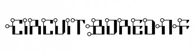
A futuristic, circuit-inspired font with bold geometric shapes and mechanical aesthetics.
![CircuitBoredNF font caratteri gratis]() Scaricare 463 Downloads@WebFont
Scaricare 463 Downloads@WebFont -
( Fonts by www.crudfactory.com )
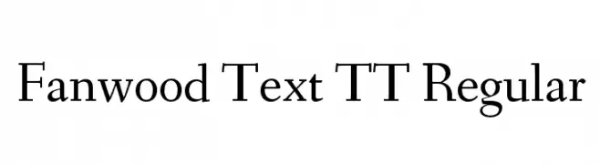
A classic serif font with elegant strokes and moderate contrast.
![Fanwood Text TT Regular font caratteri gratis]() Scaricare 463 Downloads@WebFont
Scaricare 463 Downloads@WebFont -
( Fonts by Daniel Zadorozny - www.iconian.com - Free for personal use )
A bold, geometric outline font with a futuristic and dynamic style.
![Airstrike Outline Regular font caratteri gratis]() Scaricare 463 Downloads@WebFont
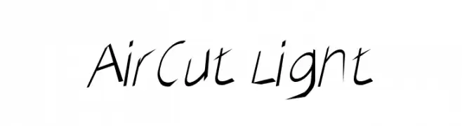
Scaricare 463 Downloads@WebFont -
![AirCut Light font caratteri gratis]() Scaricare 463 Downloads@WebFont
Scaricare 463 Downloads@WebFont -
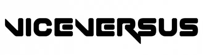
( Fonts by www.chequered.ink - Chequered Ink - Personal-use only. For commercial use please contact owner. )
A bold, futuristic font with geometric and angular design elements.
![Vice Versus font caratteri gratis]() Scaricare 463 Downloads@WebFont
Scaricare 463 Downloads@WebFont


Quali sono i font più popolari adesso?
Poppins, Roboto, Montserrat, Open Sans e Lato sono molto usati per le forme pulite e l'ampia applicabilità — dall'identità di marca alle landing page e ai poster.
Quali font si usano spesso nei loghi?
Le sans serif geometriche (es. Poppins, famiglie in stile Gotham) sono scelte comuni per un branding pulito e scalabile. Per un tocco personale restano valide script e stili manoscritti. Abbina un display deciso per i titoli a un corpo testo neutro per riconoscibilità ed equilibrio.
Ogni quanto si aggiorna la lista?
Con regolarità, in base ai download e all'attività reale. Torna spesso per scoprire in anticipo le nuove preferite.
💡 Consiglio: aggiungi ai preferiti — le tendenze cambiano in fretta e i font top di oggi possono ispirare il rebranding di domani.