Benvenuto nelle Font Più Popolari — dove popolarità e qualità si incontrano. Qui trovi i font più scaricati e usati dell'anno. Se cerchi scelte sicure per logo, web o social, inizia da qui.
Ogni font top si distingue per equilibrio, leggibilità e versatilità. Troverai sans serif moderne, script eleganti, serif vintage e display minimalisti.
-
( TSV Creative - creativemarket.com/TSVcreative )
A bold, distressed font with a grunge, hand-drawn appearance.
 Scaricare 81 Downloads@WebFont
 -
( Fonts by madeDeduk - Personal-use only. For commercial use please contact owner. )
A bold, textured script font with a playful and vintage feel.
![inblossom font caratteri gratis]() Scaricare 81 Downloads@WebFont
Scaricare 81 Downloads@WebFont -
![WBXlucidite Italic font caratteri gratis]() Scaricare 81 Downloads@WebFont
Scaricare 81 Downloads@WebFont -
![Zamrud & Khatulistiwa font caratteri gratis]() Scaricare 81 Downloads@WebFont
Scaricare 81 Downloads@WebFont -
( Fonts by Jadatype )
A bold, angular font with a gothic, medieval flair.
![Hauntress font caratteri gratis]() Scaricare 81 Downloads@WebFont
Scaricare 81 Downloads@WebFont -
-
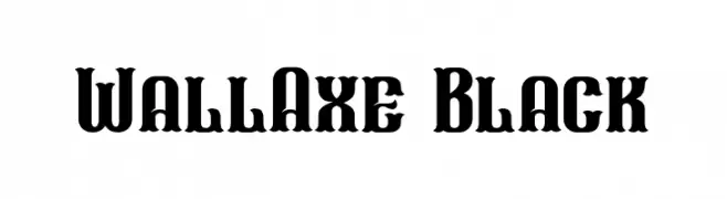
( Fonts by Nocturnal Workspace - Farhan Tirta - Personal-use only. For commercial use please contact owner. )
A bold, decorative font with intricate details and a strong presence.
![WallAxe Black font caratteri gratis]() Scaricare 81 Downloads@WebFont
Scaricare 81 Downloads@WebFont -
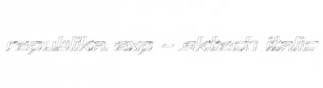
( Fonts by Apostrophic Lab )
A bold, italicized, sketch-style font with an expanded, futuristic design.
![Republika Exp - Sktech Italic font caratteri gratis]() Scaricare 81 Downloads@WebFont
Scaricare 81 Downloads@WebFont -
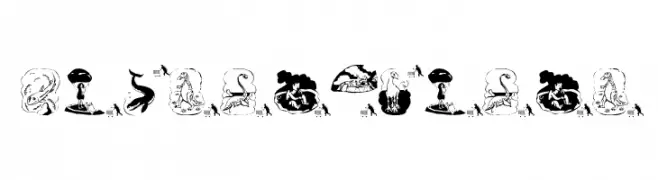
( Fonts by Manfred Klein. Free for private and charity use. Free for commercial with donation to organizations )
A playful, prehistoric-themed illustrative font with cartoonish characters.
![Prehistorish font caratteri gratis]() Scaricare 81 Downloads@WebFont
Scaricare 81 Downloads@WebFont -
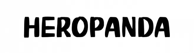
( Fonts by Phantom Studio )
A bold, playful font with thick, rounded strokes and a hand-drawn feel.
![Hero Panda font caratteri gratis]() Scaricare 81 Downloads@WebFont
Scaricare 81 Downloads@WebFont -
( Nght's Place - www.crosswinds.net/~nghtmvs/font/fonts1.html )
A playful font with letters inside heart shapes, perfect for romantic themes.
![101! Hearts font caratteri gratis]() Scaricare 81 Downloads@WebFont
Scaricare 81 Downloads@WebFont


Quali sono i font più popolari adesso?
Poppins, Roboto, Montserrat, Open Sans e Lato sono molto usati per le forme pulite e l'ampia applicabilità — dall'identità di marca alle landing page e ai poster.
Quali font si usano spesso nei loghi?
Le sans serif geometriche (es. Poppins, famiglie in stile Gotham) sono scelte comuni per un branding pulito e scalabile. Per un tocco personale restano valide script e stili manoscritti. Abbina un display deciso per i titoli a un corpo testo neutro per riconoscibilità ed equilibrio.
Ogni quanto si aggiorna la lista?
Con regolarità, in base ai download e all'attività reale. Torna spesso per scoprire in anticipo le nuove preferite.
💡 Consiglio: aggiungi ai preferiti — le tendenze cambiano in fretta e i font top di oggi possono ispirare il rebranding di domani.