Benvenuto nelle Font Più Popolari — dove popolarità e qualità si incontrano. Qui trovi i font più scaricati e usati dell'anno. Se cerchi scelte sicure per logo, web o social, inizia da qui.
Ogni font top si distingue per equilibrio, leggibilità e versatilità. Troverai sans serif moderne, script eleganti, serif vintage e display minimalisti.
-
( Fonts by Situjuh Nazara - 7ntypes.com - Personal-use only. For commercial use please contact owner. )
A playful, bold font with rounded edges and a hand-drawn style.
 Scaricare 447 Downloads@WebFont
 -
( Julieta Ulanovsky - twitter.com/julietulanovsky )
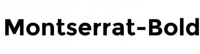
A bold, modern sans-serif font with clean lines and excellent readability.
![Montserrat-Bold font caratteri gratis]() Scaricare 447 Downloads@WebFont
Scaricare 447 Downloads@WebFont -
( Fonts by www.fontalicious.com )
A bold, geometric font with a playful and dynamic style.
![Mullet font caratteri gratis]() Scaricare 447 Downloads@WebFont
Scaricare 447 Downloads@WebFont -
( Fonts by Daniel Zadorozny - www.iconian.com - Free for personal use )
A bold, extra-condensed italic font with a dynamic and modern style.
![Tigershark Extra-Condensed Italic font caratteri gratis]() Scaricare 447 Downloads@WebFont
Scaricare 447 Downloads@WebFont -
( Fonts by Graham Meade - GemFonts )
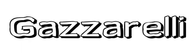
A bold, playful font with a 3D shadow effect and rounded strokes.
![Gazzarelli font caratteri gratis]() Scaricare 447 Downloads@WebFont
Scaricare 447 Downloads@WebFont -
-
( Fonts by Milena B Design )
A bold, rounded, and playful font with a modern, friendly appearance.
![Fredoka One Regular font caratteri gratis]() Scaricare 447 Downloads@WebFont
Scaricare 447 Downloads@WebFont -
( Fonts by Jadatype )
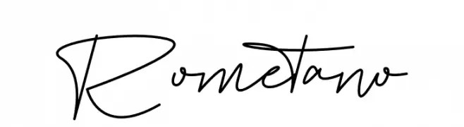
A modern, elegant handwritten font with fluid, continuous strokes.
![Rometano font caratteri gratis]() Scaricare 447 Downloads@WebFont
Scaricare 447 Downloads@WebFont -
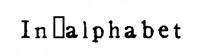
![In_alphabet font caratteri gratis]() Scaricare 447 Downloads@WebFont
Scaricare 447 Downloads@WebFont -
( Fonts by Daniel Zadorozny - www.iconian.com - Free for personal use )
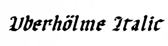
A bold, italicized blackletter font with a medieval aesthetic.
![Uberhölme Italic font caratteri gratis]() Scaricare 447 Downloads@WebFont
Scaricare 447 Downloads@WebFont -
( Fonts by Typhoon Type - Suthi Srisopha - www.typhoontype.net - Personal-use only. For commercial use please contact owner. )
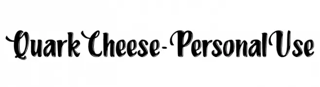
A bold, playful script font with a hand-drawn, decorative style.
![QuarkCheese-PersonalUse font caratteri gratis]() Scaricare 447 Downloads@WebFont
Scaricare 447 Downloads@WebFont -
( Fonts by Khurasan )
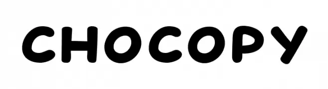
A playful, bold font with rounded, thick strokes and a friendly appearance.
![Chocopy font caratteri gratis]() Scaricare 447 Downloads@WebFont
Scaricare 447 Downloads@WebFont -
( truefonts.blogspot.com )
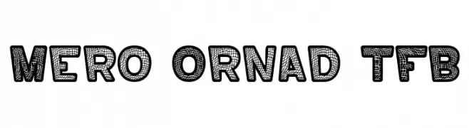
A bold, decorative font with textured, artistic characters.
![Mero Ornad TFB font caratteri gratis]() Scaricare 447 Downloads@WebFont
Scaricare 447 Downloads@WebFont -
( Fonts by MonkeyRoodles Fonts )
A playful, casual handwritten font with consistent line weight and whimsical strokes.
![Rocky Mountain Beauty font caratteri gratis]() Scaricare 447 Downloads@WebFont
Scaricare 447 Downloads@WebFont -
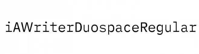
( Fonts by iA - Personal-use only. For commercial use please contact owner. )
A clean, modern sans-serif monospaced font with low contrast and excellent readability.
![iA Writer Duospace Regular font caratteri gratis]() Scaricare 447 Downloads@WebFont
Scaricare 447 Downloads@WebFont -
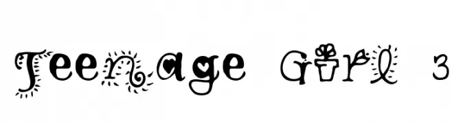
![Teenage Girl 3 font caratteri gratis]() Scaricare 447 Downloads@WebFont
Scaricare 447 Downloads@WebFont -
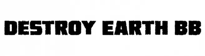
( Fonts by www.blambot.com )
A bold, distressed font with a rugged, industrial feel.
![Destroy Earth BB font caratteri gratis]() Scaricare 447 Downloads@WebFont
Scaricare 447 Downloads@WebFont -
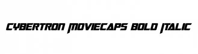
![Cybertron Moviecaps Bold Italic font caratteri gratis]() Scaricare 447 Downloads@WebFont
Scaricare 447 Downloads@WebFont -
![Sawasdee font caratteri gratis]() Scaricare 447 Downloads@WebFont
Scaricare 447 Downloads@WebFont -
( Hanoded - David Kerkhoff - www.hanodedfonts.com )
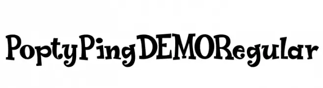
A playful, whimsical font with bold, irregular strokes and a lively appearance.
![Popty Ping DEMO Regular font caratteri gratis]() Scaricare 447 Downloads@WebFont
Scaricare 447 Downloads@WebFont -
( Fonts by epiclinez )
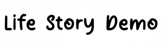
A playful, handwritten font with rounded, consistent strokes and a friendly appearance.
![Life Story Demo font caratteri gratis]() Scaricare 447 Downloads@WebFont
Scaricare 447 Downloads@WebFont -
( Fonts by www.houseoflime.com )
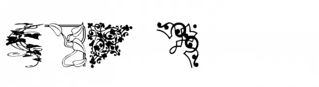
An ornate and decorative font with intricate corner embellishments.
![DBL Corners font caratteri gratis]() Scaricare 447 Downloads@WebFont
Scaricare 447 Downloads@WebFont -
( Fonts by a Neale Davidson - www.pixelsagas.com. Personal-use only. For commercial use please contact owner. )
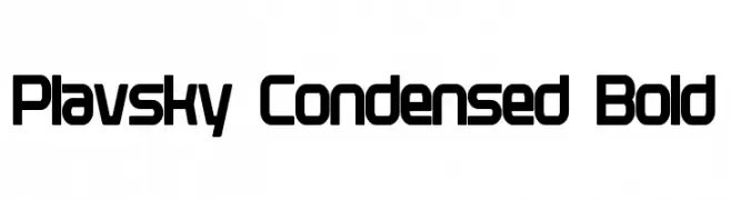
A bold, condensed, and modern sans-serif font with geometric shapes.
![Plavsky Condensed Bold font caratteri gratis]() Scaricare 447 Downloads@WebFont
Scaricare 447 Downloads@WebFont -
( Fonts by Andi Moz )
A playful and elegant script font with a handwritten, flowing style.
![Choice font caratteri gratis]() Scaricare 447 Downloads@WebFont
Scaricare 447 Downloads@WebFont -
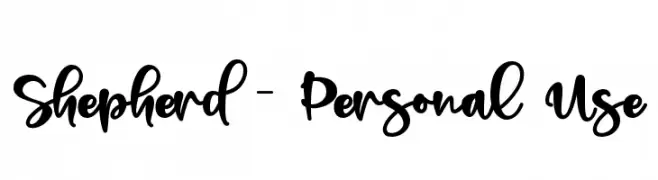
( Fonts by Letterara - Thomas Aradea - Personal-use only. For commercial use please contact owner. )
A bold, expressive script font with a playful, handwritten style.
![Shepherd - Personal Use font caratteri gratis]() Scaricare 447 Downloads@WebFont
Scaricare 447 Downloads@WebFont -
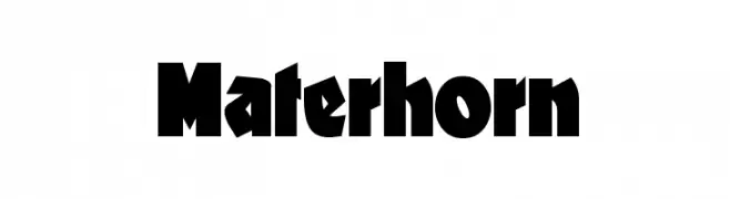
( Fonts by Nick Curtis - www.nicksfonts.com )
A bold, angular font with a strong, impactful presence.
![Materhorn font caratteri gratis]() Scaricare 447 Downloads
Scaricare 447 Downloads -
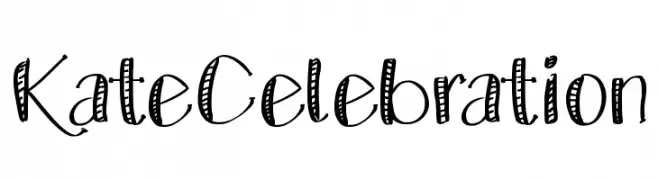
( Fonts by Mikel Kate )
A playful, hand-drawn font with decorative striped patterns.
![KateCelebration font caratteri gratis]() Scaricare 447 Downloads@WebFont
Scaricare 447 Downloads@WebFont -
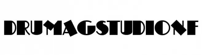
( Fonts by Nick Curtis - www.nicksfonts.com )
A bold, geometric font with Art Deco influences and strong visual impact.
![DrumagStudioNF font caratteri gratis]() Scaricare 446 Downloads@WebFont
Scaricare 446 Downloads@WebFont -
( Addax Designs - www.nt-p.net/adx/index.html )
A modern, geometric sans-serif font with clean lines and balanced proportions.
![TeaPot font caratteri gratis]() Scaricare 446 Downloads@WebFont
Scaricare 446 Downloads@WebFont -
![diamond d font caratteri gratis]() Scaricare 446 Downloads@WebFont
Scaricare 446 Downloads@WebFont -
( Fonts by Dagon Collective )
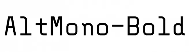
A bold, monospaced font with geometric lines and uniform character width.
![AltMono-Bold font caratteri gratis]() Scaricare 446 Downloads@WebFont
Scaricare 446 Downloads@WebFont -
( Fonts by Dieter Steffmann )
A bold, decorative font with artistic and dynamic character designs.
![Siegfried font caratteri gratis]() Scaricare 446 Downloads@WebFont
Scaricare 446 Downloads@WebFont -
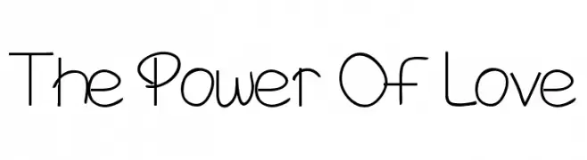
![The Power Of Love font caratteri gratis]() Scaricare 446 Downloads@WebFont
Scaricare 446 Downloads@WebFont -
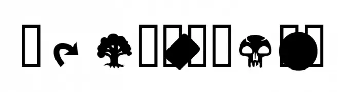
![MagicSymbols font caratteri gratis]() Scaricare 446 Downloads@WebFont
Scaricare 446 Downloads@WebFont -
( Fonts by madeDeduk )
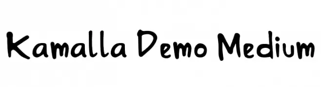
A playful, handwritten font with bold, irregular strokes.
![Kamalla Demo Medium font caratteri gratis]() Scaricare 446 Downloads@WebFont
Scaricare 446 Downloads@WebFont -
( These fonts are free to use in any private, recreational manner.For commercial go to www.flopdesign.com/fordesign/font.html )
A modern, geometric font with sharp angles and consistent stroke width.
![S A0kmh font caratteri gratis]() Scaricare 446 Downloads@WebFont
Scaricare 446 Downloads@WebFont


Quali sono i font più popolari adesso?
Poppins, Roboto, Montserrat, Open Sans e Lato sono molto usati per le forme pulite e l'ampia applicabilità — dall'identità di marca alle landing page e ai poster.
Quali font si usano spesso nei loghi?
Le sans serif geometriche (es. Poppins, famiglie in stile Gotham) sono scelte comuni per un branding pulito e scalabile. Per un tocco personale restano valide script e stili manoscritti. Abbina un display deciso per i titoli a un corpo testo neutro per riconoscibilità ed equilibrio.
Ogni quanto si aggiorna la lista?
Con regolarità, in base ai download e all'attività reale. Torna spesso per scoprire in anticipo le nuove preferite.
💡 Consiglio: aggiungi ai preferiti — le tendenze cambiano in fretta e i font top di oggi possono ispirare il rebranding di domani.