Benvenuto nelle Font Più Popolari — dove popolarità e qualità si incontrano. Qui trovi i font più scaricati e usati dell'anno. Se cerchi scelte sicure per logo, web o social, inizia da qui.
Ogni font top si distingue per equilibrio, leggibilità e versatilità. Troverai sans serif moderne, script eleganti, serif vintage e display minimalisti.
-
 Scaricare 454 Downloads@WebFont
 -
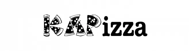
![KAPizza font caratteri gratis]() Scaricare 454 Downloads@WebFont
Scaricare 454 Downloads@WebFont -
( Addax Designs - www.nt-p.net/adx/index.html )
A modern, geometric sans-serif font with clean lines and balanced proportions.
![TeaPot font caratteri gratis]() Scaricare 453 Downloads@WebFont
Scaricare 453 Downloads@WebFont -
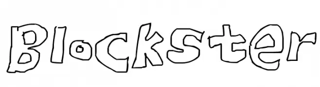
![Blockster font caratteri gratis]() Scaricare 453 Downloads@WebFont
Scaricare 453 Downloads@WebFont -
( Fonts by a Neale Davidson - www.pixelsagas.com. Personal-use only. For commercial use please contact owner. )
A bold, futuristic font with geometric shapes and sharp angles.
![Chromia Supercap Bold font caratteri gratis]() Scaricare 453 Downloads@WebFont
Scaricare 453 Downloads@WebFont -
![Addround font caratteri gratis]() Scaricare 453 Downloads@WebFont
Scaricare 453 Downloads@WebFont -
( www.southype.com )
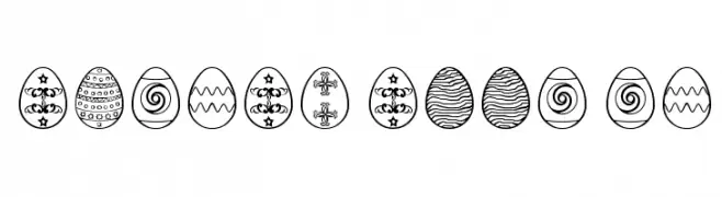
Hand-drawn Easter egg illustrations with varied decorative patterns.
![Easter eggs ST font caratteri gratis]() Scaricare 453 Downloads@WebFont
Scaricare 453 Downloads@WebFont -
( Fonts by Daniel Zadorozny - www.iconian.com - Free for personal use )
A bold, condensed, and dynamic font with a playful slant.
![International Super Hero Cond font caratteri gratis]() Scaricare 453 Downloads@WebFont
Scaricare 453 Downloads@WebFont -
![crustype_crust font caratteri gratis]() Scaricare 453 Downloads@WebFont
Scaricare 453 Downloads@WebFont -
![Anna-Bold font caratteri gratis]() Scaricare 453 Downloads@WebFont
Scaricare 453 Downloads@WebFont -
( Fonts by Chris Vile )
A bold, distressed font with a gritty, industrial texture.
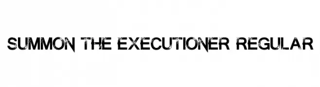
![Summon the Executioner Regular font caratteri gratis]() Scaricare 453 Downloads@WebFont
Scaricare 453 Downloads@WebFont -
![Fast Money Regular font caratteri gratis]() Scaricare 453 Downloads@WebFont
Scaricare 453 Downloads@WebFont -
![The Power Of Love font caratteri gratis]() Scaricare 453 Downloads@WebFont
Scaricare 453 Downloads@WebFont -
![Milkman Conspiracy font caratteri gratis]() Scaricare 453 Downloads@WebFont
Scaricare 453 Downloads@WebFont -
( Fonts by Giga Typography - GigaType - www.deviantart.com/wolves-fonts - Personal-use only. For commercial use please contact owner. )
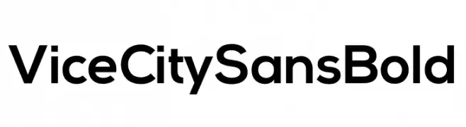
Bold, modern sans-serif font.
![Vice City Sans Bold font caratteri gratis]() Scaricare 453 Downloads@WebFont
Scaricare 453 Downloads@WebFont -
( Fonts by Abstract Type Design - Patrick Durr )
A modern sans-serif font with clean, geometric lines and uniform stroke width.
![Smog font caratteri gratis]() Scaricare 453 Downloads@WebFont
Scaricare 453 Downloads@WebFont -
( Fonts by Linafis Studio )
A playful, bold handwritten font with thick, rounded strokes.
![THEDARKOCEAN font caratteri gratis]() Scaricare 453 Downloads@WebFont
Scaricare 453 Downloads@WebFont -
![Star Hound font caratteri gratis]() Scaricare 453 Downloads@WebFont
Scaricare 453 Downloads@WebFont -
Caratteri di NicholasJudy456. For commercial use please contact the owner.
![Firehouse font caratteri gratis]() Scaricare 453 Downloads@WebFont
Scaricare 453 Downloads@WebFont -
( M#rm#n - Mar Man )
A tall, narrow, and modern font with consistent stroke width and elegant design.
![BREE font caratteri gratis]() Scaricare 453 Downloads@WebFont
Scaricare 453 Downloads@WebFont -
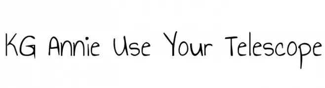
( Fonts by www.kimberlygeswein.com - Kimberly Geswein )
A playful, handwritten font with a casual and friendly style.
![KG Annie Use Your Telescope font caratteri gratis]() Scaricare 453 Downloads@WebFont
Scaricare 453 Downloads@WebFont -
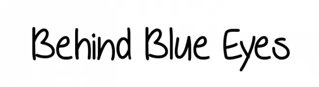
( Fonts by Misti`s Fonts - mistifonts.com - Personal-use only. For commercial use please contact owner. )
A playful, handwritten font with a casual and friendly style.
![Behind Blue Eyes font caratteri gratis]() Scaricare 453 Downloads@WebFont
Scaricare 453 Downloads@WebFont -
![PhatBoy Slim Italic font caratteri gratis]() Scaricare 453 Downloads@WebFont
Scaricare 453 Downloads@WebFont -
( Fonts by Socialh. Personal-use only. For commercial use please contact owner. )
Outlined, rounded icons representing various social media and web platforms.
![Social Media Icons font caratteri gratis]() Scaricare 453 Downloads@WebFont
Scaricare 453 Downloads@WebFont -
( Fonts by LyonsType - Daniel Lyons - Personal-use only. For commercial use please contact owner. )
A bold, modern sans-serif font with clean lines and balanced spacing.
![LT Asus Bold font caratteri gratis]() Scaricare 453 Downloads@WebFont
Scaricare 453 Downloads@WebFont -
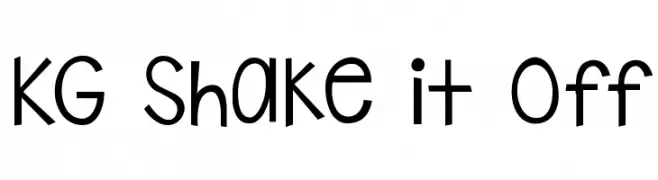
( Fonts by www.kimberlygeswein.com - Kimberly Geswein )
A playful, hand-drawn font with a whimsical and casual style.
![KG Shake it Off font caratteri gratis]() Scaricare 453 Downloads@WebFont
Scaricare 453 Downloads@WebFont -
Caratteri di HammerBro101. For commercial use please contact the owner.
![HelveticaNowText-RegIta font caratteri gratis]() Scaricare 453 Downloads@WebFont
Scaricare 453 Downloads@WebFont -
Caratteri di krraaa. For commercial use please contact the owner.
( Fonts by Lukas Krakora - Free for personal use )
A distressed, typewriter-style font with a grunge, vintage look.
![vVWweRraType! font caratteri gratis]() Scaricare 453 Downloads@WebFont
Scaricare 453 Downloads@WebFont -
( Chequered Ink - chequered.ink/ )
A bold, geometric font with clean lines and uniform stroke widths, perfect for impactful statements.
![Feeding a Moment font caratteri gratis]() Scaricare 453 Downloads@WebFont
Scaricare 453 Downloads@WebFont -
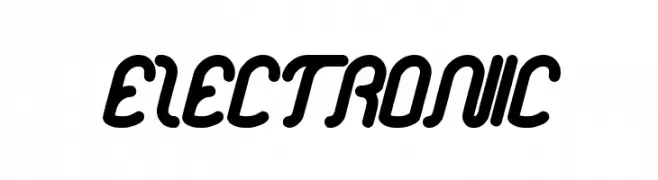
![electronic font caratteri gratis]() Scaricare 453 Downloads@WebFont
Scaricare 453 Downloads@WebFont -
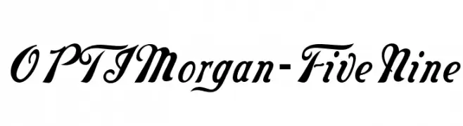
( Fonts by Castcraft Software - opti.netii.net - check the website before use )
An elegant script font with flowing, ornamental characters.
![OPTIMorgan-FiveNine font caratteri gratis]() Scaricare 453 Downloads@WebFont
Scaricare 453 Downloads@WebFont -
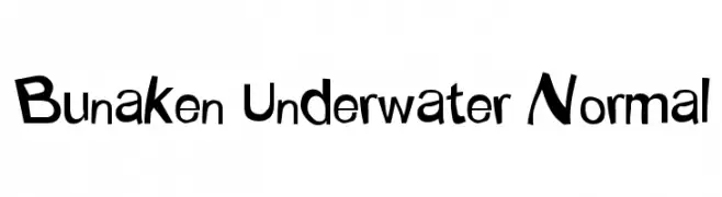
( Fonts by Adien Gunarta - fontasticindonesia.blogspot.com )
A playful, hand-drawn font with a whimsical and dynamic style.
![Bunaken Underwater Normal font caratteri gratis]() Scaricare 453 Downloads@WebFont
Scaricare 453 Downloads@WebFont -
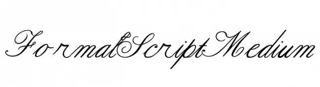
( Fonts by George Williams - Personal-use only. For commercial use please contact owner. )
An elegant script font with flowing, cursive letterforms and intricate details.
![Formal Script Medium font caratteri gratis]() Scaricare 453 Downloads@WebFont
Scaricare 453 Downloads@WebFont -
( Fonts by Manfred Klein. Free for private and charity use. Free for commercial with donation to organizations )
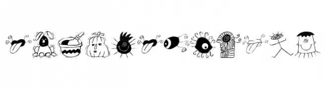
A playful collection of doodle-like illustrations with a whimsical, childlike style.
![20thCenturyTwo font caratteri gratis]() Scaricare 453 Downloads@WebFont
Scaricare 453 Downloads@WebFont -
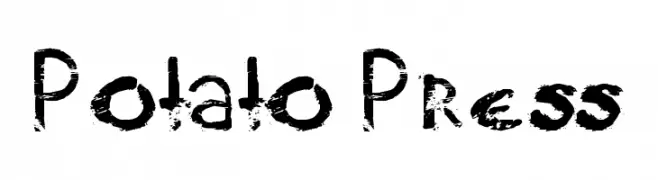
![Potato Press font caratteri gratis]() Scaricare 453 Downloads@WebFont
Scaricare 453 Downloads@WebFont


Quali sono i font più popolari adesso?
Poppins, Roboto, Montserrat, Open Sans e Lato sono molto usati per le forme pulite e l'ampia applicabilità — dall'identità di marca alle landing page e ai poster.
Quali font si usano spesso nei loghi?
Le sans serif geometriche (es. Poppins, famiglie in stile Gotham) sono scelte comuni per un branding pulito e scalabile. Per un tocco personale restano valide script e stili manoscritti. Abbina un display deciso per i titoli a un corpo testo neutro per riconoscibilità ed equilibrio.
Ogni quanto si aggiorna la lista?
Con regolarità, in base ai download e all'attività reale. Torna spesso per scoprire in anticipo le nuove preferite.
💡 Consiglio: aggiungi ai preferiti — le tendenze cambiano in fretta e i font top di oggi possono ispirare il rebranding di domani.