Benvenuto nelle Font Più Popolari — dove popolarità e qualità si incontrano. Qui trovi i font più scaricati e usati dell'anno. Se cerchi scelte sicure per logo, web o social, inizia da qui.
Ogni font top si distingue per equilibrio, leggibilità e versatilità. Troverai sans serif moderne, script eleganti, serif vintage e display minimalisti.
-
( Fonts by zulkhairilettering - Zulkhairi M Saleh - Personal-use only. For commercial use please contact owner. )
A playful and dynamic font with geometric and whimsical elements.
 Scaricare 78 Downloads@WebFont
 -
( CloutierFontes - www.cloutierfontes.ca )
A playful, bold font with a hand-drawn, whimsical style.
![Pistache Regular font caratteri gratis]() Scaricare 78 Downloads@WebFont
Scaricare 78 Downloads@WebFont -
( Fonts by Anton Bohlin - Personal-use only. For commercial use please contact owner. )
A geometric and angular font with a modern, bold aesthetic.
![Woodwarrior-Light font caratteri gratis]() Scaricare 78 Downloads@WebFont
Scaricare 78 Downloads@WebFont -
![Sezza 2 font caratteri gratis]() Scaricare 78 Downloads@WebFont
Scaricare 78 Downloads@WebFont -
( Morel Rooms - Jim Morel )
A bold, thorn-inspired font with sharp, edgy details.
![Thorny Bits Regular font caratteri gratis]() Scaricare 78 Downloads@WebFont
Scaricare 78 Downloads@WebFont -
-
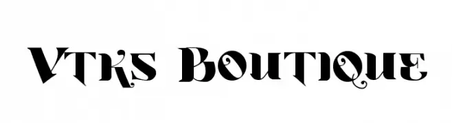
( Fonts by Douglas Vitkauskas - www.vtksdesign.com. Personal-use only. For commercial use please contact owner. )
A bold, decorative font with vintage flair and elegant flourishes.
![Vtks Boutique font caratteri gratis]() Scaricare 78 Downloads@WebFont
Scaricare 78 Downloads@WebFont -
( Fonts by Creative Lab - Creative LAB - Personal-use only. For commercial use please contact owner. )
A bold, handwritten font with a playful and energetic style.
![Mellow font caratteri gratis]() Scaricare 78 Downloads@WebFont
Scaricare 78 Downloads@WebFont -
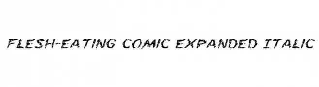
( Fonts by Daniel Zadorozny - www.iconian.com )
A bold, distressed, and italicized font with a grunge aesthetic.
![Flesh-Eating Comic Expanded Italic font caratteri gratis]() Scaricare 78 Downloads@WebFont
Scaricare 78 Downloads@WebFont -
( Fonts by Alif Ryan Zulfikar )
A playful, bold, and handwritten font with a lively and energetic style.
![Cheerful Peach - Personal Use font caratteri gratis]() Scaricare 78 Downloads@WebFont
Scaricare 78 Downloads@WebFont -
( Fonts by Uncarving Nation )
A bold, geometric font with a futuristic, stencil-like design.
![M290 font caratteri gratis]() Scaricare 78 Downloads@WebFont
Scaricare 78 Downloads@WebFont


Quali sono i font più popolari adesso?
Poppins, Roboto, Montserrat, Open Sans e Lato sono molto usati per le forme pulite e l'ampia applicabilità — dall'identità di marca alle landing page e ai poster.
Quali font si usano spesso nei loghi?
Le sans serif geometriche (es. Poppins, famiglie in stile Gotham) sono scelte comuni per un branding pulito e scalabile. Per un tocco personale restano valide script e stili manoscritti. Abbina un display deciso per i titoli a un corpo testo neutro per riconoscibilità ed equilibrio.
Ogni quanto si aggiorna la lista?
Con regolarità, in base ai download e all'attività reale. Torna spesso per scoprire in anticipo le nuove preferite.
💡 Consiglio: aggiungi ai preferiti — le tendenze cambiano in fretta e i font top di oggi possono ispirare il rebranding di domani.