Benvenuto nelle Font Più Popolari — dove popolarità e qualità si incontrano. Qui trovi i font più scaricati e usati dell'anno. Se cerchi scelte sicure per logo, web o social, inizia da qui.
Ogni font top si distingue per equilibrio, leggibilità e versatilità. Troverai sans serif moderne, script eleganti, serif vintage e display minimalisti.
-
 Scaricare 4966 Downloads@WebFont
 -
( Fonts by Castcraft Software - opti.netii.net - check the website before use )
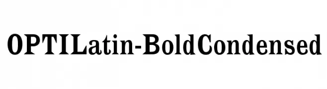
A bold, condensed typeface with strong, legible characters ideal for impactful headlines.
![OPTILatin-BoldCondensed font caratteri gratis]() Scaricare 4963 Downloads@WebFont
Scaricare 4963 Downloads@WebFont -
( Fonts by StudioTypo - Personal-use only. For commercial use please contact owner. )
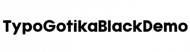
A bold, geometric font with a modern and clean aesthetic.
![Typo Gotika Black Demo font caratteri gratis]() Scaricare 4962 Downloads@WebFont
Scaricare 4962 Downloads@WebFont -
( Fonts by Castcraft Software - opti.netii.net - check the website before use )
A modern, condensed sans-serif font with uniform stroke width and excellent readability.
![OPTIAkroGrotesk-Cond font caratteri gratis]() Scaricare 4962 Downloads@WebFont
Scaricare 4962 Downloads@WebFont -
![Tooncast font caratteri gratis]() Scaricare 4957 Downloads@WebFont
Scaricare 4957 Downloads@WebFont -
-
![Greek font caratteri gratis]() Scaricare 4952 Downloads
Scaricare 4952 Downloads -
( Fonts by Paul Reid - tracertong.co.uk )
A bold, rugged font with a distressed, shredded appearance.
![Shredded font caratteri gratis]() Scaricare 4951 Downloads
Scaricare 4951 Downloads -
( Fonts by fabiandesmet.com )
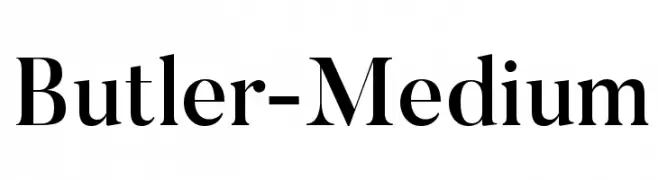
A sophisticated serif font with high contrast and elegant design.
![Butler-Medium font caratteri gratis]() Scaricare 4946 Downloads@WebFont
Scaricare 4946 Downloads@WebFont -
![Bloody font caratteri gratis]() Scaricare 4943 Downloads@WebFont
Scaricare 4943 Downloads@WebFont -
![All That Jazz font caratteri gratis]() Scaricare 4941 Downloads@WebFont
Scaricare 4941 Downloads@WebFont -
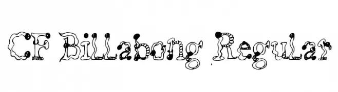
![CF Billabong Regular font caratteri gratis]() Scaricare 4940 Downloads@WebFont
Scaricare 4940 Downloads@WebFont -
( Fonts by Andrew Hart - dirt2.com )
A playful, hand-drawn font with heart motifs and decorative elements.
![Demo font caratteri gratis]() Scaricare 4939 Downloads@WebFont
Scaricare 4939 Downloads@WebFont -
![TY font caratteri gratis]() Scaricare 4937 Downloads@WebFont
Scaricare 4937 Downloads@WebFont -
( Copyright (c) 2010, Daniel Rhatigan (sparky@ultrasparky.org) )
A modern serif font with medium contrast and elegant serifs.
![Copse font caratteri gratis]() Scaricare 4934 Downloads@WebFont
Scaricare 4934 Downloads@WebFont -
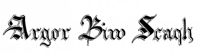
![Argor Biw Scaqh font caratteri gratis]() Scaricare 4933 Downloads@WebFont
Scaricare 4933 Downloads@WebFont -
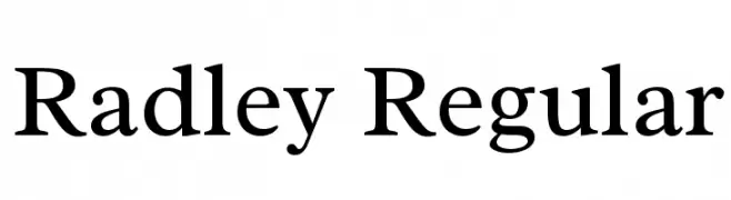
( Copyright 2011 The Radley Project Authors (https://github.com/googlefonts/RadleyFont) )
A classic serif font with elegant curves and moderate contrast.
![Radley Regular font caratteri gratis]() Scaricare 4932 Downloads@WebFont
Scaricare 4932 Downloads@WebFont -
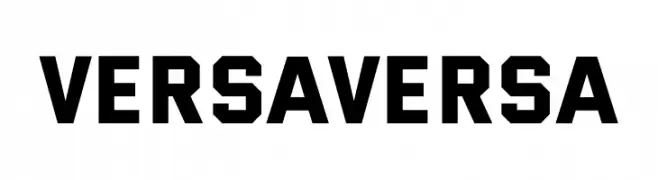
( Fonts by James Lewis )
A bold, geometric font with strong, angular lines and a modern aesthetic.
![Versa Versa font caratteri gratis]() Scaricare 4931 Downloads@WebFont
Scaricare 4931 Downloads@WebFont -
( Fonts by Hideki Katayama - com4t-fff.seesaa.net )
A classic serif font with high contrast and elegant serifs.
![COM4t Drify Light font caratteri gratis]() Scaricare 4931 Downloads@WebFont
Scaricare 4931 Downloads@WebFont -
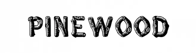
( Fonts by Rick Mueller )
A playful, textured font with bold, rounded shapes and intricate patterns.
![Pinewood font caratteri gratis]() Scaricare 4931 Downloads@WebFont
Scaricare 4931 Downloads@WebFont -
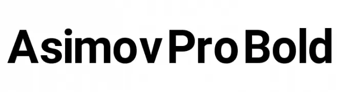
![Asimov Pro Bold font caratteri gratis]() Scaricare 4930 Downloads@WebFont
Scaricare 4930 Downloads@WebFont -
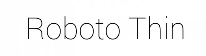
( Fonts by developer.android.com )
A thin, modern sans-serif font with excellent readability and a sleek appearance.
![Roboto Thin font caratteri gratis]() Scaricare 4929 Downloads@WebFont
Scaricare 4929 Downloads@WebFont -
![Mickey's Merry Christmas font caratteri gratis]() Scaricare 4929 Downloads@WebFont
Scaricare 4929 Downloads@WebFont -
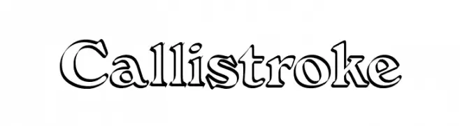
( Fonts by Graham Meade - GemFonts )
A bold, outlined decorative font with a playful yet sophisticated style.
![Callistroke font caratteri gratis]() Scaricare 4928 Downloads@WebFont
Scaricare 4928 Downloads@WebFont -
( گالری فانت فارسی پژوهش آريانا - only compatible with Farsi and Arabic )
A bold, modern font with geometric shapes and smooth curves.
![Beirut Black font caratteri gratis]() Scaricare 4926 Downloads@WebFont
Scaricare 4926 Downloads@WebFont -
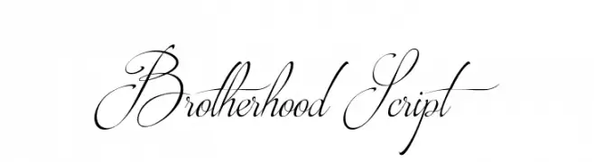
( Fonts by a Youssef Habchi - youssef-habchi.com. Personal-use only. For commercial use please contact owner. )
An elegant script font with flowing, interconnected letters and a classic calligraphic style.
![Brotherhood Script font caratteri gratis]() Scaricare 4924 Downloads@WebFont
Scaricare 4924 Downloads@WebFont -
( Måns Grebäck - www.mansgreback.com )
A bold, extra-expanded font with a modern geometric style.
![Specify PERSONAL Extraexpanded Black font caratteri gratis]() Scaricare 4922 Downloads@WebFont
Scaricare 4922 Downloads@WebFont -
![Farsi 1.1 font caratteri gratis]() Scaricare 4918 Downloads@WebFont
Scaricare 4918 Downloads@WebFont -
( Copyright (c) 2011, Pablo Impallari (www.impallari.com|impallari@gmail.com) )
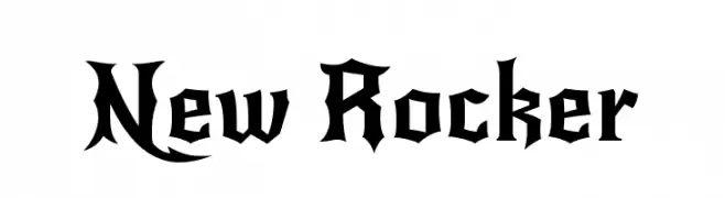
A bold, gothic-inspired font with sharp, angular lines and dramatic flair.
![New Rocker font caratteri gratis]() Scaricare 4916 Downloads@WebFont
Scaricare 4916 Downloads@WebFont -
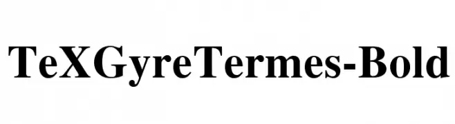
![TeXGyreTermes-Bold font caratteri gratis]() Scaricare 4916 Downloads@WebFont
Scaricare 4916 Downloads@WebFont -
( Fonts by Jayde Garrow - GarrowGlitch - http://jaydegarrow.wix.com/jaydefonts. Personal-use only. For commercial use please contact owner. )
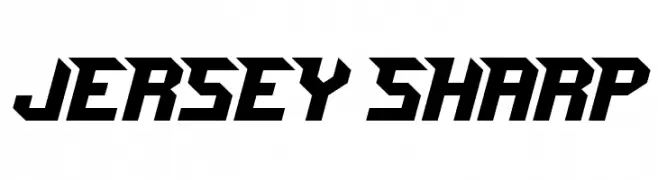
A bold, angular font with a sporty, dynamic style.
![Jersey Sharp font caratteri gratis]() Scaricare 4915 Downloads@WebFont
Scaricare 4915 Downloads@WebFont -
![Avalon Quest font caratteri gratis]() Scaricare 4913 Downloads@WebFont
Scaricare 4913 Downloads@WebFont -
![Libel Suit font caratteri gratis]() Scaricare 4913 Downloads@WebFont
Scaricare 4913 Downloads@WebFont -
( Fonts by a Des Gomez. Personal-use only. For commercial use please contact owner. )
A playful, handwritten font with a quirky and dynamic style.
![SanFrancisco font caratteri gratis]() Scaricare 4912 Downloads@WebFont
Scaricare 4912 Downloads@WebFont -
![BISHOWSON2 Ranjana Lipi ISBN9993355933 font caratteri gratis]() Scaricare 4912 Downloads@WebFont
Scaricare 4912 Downloads@WebFont -
![Galactican font caratteri gratis]() Scaricare 4912 Downloads@WebFont
Scaricare 4912 Downloads@WebFont


Quali sono i font più popolari adesso?
Poppins, Roboto, Montserrat, Open Sans e Lato sono molto usati per le forme pulite e l'ampia applicabilità — dall'identità di marca alle landing page e ai poster.
Quali font si usano spesso nei loghi?
Le sans serif geometriche (es. Poppins, famiglie in stile Gotham) sono scelte comuni per un branding pulito e scalabile. Per un tocco personale restano valide script e stili manoscritti. Abbina un display deciso per i titoli a un corpo testo neutro per riconoscibilità ed equilibrio.
Ogni quanto si aggiorna la lista?
Con regolarità, in base ai download e all'attività reale. Torna spesso per scoprire in anticipo le nuove preferite.
💡 Consiglio: aggiungi ai preferiti — le tendenze cambiano in fretta e i font top di oggi possono ispirare il rebranding di domani.