Benvenuto nelle Font Più Popolari — dove popolarità e qualità si incontrano. Qui trovi i font più scaricati e usati dell'anno. Se cerchi scelte sicure per logo, web o social, inizia da qui.
Ogni font top si distingue per equilibrio, leggibilità e versatilità. Troverai sans serif moderne, script eleganti, serif vintage e display minimalisti.
-
 Scaricare 447 Downloads@WebFont
 -
( Fonts by Misti's Fonts )
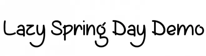
A playful, handwritten font with a casual and friendly style.
![Lazy Spring Day Demo font caratteri gratis]() Scaricare 447 Downloads@WebFont
Scaricare 447 Downloads@WebFont -
( Fonts by Woodcutter )
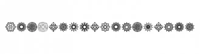
Ornamental, geometric Arabesque-inspired decorative glyphs.
![Arabesque Ornaments font caratteri gratis]() Scaricare 447 Downloads@WebFont
Scaricare 447 Downloads@WebFont -
![Teleprinter Bold Italic font caratteri gratis]() Scaricare 447 Downloads@WebFont
Scaricare 447 Downloads@WebFont -
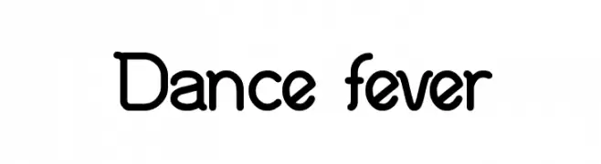
( Fonts by weknow - Wino S Kadir )
A playful, rounded font with a modern and friendly design.
![Dance fever font caratteri gratis]() Scaricare 447 Downloads@WebFont
Scaricare 447 Downloads@WebFont -
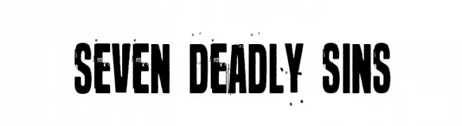
( Fonts by junkohanhero )
A bold, distressed font with a rugged, vintage aesthetic.
![Seven deadly sins font caratteri gratis]() Scaricare 447 Downloads@WebFont
Scaricare 447 Downloads@WebFont -
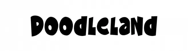
( Fonts by Creatype Studio )
A playful, hand-drawn font with bold, irregular shapes and a cartoonish style.
![Doodleland font caratteri gratis]() Scaricare 447 Downloads@WebFont
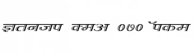
Scaricare 447 Downloads@WebFont -
![Kruti Dev 070 Wide font caratteri gratis]() Scaricare 447 Downloads@WebFont
Scaricare 447 Downloads@WebFont -
( Fonts by Woodcutter Manero - http://www.woodcutter.es - Personal-use only. For commercial use please contact owner. )
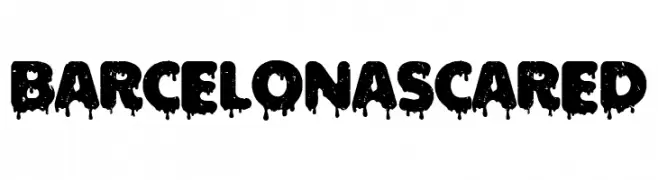
A bold, dripping font perfect for horror and Halloween themes.
![Barcelona Scared font caratteri gratis]() Scaricare 447 Downloads@WebFont
Scaricare 447 Downloads@WebFont -
( Fonts by Maelle.K - Thomas Boucherie )
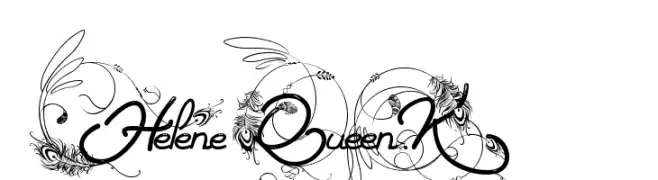
An ornate and decorative script font with intricate flourishes.
![Helene Queen.K font caratteri gratis]() Scaricare 447 Downloads@WebFont
Scaricare 447 Downloads@WebFont -
( Fonts by a Zaffar Ansari - Zansari . Personal-use only. For commercial use please contact owner. )
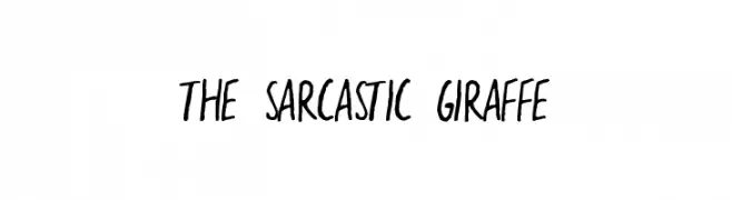
A playful, handwritten font with irregular strokes and a casual style.
![the sarcastic giraffe font caratteri gratis]() Scaricare 447 Downloads@WebFont
Scaricare 447 Downloads@WebFont -
( Fonts by Kong Font - Personal-use only. For commercial use please contact owner. )
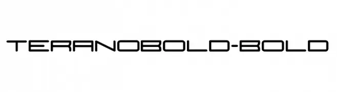
A bold, futuristic font with geometric and rounded letterforms.
![TeranoBold-Bold font caratteri gratis]() Scaricare 447 Downloads@WebFont
Scaricare 447 Downloads@WebFont -
( Copyright (c) 2010, Kimberly Geswein (kimberlygeswein.com) )
A lively, flowing handwritten font with smooth, cursive strokes.
![Zeyada font caratteri gratis]() Scaricare 447 Downloads@WebFont
Scaricare 447 Downloads@WebFont -
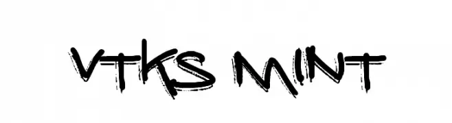
( Fonts by Douglas Vitkauskas - www.vtksdesign.com. Personal-use only. For commercial use please contact owner. )
A bold, graffiti-inspired font with a rough, hand-drawn appearance.
![vtks mint font caratteri gratis]() Scaricare 447 Downloads@WebFont
Scaricare 447 Downloads@WebFont -
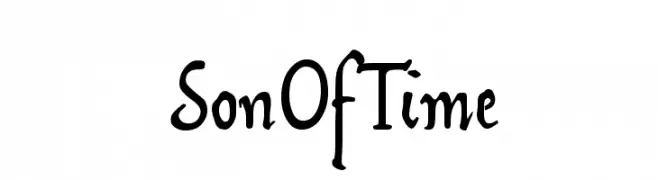
( Fonts by www.pia-frauss.de )
A whimsical, artistic font with playful curves and unique letterforms.
![SonOfTime font caratteri gratis]() Scaricare 447 Downloads@WebFont
Scaricare 447 Downloads@WebFont -
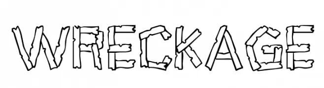
( Fonts by Jacob Fisher - www.pizzadude.dk )
A fragmented, distressed font with a chaotic, wreckage-inspired design.
![Wreckage font caratteri gratis]() Scaricare 447 Downloads@WebFont
Scaricare 447 Downloads@WebFont -
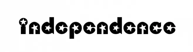
![Independence font caratteri gratis]() Scaricare 447 Downloads@WebFont
Scaricare 447 Downloads@WebFont -
![Sleight Of Font font caratteri gratis]() Scaricare 447 Downloads@WebFont
Scaricare 447 Downloads@WebFont -
( www.emmabowey.co.uk )
A playful, bold font with rounded, bubbly characters.
![Sponge font caratteri gratis]() Scaricare 447 Downloads@WebFont
Scaricare 447 Downloads@WebFont -
( Fonts by Cristiano Sobral - Personal-use only. For commercial use please contact owner. )
A thin, modern sans-serif font with a clean and minimalist design.
![Argentum Sans Thin font caratteri gratis]() Scaricare 447 Downloads@WebFont
Scaricare 447 Downloads@WebFont -
![Kitchen Kapers II font caratteri gratis]() Scaricare 447 Downloads@WebFont
Scaricare 447 Downloads@WebFont -
( Free for Personal Use. To use commercially please visit the www.bvfonts.com )
A playful, hand-drawn font with a rough, organic texture.
![GrumbleOT font caratteri gratis]() Scaricare 447 Downloads@WebFont
Scaricare 447 Downloads@WebFont -
![Horseradish font caratteri gratis]() Scaricare 447 Downloads@WebFont
Scaricare 447 Downloads@WebFont -
( Southype - Rodrigo Gonzalez - www.southype.com )
A bold, geometric font with a condensed and modern style.
![Imnova St font caratteri gratis]() Scaricare 447 Downloads@WebFont
Scaricare 447 Downloads@WebFont -
( Fonts by Jayde Garrow - GarrowGlitch - http://jaydegarrow.wix.com/jaydefonts. Personal-use only. For commercial use please contact owner. )
A bold, jagged font with dynamic strokes and a graffiti-like style.
![HoganMania font caratteri gratis]() Scaricare 447 Downloads@WebFont
Scaricare 447 Downloads@WebFont -
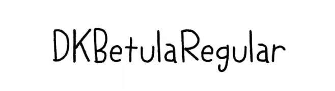
![DK Betula Regular font caratteri gratis]() Scaricare 447 Downloads@WebFont
Scaricare 447 Downloads@WebFont -
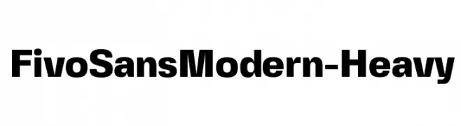
( Fonts by Alex Slobzheninov - Personal-use only. For commercial use please contact owner. )
A bold, modern sans-serif font with a heavy weight and clean lines.
![FivoSansModern-Heavy font caratteri gratis]() Scaricare 447 Downloads@WebFont
Scaricare 447 Downloads@WebFont -
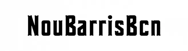
( Fonts by Woodcutter Manero - www.woodcutter.es - Personal-use only. For commercial use please contact owner. )
A bold, vintage-style font with a strong, blocky design.
![Nou Barris Bcn font caratteri gratis]() Scaricare 447 Downloads@WebFont
Scaricare 447 Downloads@WebFont -
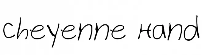
( Fonts by Daniel Zadorozny - www.iconian.com )
A casual, handwritten font with a playful and organic feel.
![Cheyenne Hand font caratteri gratis]() Scaricare 447 Downloads@WebFont
Scaricare 447 Downloads@WebFont -
( Fonts by dustBUST - Andreas Nylin )
A bold, italicized font with a futuristic and sleek design.
![Sci Fied BoldItalic font caratteri gratis]() Scaricare 447 Downloads@WebFont
Scaricare 447 Downloads@WebFont -
( Fonts by Willetter Studio )
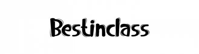
A bold, playful font with a hand-drawn, three-dimensional look.
![Bestinclass font caratteri gratis]() Scaricare 447 Downloads@WebFont
Scaricare 447 Downloads@WebFont -
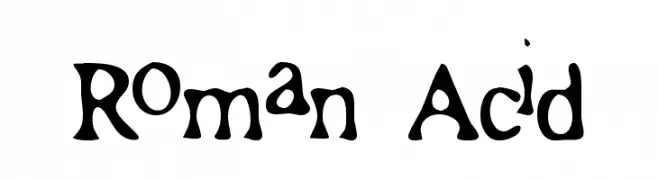
![Roman Acid font caratteri gratis]() Scaricare 447 Downloads@WebFont
Scaricare 447 Downloads@WebFont -
( Fonts by Daniel Zadorozny - www.iconian.com - Free for personal use )
A modern, italicized font with a sleek and dynamic design.
![Federal Service Italic font caratteri gratis]() Scaricare 447 Downloads@WebFont
Scaricare 447 Downloads@WebFont -
( Fonts by joorgemoron - Personal-use only. For commercial use please contact owner. )
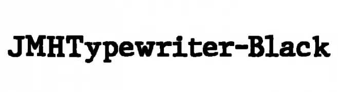
A bold, vintage typewriter-style font with slab serifs and strong, uniform strokes.
![JMHTypewriter-Black font caratteri gratis]() Scaricare 447 Downloads@WebFont
Scaricare 447 Downloads@WebFont -
( Fonts by Rachel White )
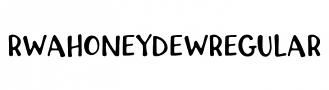
A playful, handwritten font with bold, rounded strokes and a casual style.
![RWA Honeydew Regular font caratteri gratis]() Scaricare 447 Downloads@WebFont
Scaricare 447 Downloads@WebFont


Quali sono i font più popolari adesso?
Poppins, Roboto, Montserrat, Open Sans e Lato sono molto usati per le forme pulite e l'ampia applicabilità — dall'identità di marca alle landing page e ai poster.
Quali font si usano spesso nei loghi?
Le sans serif geometriche (es. Poppins, famiglie in stile Gotham) sono scelte comuni per un branding pulito e scalabile. Per un tocco personale restano valide script e stili manoscritti. Abbina un display deciso per i titoli a un corpo testo neutro per riconoscibilità ed equilibrio.
Ogni quanto si aggiorna la lista?
Con regolarità, in base ai download e all'attività reale. Torna spesso per scoprire in anticipo le nuove preferite.
💡 Consiglio: aggiungi ai preferiti — le tendenze cambiano in fretta e i font top di oggi possono ispirare il rebranding di domani.