Benvenuto nelle Font Più Popolari — dove popolarità e qualità si incontrano. Qui trovi i font più scaricati e usati dell'anno. Se cerchi scelte sicure per logo, web o social, inizia da qui.
Ogni font top si distingue per equilibrio, leggibilità e versatilità. Troverai sans serif moderne, script eleganti, serif vintage e display minimalisti.
-
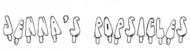
( Fonts by Anke Arnold - www.anke-art.de )
A playful, popsicle-themed decorative font with a hand-drawn, cartoonish style.
 Scaricare 446 Downloads@WebFont
 -
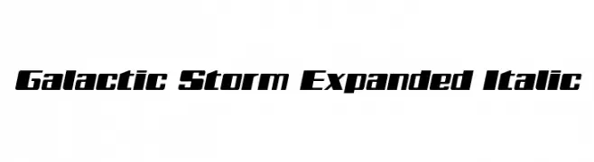
( Fonts by Daniel Zadorozny - www.iconian.com - Free for personal use )
A bold, expanded italic font with a futuristic and dynamic style.
![Galactic Storm Expanded Italic font caratteri gratis]() Scaricare 446 Downloads@WebFont
Scaricare 446 Downloads@WebFont -
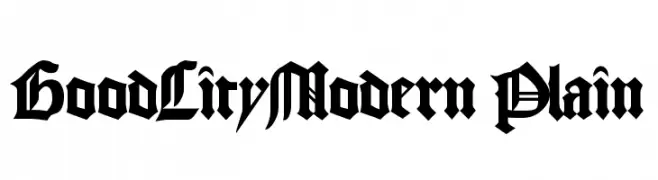
( Fonts by Altsys Metamorphosis )
A bold, blackletter-inspired font with high contrast and intricate detailing.
![GoodCityModern Plain font caratteri gratis]() Scaricare 446 Downloads@WebFont
Scaricare 446 Downloads@WebFont -
![Autocars & Rolling Bikes Regular font caratteri gratis]() Scaricare 446 Downloads@WebFont
Scaricare 446 Downloads@WebFont -
![BelleFontNouveau font caratteri gratis]() Scaricare 446 Downloads@WebFont
Scaricare 446 Downloads@WebFont -
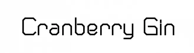
![Cranberry Gin font caratteri gratis]() Scaricare 446 Downloads@WebFont
Scaricare 446 Downloads@WebFont -
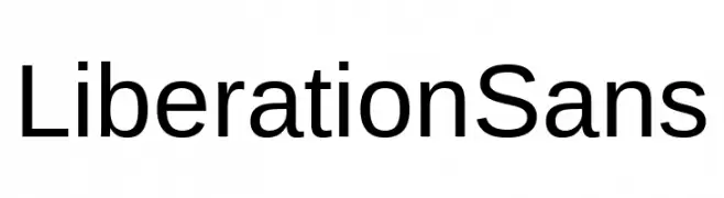
( Fonts by Red Hat )
A clean, modern sans-serif font with excellent readability and balanced design.
![Liberation Sans font caratteri gratis]() Scaricare 446 Downloads@WebFont
Scaricare 446 Downloads@WebFont -
( Fonts by German Olaya - www.typo5.com )
A bold, distressed font with a hand-drawn, graffiti-like style.
![maldita font caratteri gratis]() Scaricare 446 Downloads@WebFont
Scaricare 446 Downloads@WebFont -
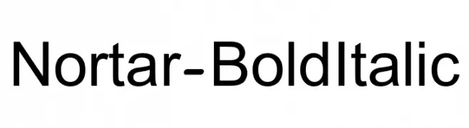
( Fonts by armenia.renderforest.com - Personal-use only. For commercial use please contact owner. )
A bold, italicized sans-serif font with a modern and clean design.
![Nortar-BoldItalic font caratteri gratis]() Scaricare 446 Downloads@WebFont
Scaricare 446 Downloads@WebFont -
![Industrial Schizophrenic font caratteri gratis]() Scaricare 446 Downloads@WebFont
Scaricare 446 Downloads@WebFont -
( Fonts by Projeto Tipo da Fonte )
A bold, angular Gothic font with a modern, cyberpunk twist.
![CiberGotica font caratteri gratis]() Scaricare 446 Downloads@WebFont
Scaricare 446 Downloads@WebFont -
( Fonts by www.gliphmaker.com. Personal-use only. For commercial use please contact owner. )
An elegant and decorative serif font with high contrast and unique character designs.
![Ametist font caratteri gratis]() Scaricare 446 Downloads@WebFont
Scaricare 446 Downloads@WebFont -
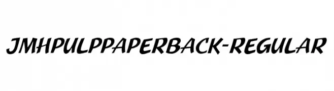
![JMHPulpPaperback-Regular font caratteri gratis]() Scaricare 446 Downloads@WebFont
Scaricare 446 Downloads@WebFont -
( Fonts by ShyFonts )
A dynamic, oblique font with sleek, narrow letters and a modern aesthetic.
![SF Movie Poster Oblique font caratteri gratis]() Scaricare 446 Downloads@WebFont
Scaricare 446 Downloads@WebFont -
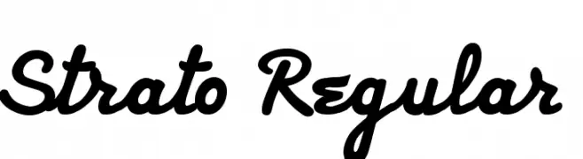
( Bastien Sozoo - sozoo.fr/ )
A bold, cursive script font with a playful and sophisticated style.
![Strato Regular font caratteri gratis]() Scaricare 446 Downloads@WebFont
Scaricare 446 Downloads@WebFont -
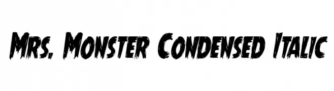
( Fonts by Daniel Zadorozny - www.iconian.com - Free for personal use )
A bold, condensed italic font with jagged edges, perfect for dramatic themes.
![Mrs. Monster Condensed Italic font caratteri gratis]() Scaricare 446 Downloads@WebFont
Scaricare 446 Downloads@WebFont -
![Natura Play Bold font caratteri gratis]() Scaricare 445 Downloads@WebFont
Scaricare 445 Downloads@WebFont -
( Fonts by Wino S Kadir - weknow - www.revolge.com/shop/weknow/ - Personal-use only. For commercial use please contact owner. )
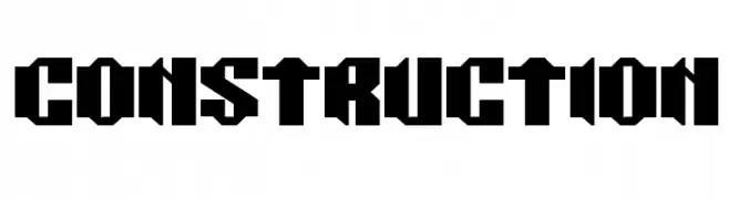
A bold, geometric font with angular lines and a modern, industrial feel.
![CONSTRUCTION font caratteri gratis]() Scaricare 445 Downloads@WebFont
Scaricare 445 Downloads@WebFont -
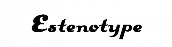
![Estenotype font caratteri gratis]() Scaricare 445 Downloads@WebFont
Scaricare 445 Downloads@WebFont -
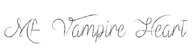
( Fonts by Misti`s Fonts - mistifonts.com - Personal-use only. For commercial use please contact owner. )
An elegant, cursive script font with flowing, decorative strokes.
![Mf Vampire Heart font caratteri gratis]() Scaricare 445 Downloads@WebFont
Scaricare 445 Downloads@WebFont -
![Stencil Intellecta Limited Set font caratteri gratis]() Scaricare 445 Downloads@WebFont
Scaricare 445 Downloads@WebFont -
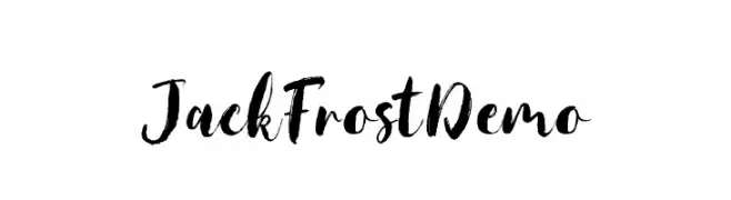
( Siwox Studios - bit.ly/saffatinmyfonts )
A bold, expressive script font with dynamic, hand-drawn strokes.
![JackFrostDemo font caratteri gratis]() Scaricare 445 Downloads@WebFont
Scaricare 445 Downloads@WebFont -
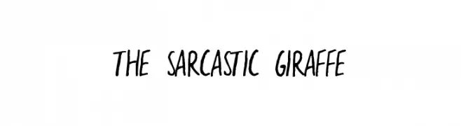
( Fonts by a Zaffar Ansari - Zansari . Personal-use only. For commercial use please contact owner. )
A playful, handwritten font with irregular strokes and a casual style.
![the sarcastic giraffe font caratteri gratis]() Scaricare 445 Downloads@WebFont
Scaricare 445 Downloads@WebFont -
( Fonts by Agathe M.Joyce - www.foundmyfont.com - Personal-use only. For commercial use please contact owner. )
A bold, calligraphic font with dynamic strokes and artistic flair.
![The Black Pearl font caratteri gratis]() Scaricare 445 Downloads@WebFont
Scaricare 445 Downloads@WebFont -
( Fonts by AZ Std )
A bold, playful font with rounded edges and a hand-drawn style.
![Uncle House font caratteri gratis]() Scaricare 445 Downloads@WebFont
Scaricare 445 Downloads@WebFont -
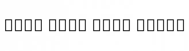
( Noto is a trademark of Google Inc. Noto fonts are open source. All Noto fonts are published under the SIL Open Font License, Version 1.1 )
Invalid font display with placeholder symbols.
![Noto Sans Thai Light font caratteri gratis]() Scaricare 445 Downloads@WebFont
Scaricare 445 Downloads@WebFont -
![Demure Fleur font caratteri gratis]() Scaricare 445 Downloads@WebFont
Scaricare 445 Downloads@WebFont -
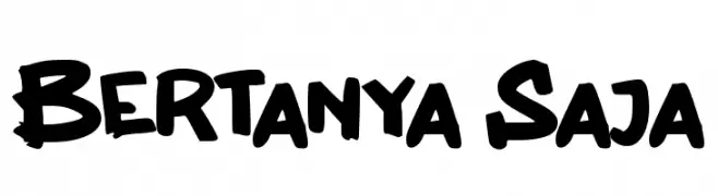
( Fonts by wep )
A bold, brush-like font with a playful and dynamic style.
![Bertanya Saja font caratteri gratis]() Scaricare 445 Downloads@WebFont
Scaricare 445 Downloads@WebFont -
![VireoFont font caratteri gratis]() Scaricare 445 Downloads@WebFont
Scaricare 445 Downloads@WebFont -
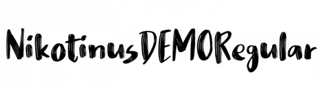
( bogstav - www.bogstav.com )
A bold, hand-painted style font with dynamic, brush-like strokes.
![Nikotinus DEMO Regular font caratteri gratis]() Scaricare 445 Downloads@WebFont
Scaricare 445 Downloads@WebFont -
( Fonts by Kenneth Hirst )
A bold, geometric font with a modern, pixelated style.
![AmericanIndian font caratteri gratis]() Scaricare 445 Downloads@WebFont
Scaricare 445 Downloads@WebFont -
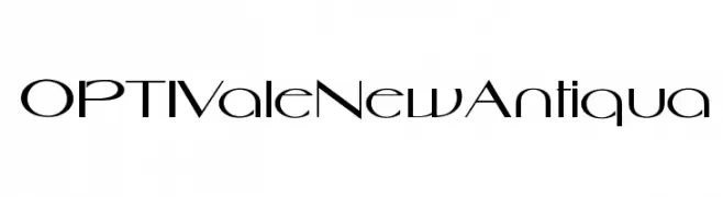
( Fonts by Castcraft Software - OPTI Fonts Archive - opti.netii.net - Personal-use only. For commercial use please contact owner. )
A sleek, modern font with geometric structure and dynamic style.
![OPTIValeNewAntiqua font caratteri gratis]() Scaricare 445 Downloads@WebFont
Scaricare 445 Downloads@WebFont -
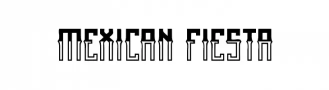
( Qkila - Quentin Aquila - www.creativefabrica.com/designer/qkila/ )
A bold, decorative font with geometric influences and a festive flair.
![Mexican fiesta font caratteri gratis]() Scaricare 445 Downloads@WebFont
Scaricare 445 Downloads@WebFont -
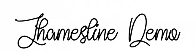
( Fonts by Noah Type - noahtype.com - Personal-use only. For commercial use please contact owner. )
An ornate and decorative script font with elegant swirls and flowing lines.
![Jhamesline Demo font caratteri gratis]() Scaricare 445 Downloads@WebFont
Scaricare 445 Downloads@WebFont -
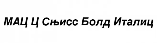
![MAC C Swiss Bold Italic font caratteri gratis]() Scaricare 445 Downloads
Scaricare 445 Downloads


Quali sono i font più popolari adesso?
Poppins, Roboto, Montserrat, Open Sans e Lato sono molto usati per le forme pulite e l'ampia applicabilità — dall'identità di marca alle landing page e ai poster.
Quali font si usano spesso nei loghi?
Le sans serif geometriche (es. Poppins, famiglie in stile Gotham) sono scelte comuni per un branding pulito e scalabile. Per un tocco personale restano valide script e stili manoscritti. Abbina un display deciso per i titoli a un corpo testo neutro per riconoscibilità ed equilibrio.
Ogni quanto si aggiorna la lista?
Con regolarità, in base ai download e all'attività reale. Torna spesso per scoprire in anticipo le nuove preferite.
💡 Consiglio: aggiungi ai preferiti — le tendenze cambiano in fretta e i font top di oggi possono ispirare il rebranding di domani.