Benvenuto nelle Font Più Popolari — dove popolarità e qualità si incontrano. Qui trovi i font più scaricati e usati dell'anno. Se cerchi scelte sicure per logo, web o social, inizia da qui.
Ogni font top si distingue per equilibrio, leggibilità e versatilità. Troverai sans serif moderne, script eleganti, serif vintage e display minimalisti.
-
( Fonts by surotype - Adil Budianto - Personal-use only. For commercial use please contact owner. )
A bold, italic font with strong, dynamic characters and a modern style.
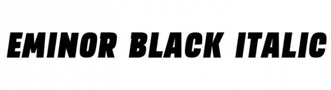 Scaricare 76 Downloads@WebFont
 -
( Fonts by Wahyu & Sani Co. - Sani Sanjaya - Personal-use only. For commercial use please contact owner. )
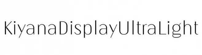
A sleek, ultra-light font with a modern and minimalistic design.
![Kiyana Display UltraLight font caratteri gratis]() Scaricare 76 Downloads@WebFont
Scaricare 76 Downloads@WebFont -
( Vladimir Nikolic - www.coroflot.com/vladimirnikolic )
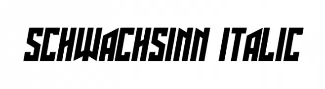
A bold, angular, and italic font with a dynamic, geometric style.
![Schwachsinn Italic font caratteri gratis]() Scaricare 76 Downloads@WebFont
Scaricare 76 Downloads@WebFont -
( Fonts by Danar Nugroho )
A playful, handwritten font with a friendly and approachable style.
![Dealova Serif font caratteri gratis]() Scaricare 76 Downloads@WebFont
Scaricare 76 Downloads@WebFont -
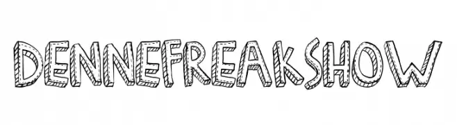
![Denne Freakshow font caratteri gratis]() Scaricare 76 Downloads@WebFont
Scaricare 76 Downloads@WebFont -
-
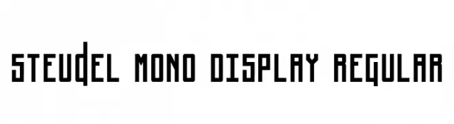
( Fonts by Pedro Munhoz - Personal-use only. For commercial use please contact owner. )
A bold, geometric monospaced font with a modern, industrial aesthetic.
![Steudel Mono Display Regular font caratteri gratis]() Scaricare 76 Downloads@WebFont
Scaricare 76 Downloads@WebFont -
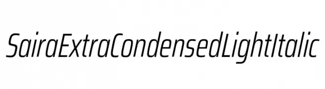
( Fonts by Omnibus Type )
A sleek, extra condensed, light italic font with a modern and dynamic style.
![Saira ExtraCondensed Light Italic font caratteri gratis]() Scaricare 76 Downloads@WebFont
Scaricare 76 Downloads@WebFont -
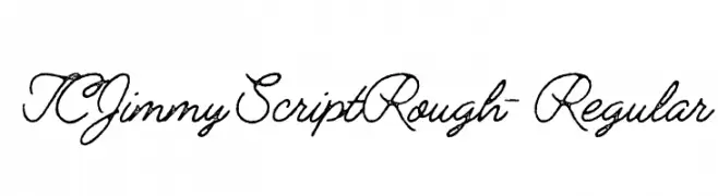
( Fonts by tomchalky.com - Personal-use only. For commercial use please contact owner. )
A rough, textured script font with a handwritten feel.
![TCJimmyScriptRough-Regular font caratteri gratis]() Scaricare 76 Downloads@WebFont
Scaricare 76 Downloads@WebFont -
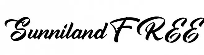
( Fonts by Vunira Design - Personal-use only. For commercial use please contact owner. )
A bold, elegant script font with flowing, cursive letterforms.
![SunnilandFREE font caratteri gratis]() Scaricare 76 Downloads@WebFont
Scaricare 76 Downloads@WebFont -
![Square Stone-7 font caratteri gratis]() Scaricare 76 Downloads@WebFont
Scaricare 76 Downloads@WebFont

Quali sono i font più popolari adesso?
Poppins, Roboto, Montserrat, Open Sans e Lato sono molto usati per le forme pulite e l'ampia applicabilità — dall'identità di marca alle landing page e ai poster.
Quali font si usano spesso nei loghi?
Le sans serif geometriche (es. Poppins, famiglie in stile Gotham) sono scelte comuni per un branding pulito e scalabile. Per un tocco personale restano valide script e stili manoscritti. Abbina un display deciso per i titoli a un corpo testo neutro per riconoscibilità ed equilibrio.
Ogni quanto si aggiorna la lista?
Con regolarità, in base ai download e all'attività reale. Torna spesso per scoprire in anticipo le nuove preferite.
💡 Consiglio: aggiungi ai preferiti — le tendenze cambiano in fretta e i font top di oggi possono ispirare il rebranding di domani.